


Home
Hi, my name is
Ma'ayan Castel
I'm a Senior Product Designer. I love problem solving and collaborating to build things that make people happy
Home
Hi, my name is
Ma'ayan Castel
I'm a Senior Product Designer. I love problem solving and collaborating to build things that make people happy
Badges + Streaks
Attain app
The Attain app is a sensor-based health, activity & rewards experience delivered via native mobile apps. To support a new user base, we needed to create a new engagement mechanism to support user achievement and health focused behavior change without a financial component.
Healthy Action Card Redesign
Attain app
Looking to improve engagement rates with the Healthy Actions feature, I lead the effort at reimagining how we serve up easy to digest tips and actions that can help users earn points and create better health habits.
Shower Sessions Podcast w/ St. Vincent
Progressive Insurance
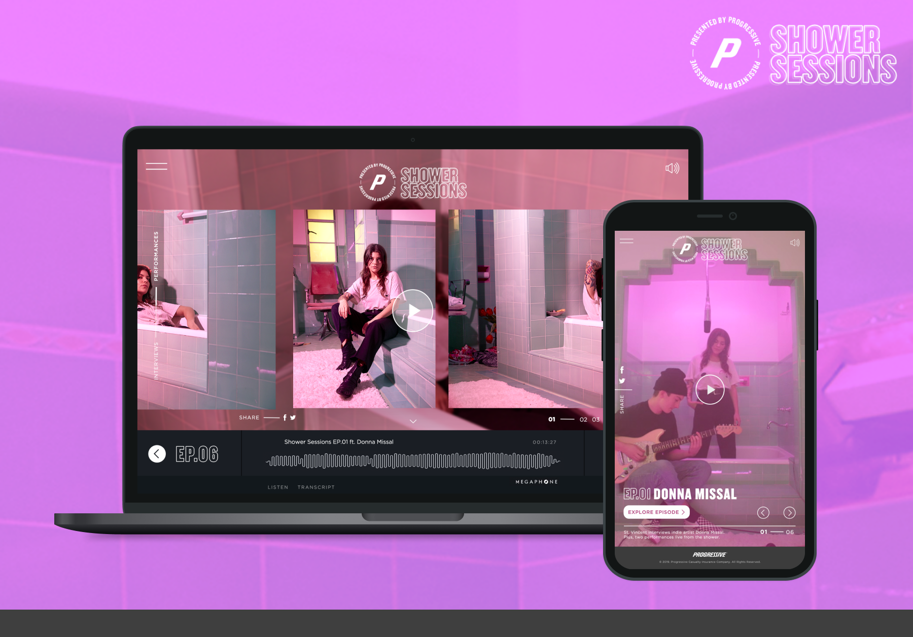
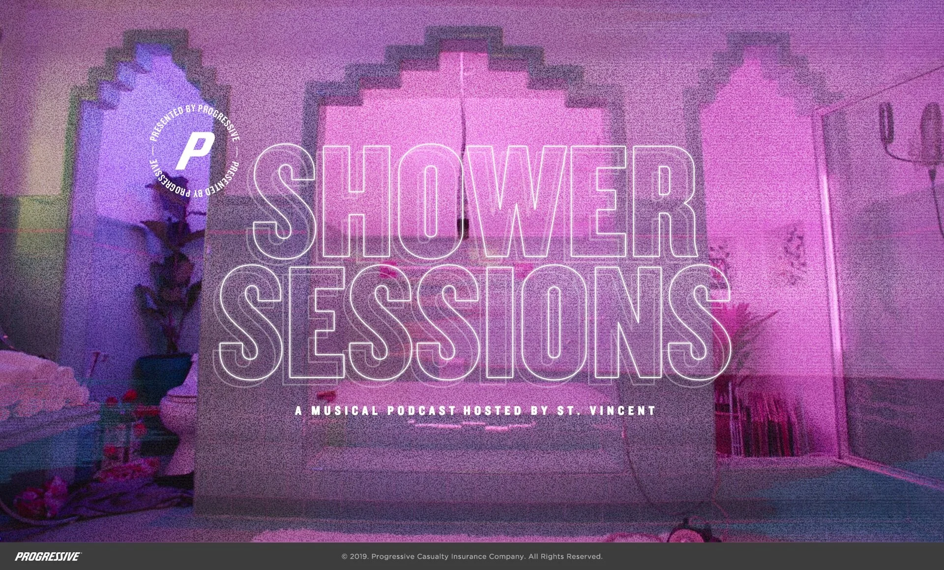
From concept to launch created a responsive and accessible microsite for a podcast series featuring St. Vincent interviewing emerging artists in the shower (where everyone sings).
We’re in this together (A wellness portal)
COSTCO
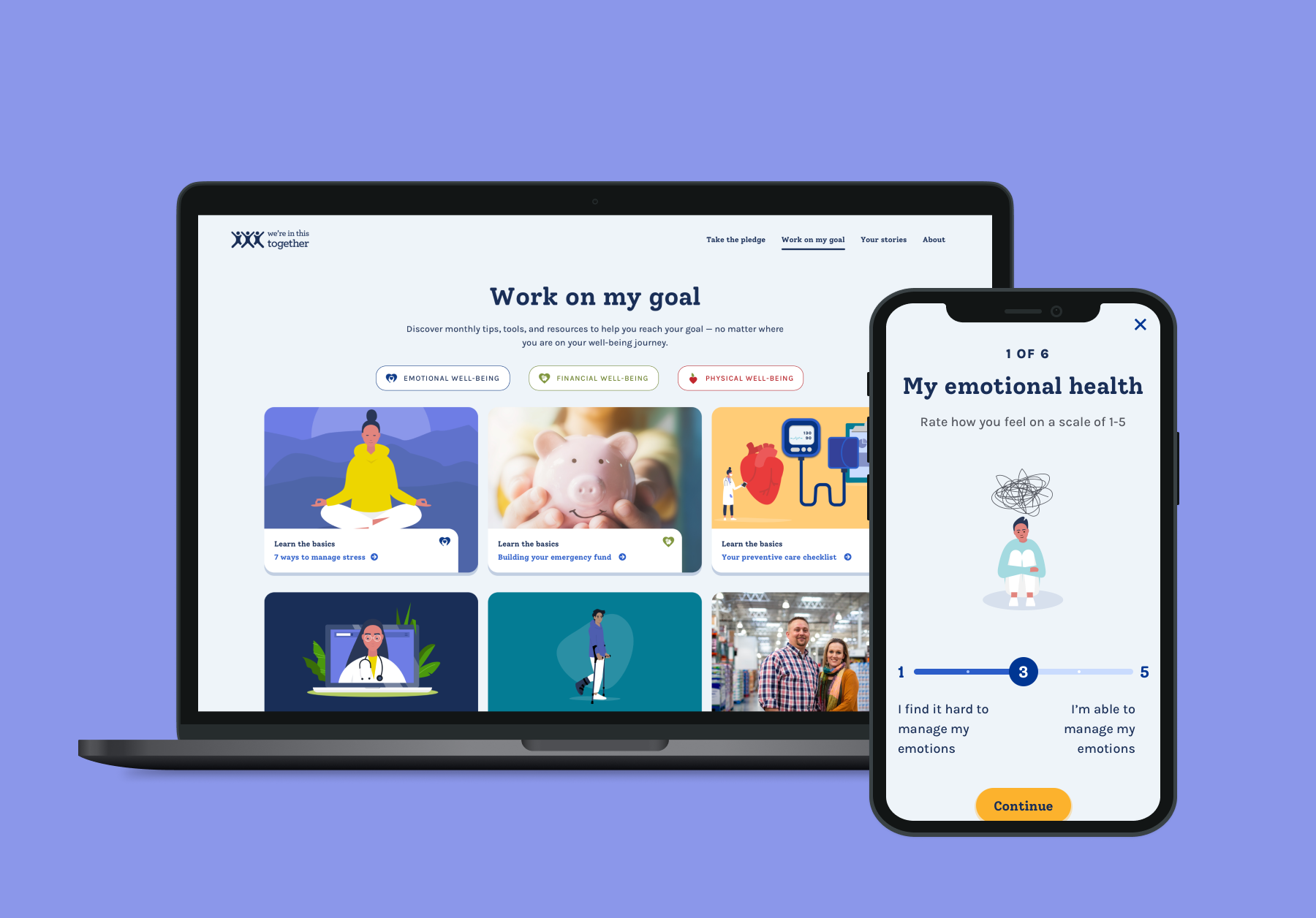
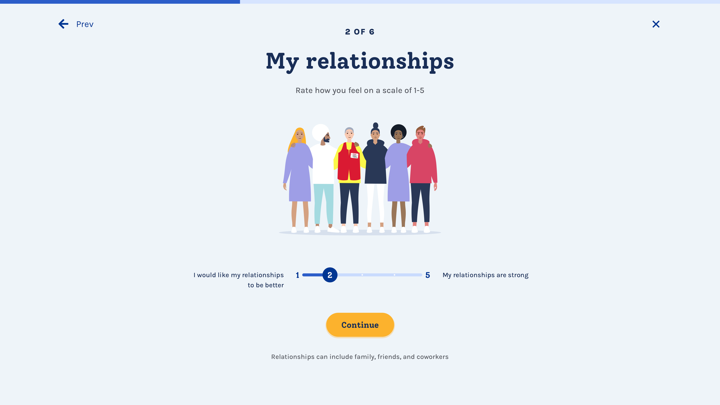
From UX strategy to the Final UI design we created a pledge experience, self assessment tool and well-being content portal for Costco employees to work on and improve their wellness.
Know your water
PUR
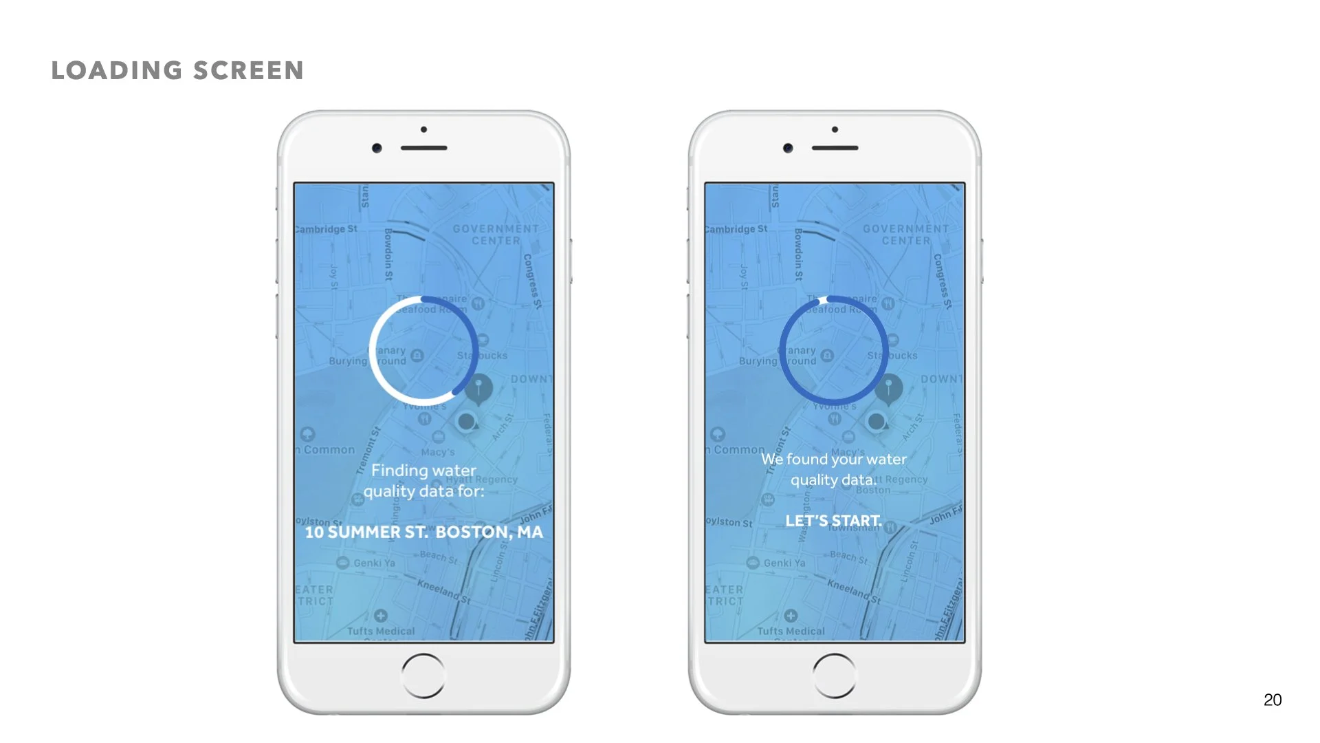
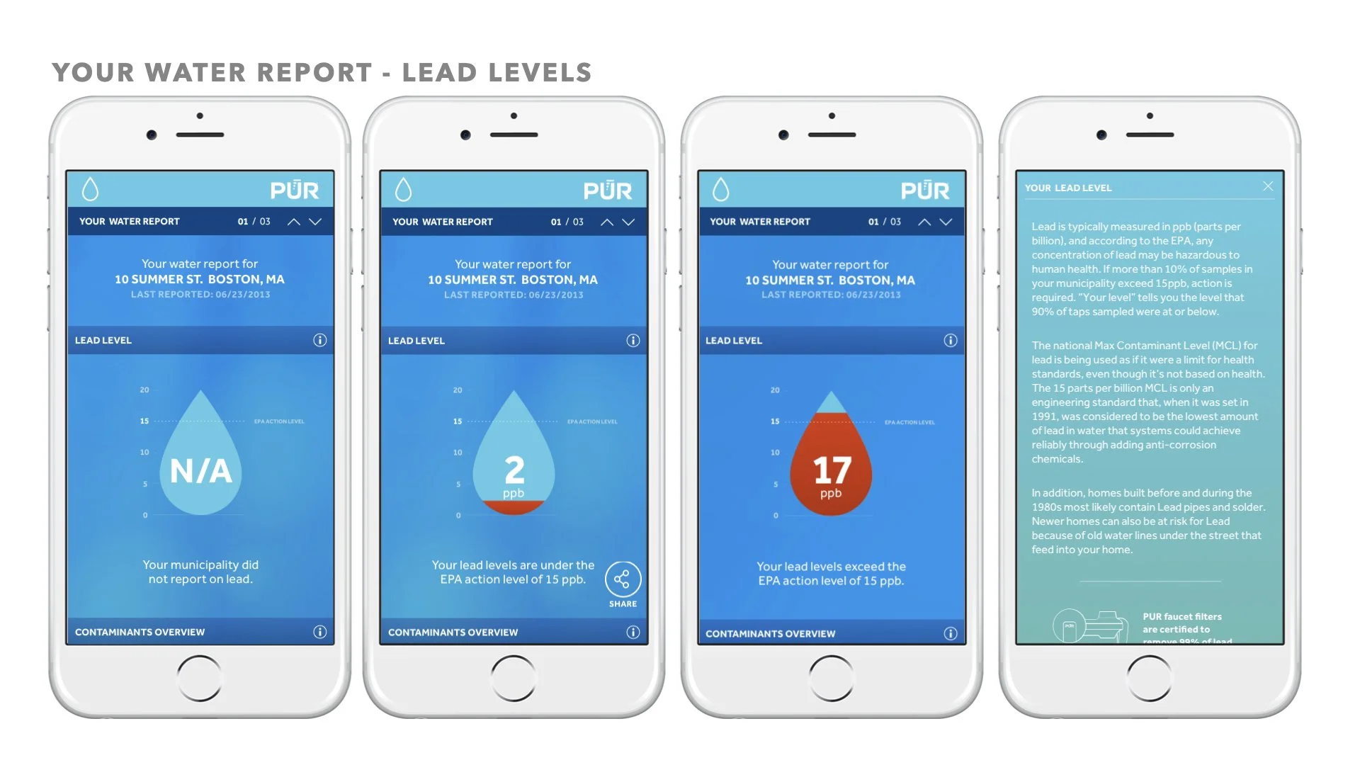
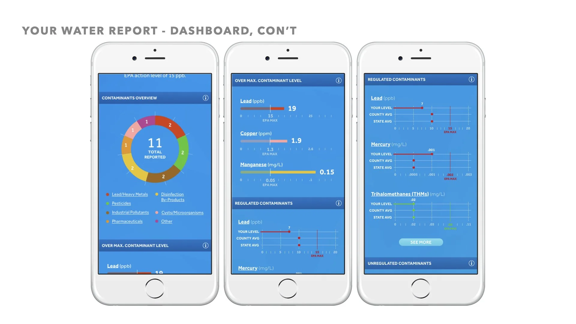
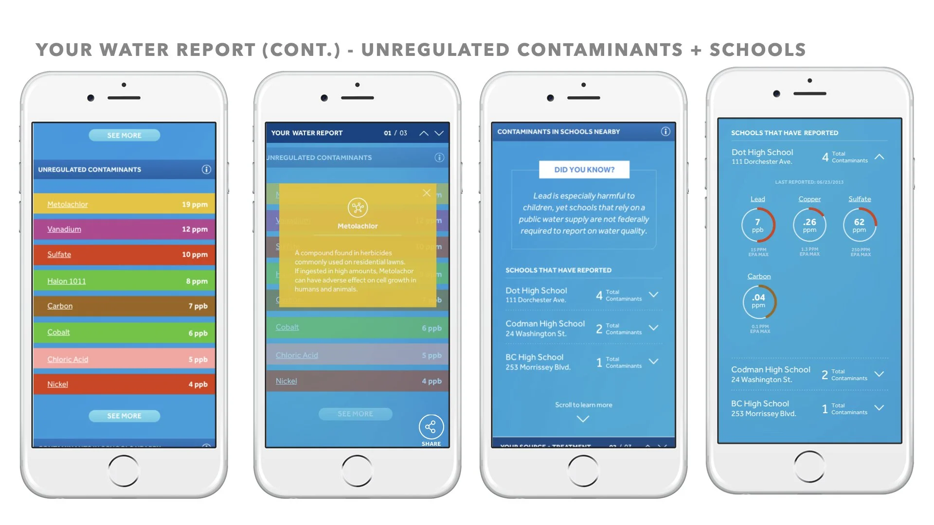
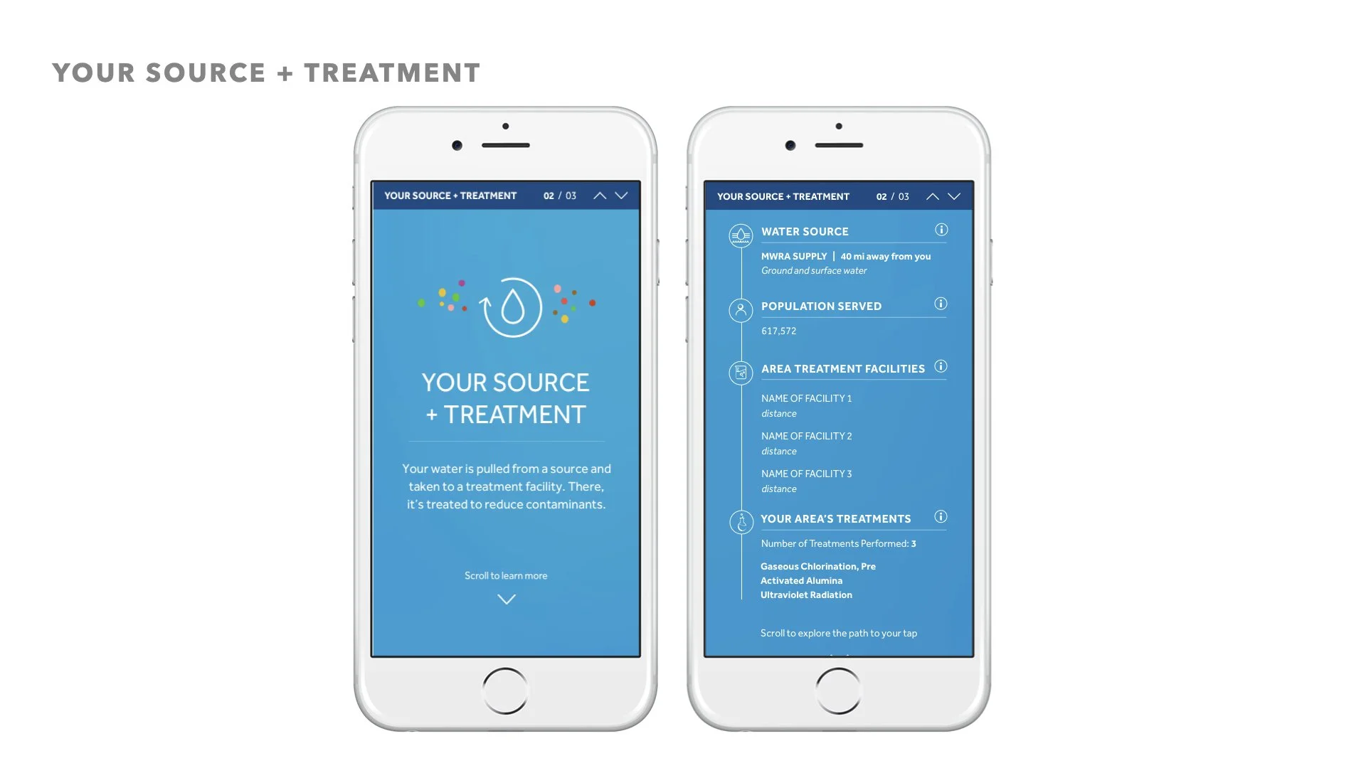
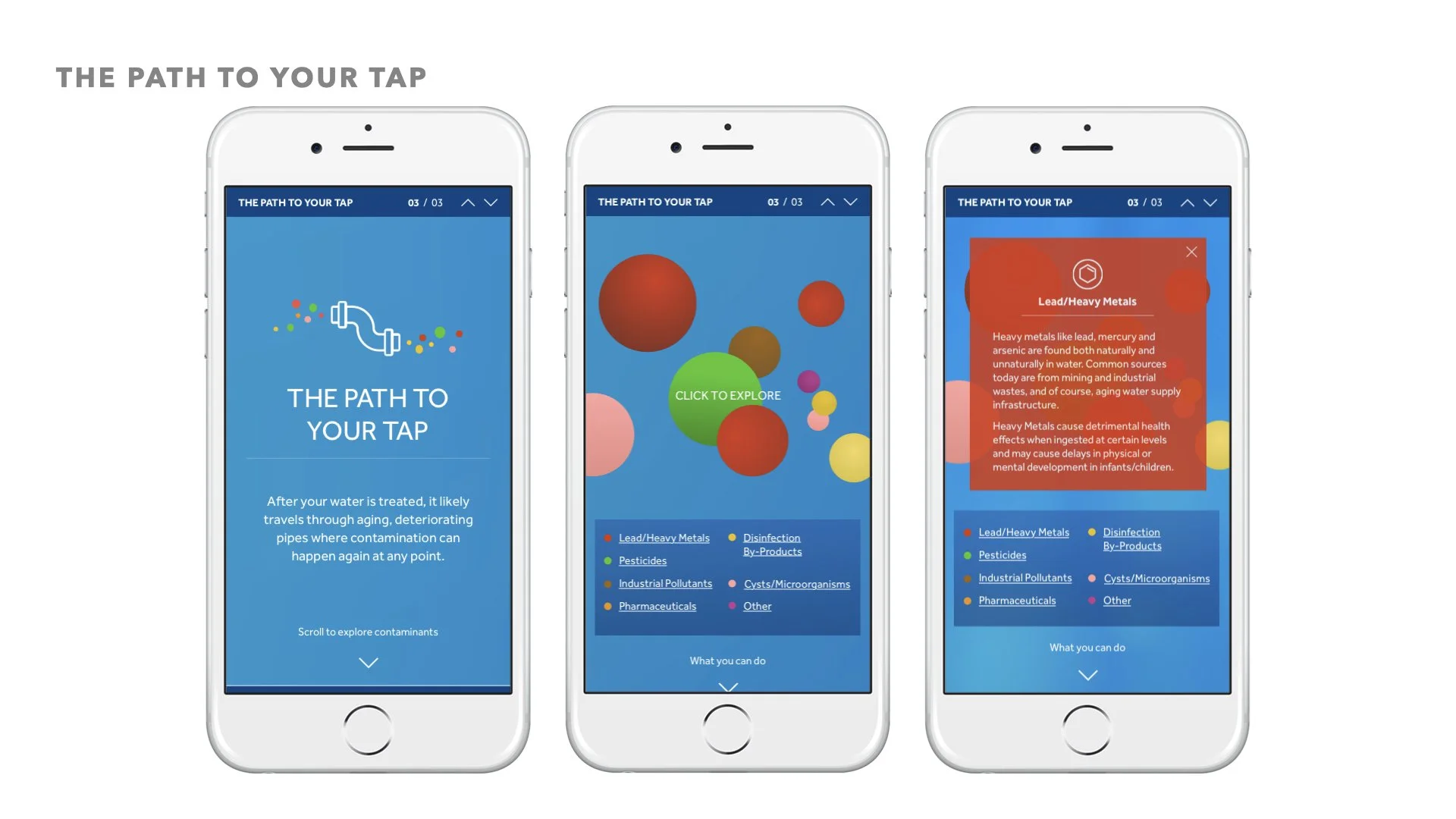
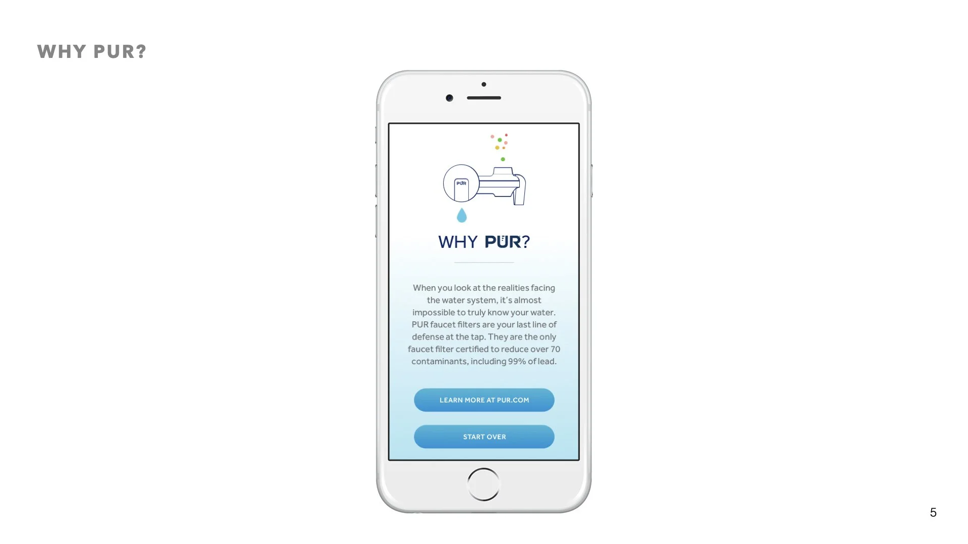
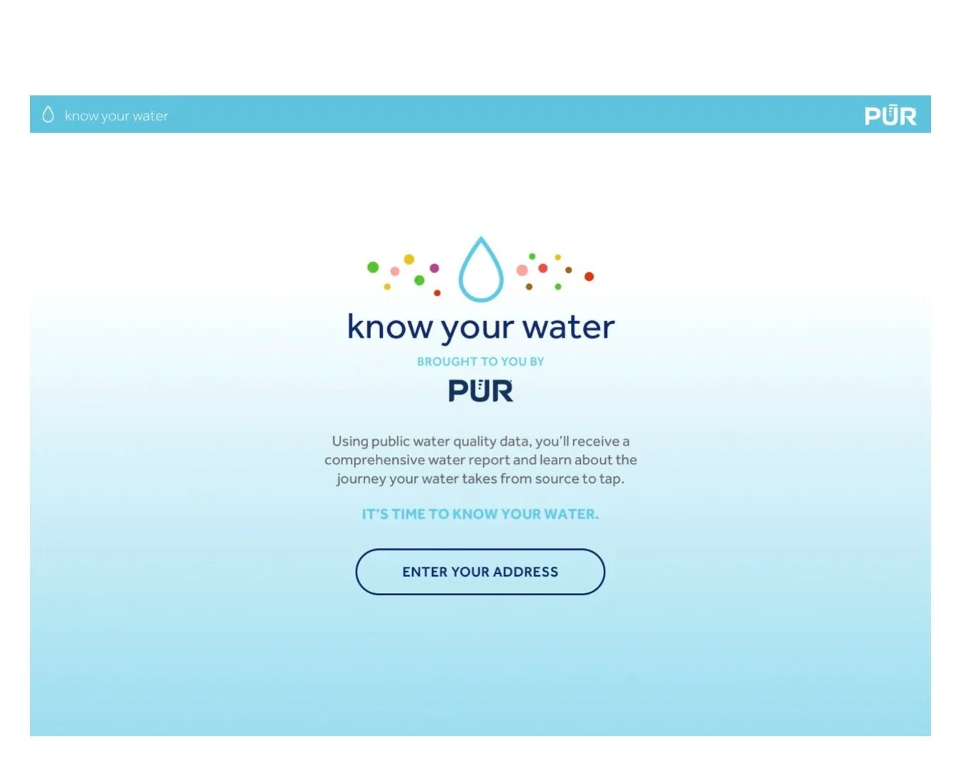
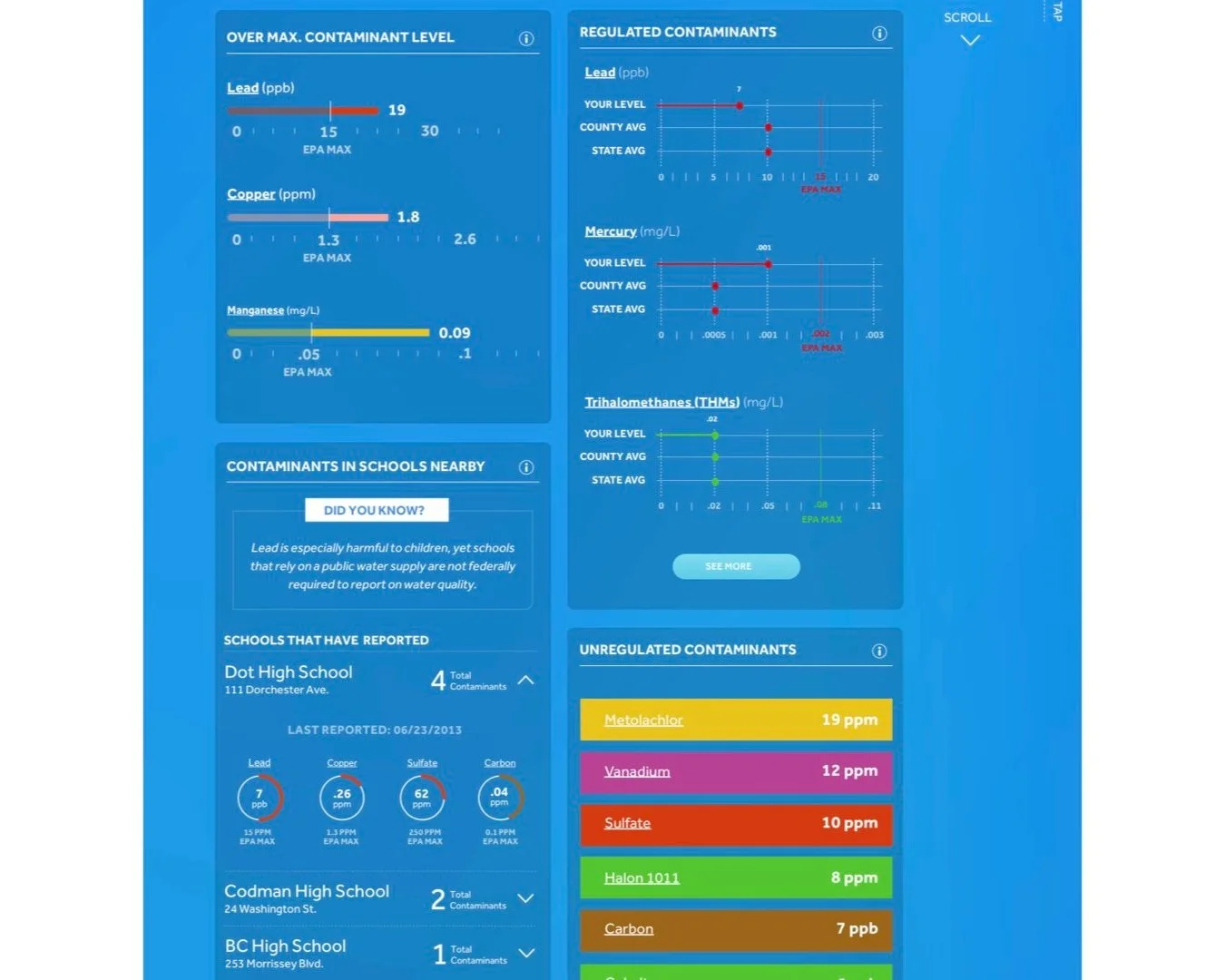
The redesigned tool we launched on December 2017, was a mobile first data driven (using machine-learning) repository of local water information leveraging strong data visualization.
CyberRange Portal
Simspace
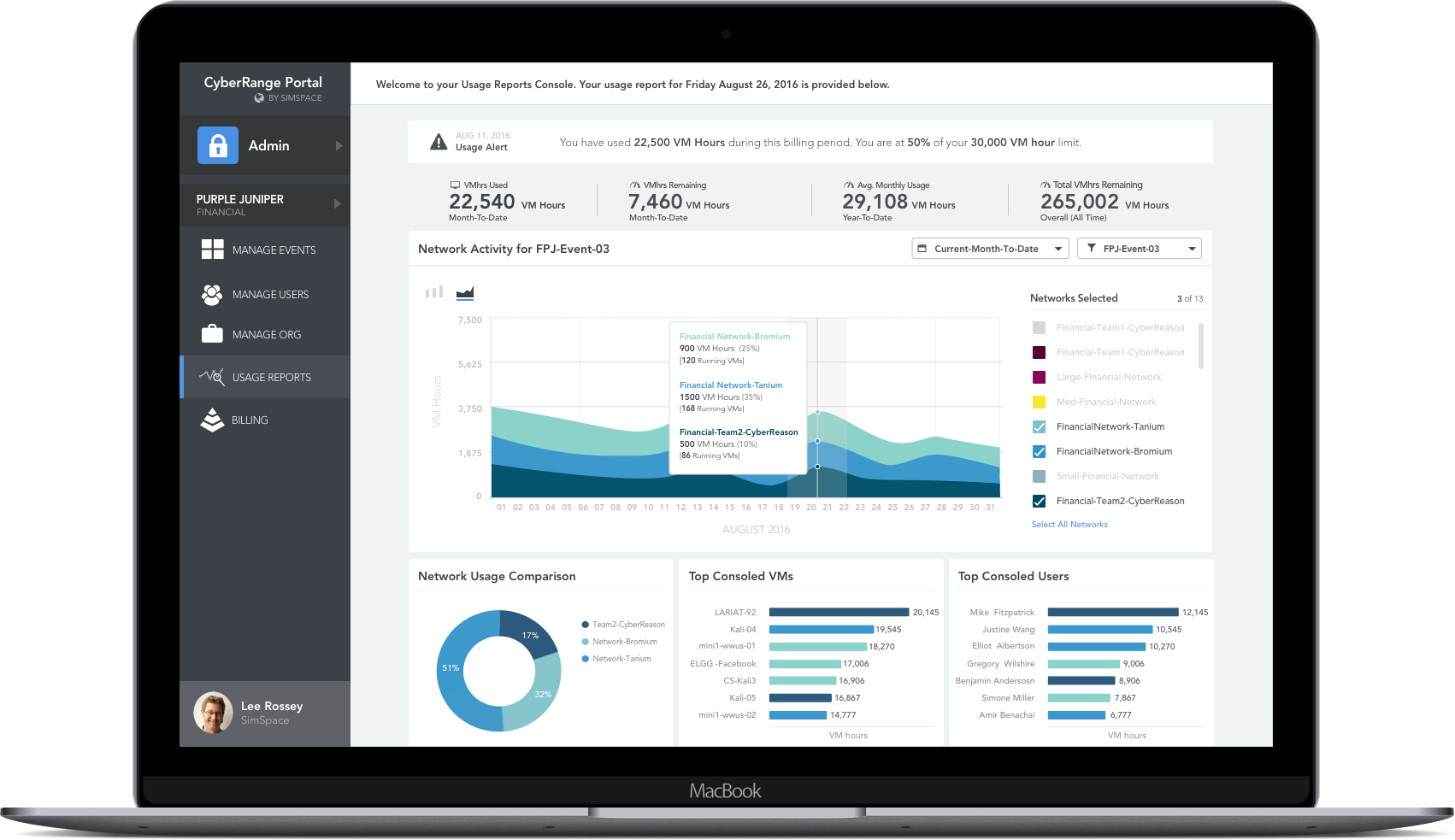
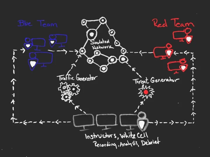
Lead the UX/UI Design of a robust suit of tools for cybersecurity training testing and assessments on a CyberRange (simulated network) used by the DOD, US Navy, US Army, and several other institutions.
MITX Site Redesign
MITX
I was brought on board to work with another UI designer and complete the IA, UX redesign and interaction design to The Massachusetts Innovation and Technology Exchange site

Attain: Streaks & Badges
Attain: Streaks & Badges
Attain App : Streaks + Badges
The Attain app is a sensor-based health, activity & rewards experience delivered via native mobile apps. Attain combines user health history with wearable data to offer personalized goals, achievable actions and rewards with the goal of driving behavior change to improve user health. In Attain, users earn points for their health interactions that can then be redeemed for gift cards or Apple Watch payment.
Problem Statement: In early 2022, it was decided to open Attain to members of the CVS Caremark and CVS Specialty programs. However, due to legal constraints we are unable to financially reward these new user types. We set out to find a solution for a non-financial rewards program that would support healthy habits and behavior change.
My Role: UX Strategy, UX Research, Content Strategy, Wireframes, User Flows, Prototypes, User Testing, Final Designs
Partner in crime: Duncan Okes
01 RESEARCH + DISCOVERY
The team conducted several research studies before beginning any design work to better understand user needs and behavior change engagement tactics that may be beneficial to the Attain user group.
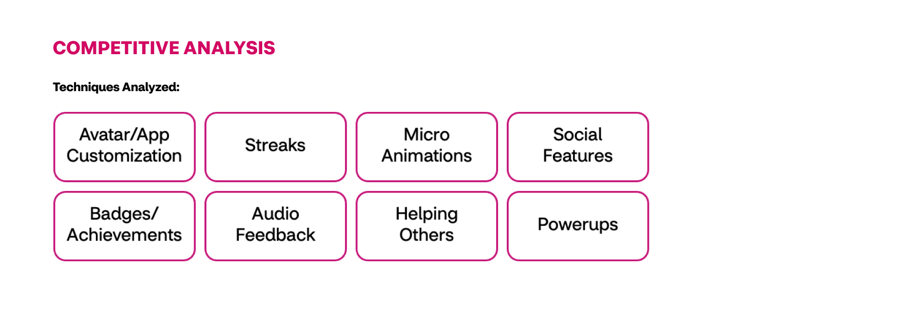
To better understand how other apps motivate their users, a competitive analysis was conducted. All told, 16 pieces of software were evaluated, ranging from Duolingo to Animal Crossing: New Horizons.
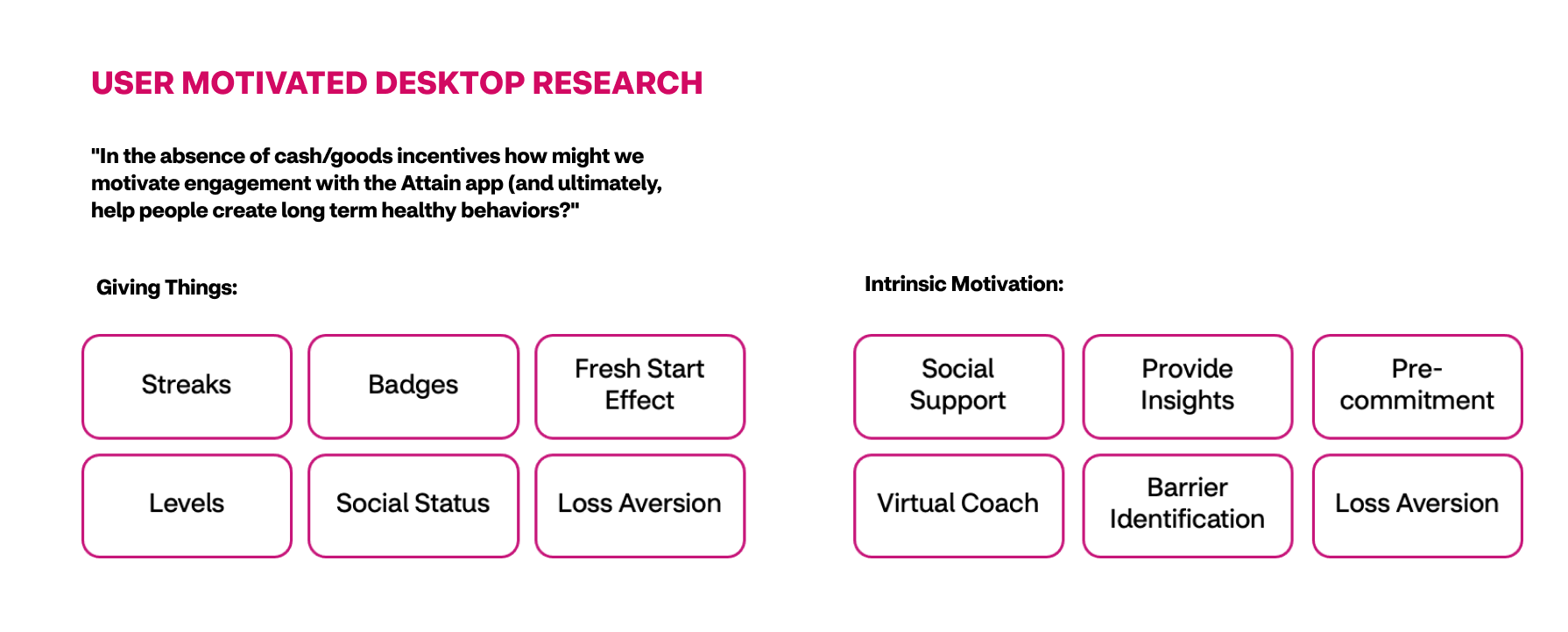
Partnering up with UXR and leaning on the COM-B model of Behavior Change we focused on these 2 directions.
02 workshop
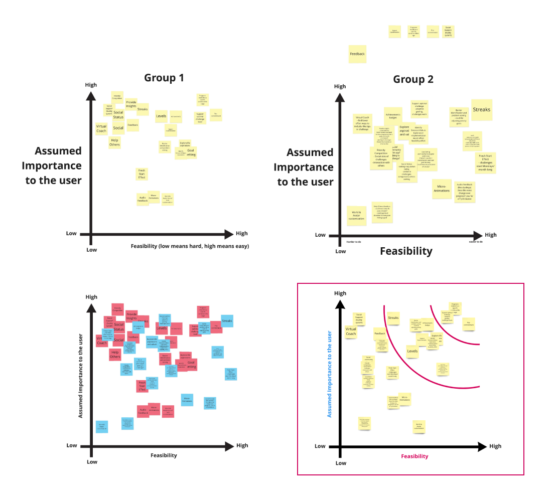
The Experience Design team ran design workshops including Crazy 8’s for non-financial rewards that could impact behavior change. Several workshops were conducted with Product, Architecture and Design teams to define scope of the features. Together we looked at all the uncovered techniques and ranked them on their assumed importance to the user and their technical feasibility.
Going off the Prioritization Grid, we dove into some of the techniques that scored high on feasibility and user importance.
Crazy 8’s sketches
Feature prioritization Grid
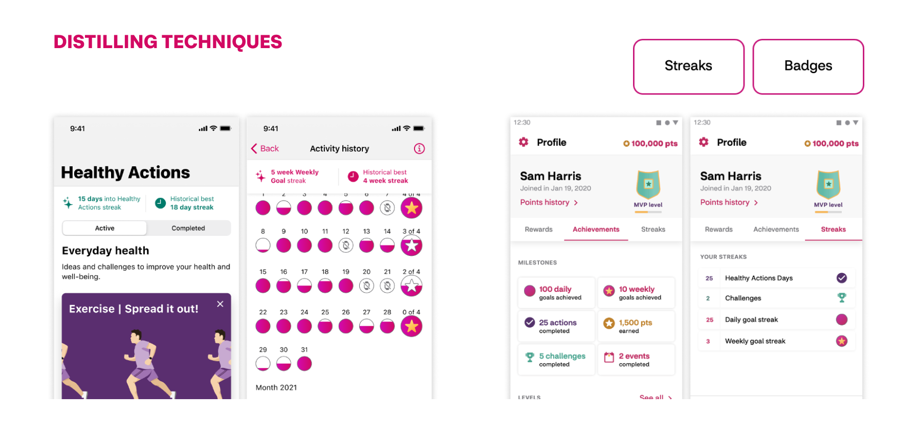
This exploration process as well as conversations with business stakeholders led us to Streaks and Badges. These would give our users something motivating that encourages daily usage, higher activity and competition with their past selves.
03 Early prototype
We designed concepts for streaks and badges, exploring the impacted screens and design implications.
Implementing streaks for Healthy Actions reinforces healthy behavior, and daily use. While streaking Weekly Goals allows us to encourage physical activity with less risk of burn out (as streaking Daily Goals would).
After narrowing down some design concepts with business stakeholders, we landed on a prototype to test with some perspective users.
04 MODERAted USER TESTING
We prepped and conducted a moderated test with 5 Attain users, 4 CVS Caremark members and 4 CVS Specialty members.
Through the test, we aimed to gather:
User's thoughts on streaks, badges, and not earning points
Preferences on Badge categorization and placement
Perception of the logic for streaks and badges
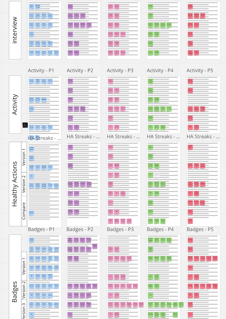
Moderated testing Notes on Miro
Test Results and Motivation Scores:
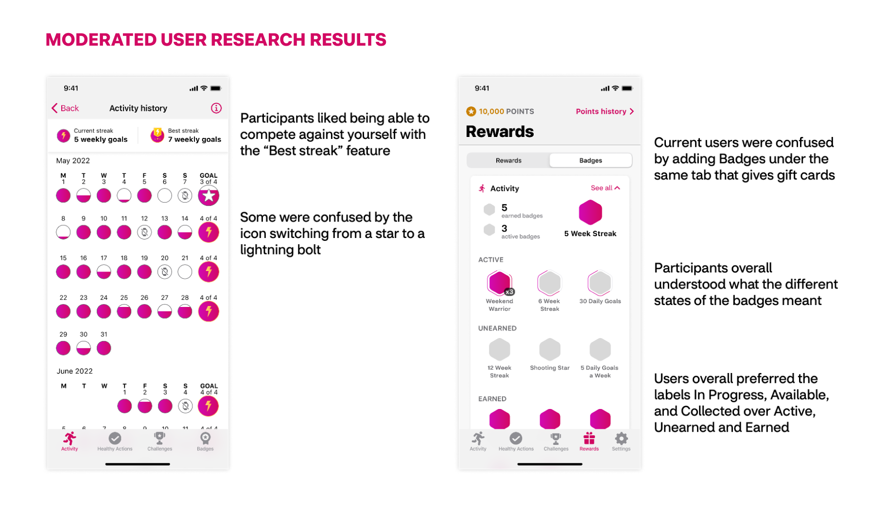
Results validated that Streaks and Badges would increase user engagement as a non-cash rewards system:
On a scale of 1 to 5, 1 being not at all motivating and 5 being extremely motivating users rated badges and streaks
05 final designs: Streaks
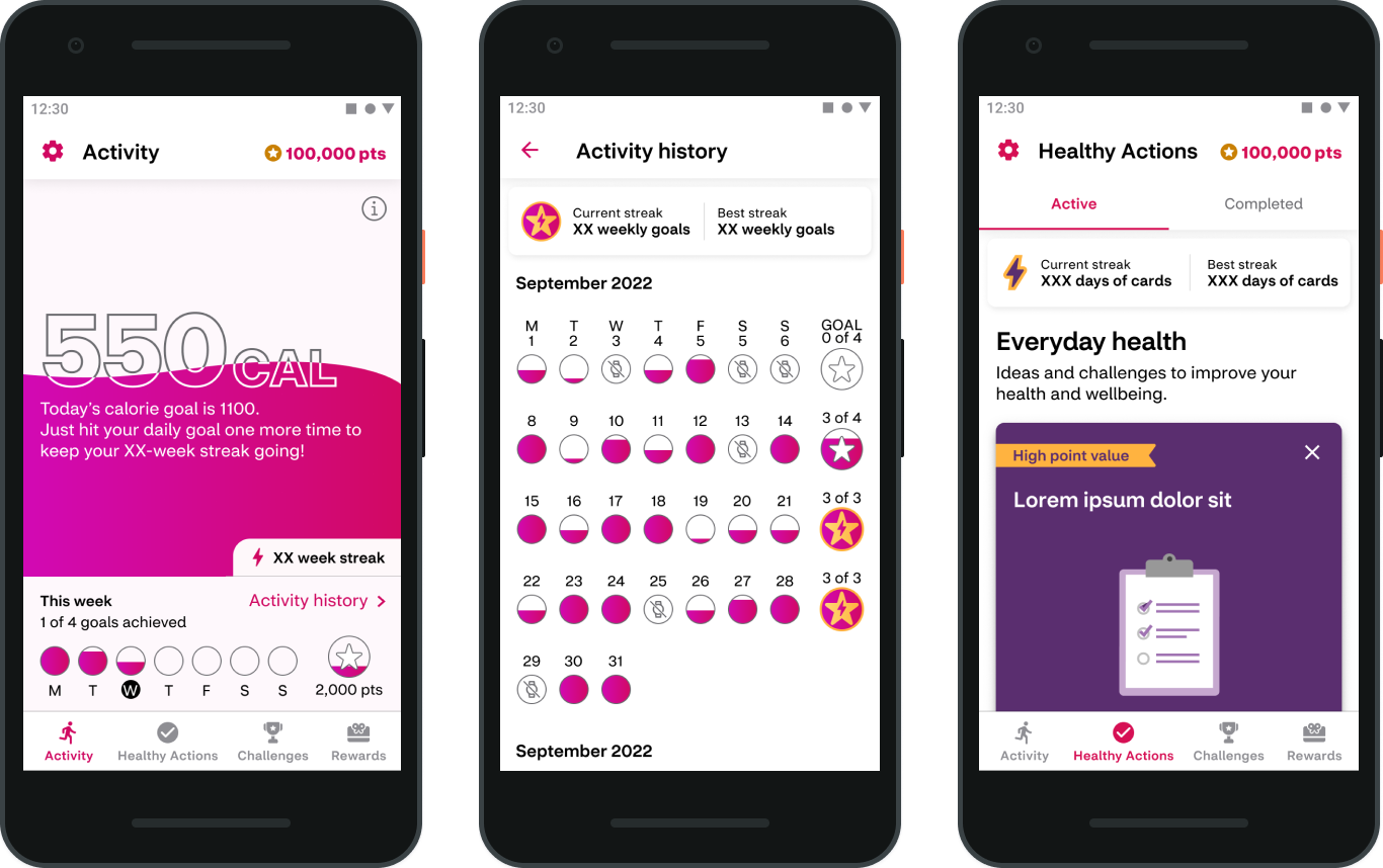
Streaks for iOS
Streaks for Android
The goal of Streaks in Attain is to increase users consistent engagement with the app. Streaks would be earned by users both within Activity and Healthy Actions. Streaks would start upon the second completion of an action, for Activity a Streak starts with 2 weeks consecutive completion of Weekly Activity Goal, for Healthy Actions a Streak starts with 2 days consecutive completion of a Healthy Action card. Users can view their current streak and best streak within the Activity and Healthy Actions tabs.
06 final designs: badges
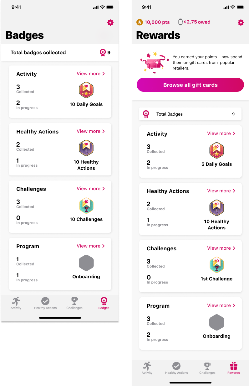
Badges Dashboard for iOS
Badges Dashboard for Android
Badges would be awarded to all users throughout the app. The feature was planned to release on both iOS and Android. Users who are eligible for financial rewards would view Badges as part of their current "Rewards" tab from the bottom navigation. Non-financial program users would see a "Badges" tab in the bottom navigation instead of "Rewards". From the main tab, users can view their recent Badges and high level stats for achievements across the app.
Badges Detail View
Users could tap into the detailed view of Badges section of the app in order to view by app section and specific Badge details. For example in "Activity Badges" view a user could swipe through achieved, in progress and available badges across this section of the app. By tapping on a specific badge, users could drill into a detail view and see more information on how to earn the badge, track progress toward the badge and see related badges available.
Streaks & Badges In-App Notification
At launch of each feature, all users would receive an in app full screen notification to educate and drive excitement for the new engagement mechanism. Users would also receive notifications in app when they completed badges that could include several badge achievements.
Badges System
To determine how users earn badges, we looked at each section of the app and worked out what they can do there. Looking at each individual action, we determined what badge type would best suit it.
For badging the repetitive completion of something like a daily goal, we landed on a milestone concept. These milestone badges run along cadences with calculated gaps that give a challenge while keeping momentum.
We also provided badges that users can earn several times (ex: 200% their daily goal) as well as ones that don’t show up in the initial list (ex: completing in the top percentile of a challenge). Some guidelines for this decision were inclusive best practices as well surprise and delight moments.
We determined most badges should be named explicitly but others could have thematic names that build with each other (like Base Camp > Ridge > Summit)

Attain: Healthy Actions
Attain: Healthy Actions
Attain App : Healthy Actions Card Redesign
The Attain app is a sensor-based health, activity & rewards experience delivered via native mobile apps. Attain combines user health history with wearable data to offer personalized goals, achievable actions and rewards with the goal of driving behavior change to improve user health.
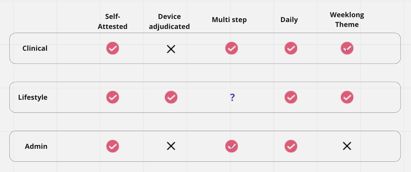
In the Attain App, Healthy Actions are easy to digest tips and actions deployed via content cards daily. Healthy Actions are an opportunity for users to develop daily engagement with in improving healthy habits around topics of sleep, nutrition, mindfulness and activity. There is also an opportunity for more personalized clinical content deployed based on user's medical history.
The Problem Statement: The goal of optimizing the design of the Healthy Action Cards was to increase engagement rates with the cards (current rates) through improved readability and hierarchy of card content. I also explored creating a more holistic experience, one that would inform the user of their progress, help them determine which content was of importance to them, and provide a more overall personalized experience.
My Role: Lead product designer, User Research + Discovery, Workshops, Wireframing, User Flows, User Testing, UI Design, Interaction Design
Baseline Test
The purpose of this test was to gain feedback from both Attain members and non-Attain members on the current lifestyle and clinical Healthy Action card experience in order to have something to compare to later when we are testing the proposed solution.
6 participants total: 3 Attain members, 3 non-Attain members
Each participant saw both the clinical and lifestyle cards, 3 participants saw lifestyle first and 3 clinical cards first.
Results:
Participants did not notice the difference in cards bw lifestyle and clinical even though they were different shades of purple and had a different headline
Participants understood the relationship between cards in multistep experience
CTA language was either not understood or felt irrelevant. Users were confused by the number of CTAs.
We conducted usability baseline testing, design exploration and workshopping to identify the first phase of improvements planned to launch, collect real time user feedback learnings, then continue to adapt and improve.
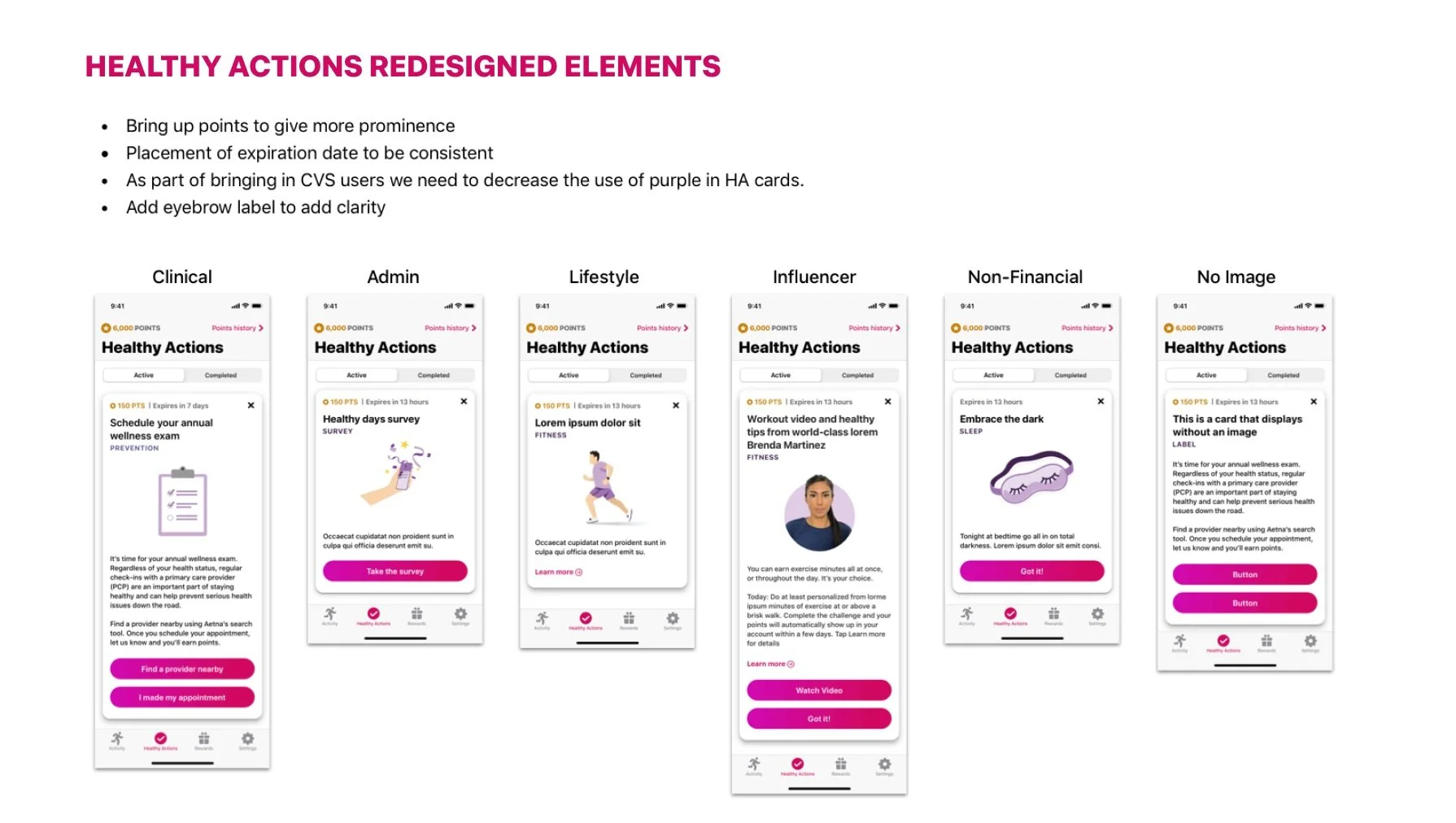
Design improvements include:
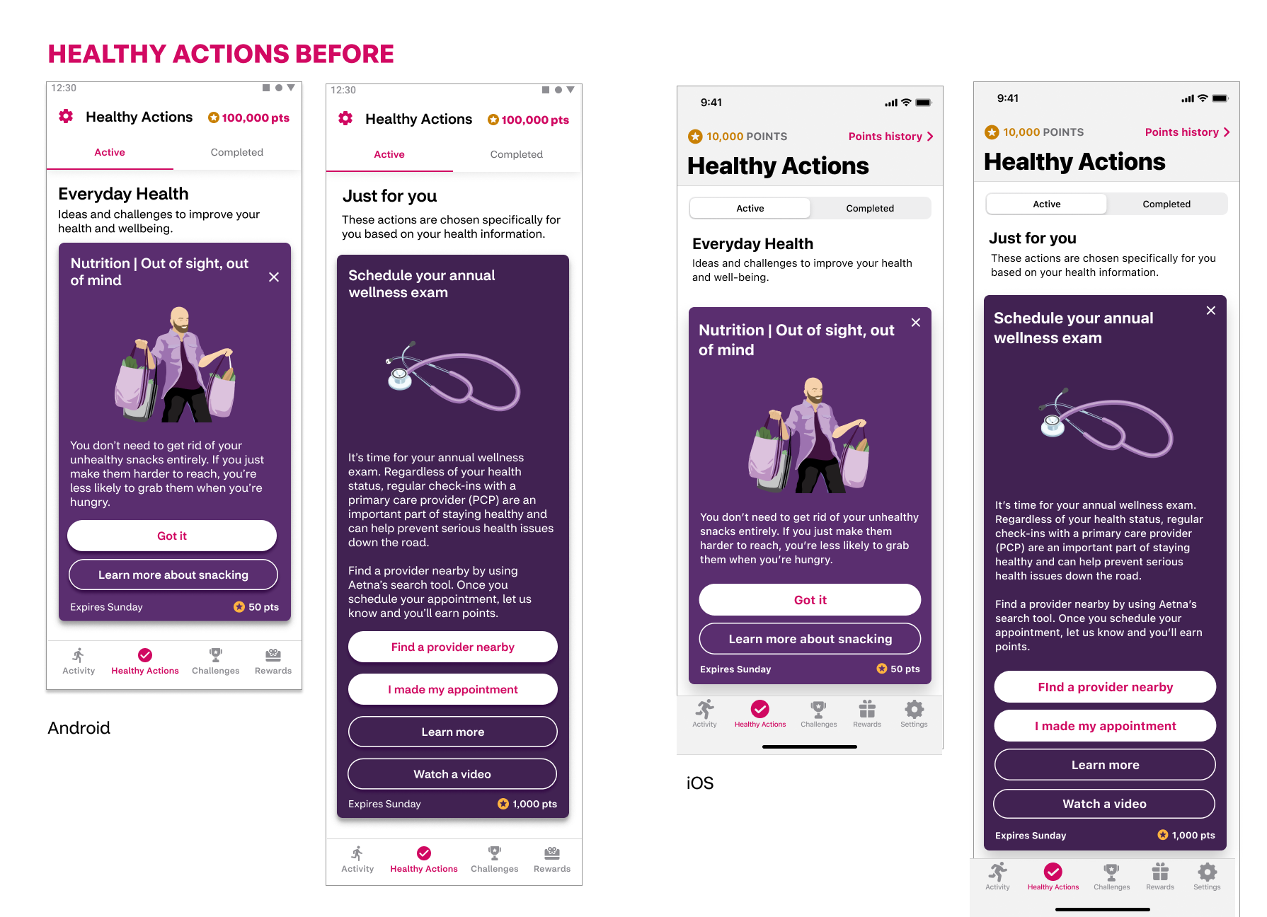
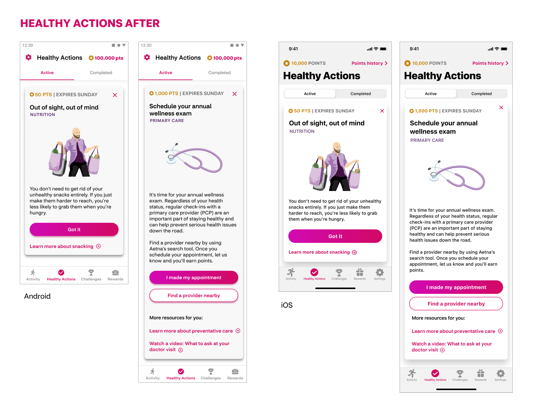
Improved CTA hierarchy: Updated call to action hierarchy to include clearly denoted primary and secondary buttons for adjudicated actions as well as links for related resources.
Update in the color of the cards for improved readability: White background with black text is easier for most users than white text on violet color, especially for longer clinical cards.
Retain branding personality: Retained brand colors and personality with the use of violet toned illustrations
Added theme visibility: With the addition of a label that denotes the theme of the Healthy Action cards, users will have more awareness of content themes that span over a week of time of clinical cards that span over several weeks.
Increased visibility of points and date: Based on user feedback of importance, moved the points value and expiration date from the bottom to top of the card.
Removed ineffective copy: From user feedback, we learned there was a lack of attention paid to and clarity to the headlines that delineated the "everyday health" and "just for you" sections of Healthy Actions. This cleans up the space so users can focus on the information of higher importance rather than what had become white noise.
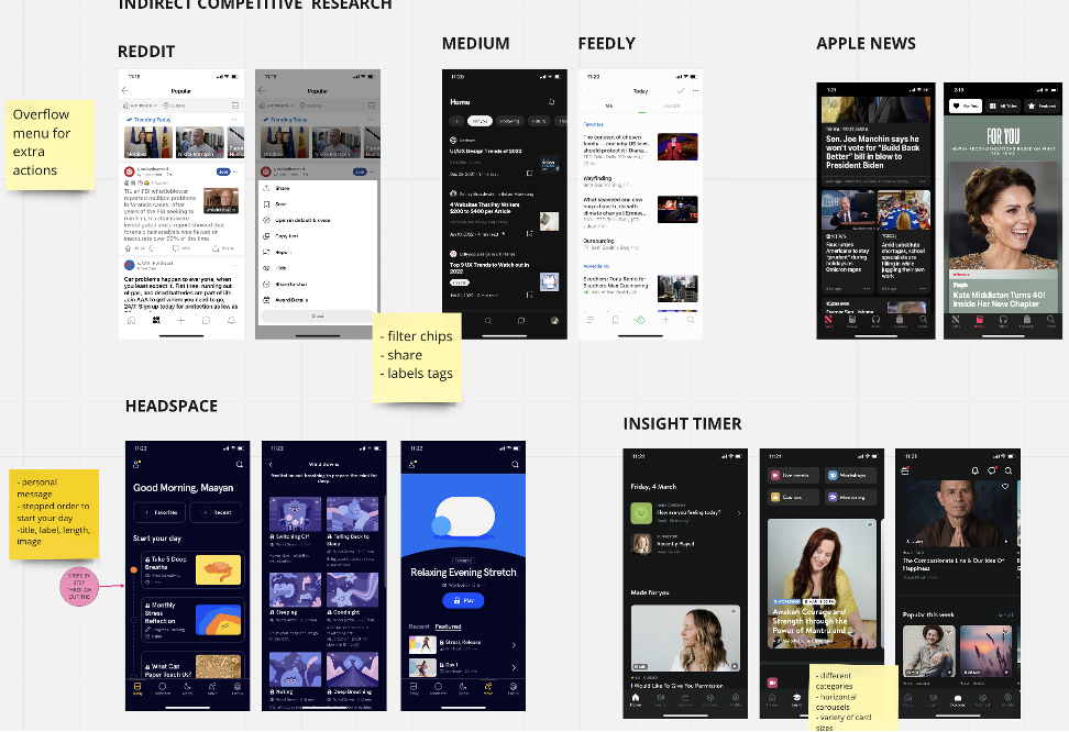
Competitive + Desktop Research:
One of my favorite things about working on Attain is the amount of time and respect given to proper research. Having a UX researcher embedded on the team was helpful though not enough. Due to capacity issues I took over the research for this redesign effort. I completed competitive research, design discovery, and Card UI Best practices audit and report. As well as user testing proposed solutions in the later stages.
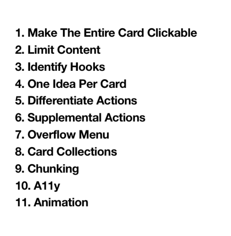
Establishing Card UI Guidelines
Some competitive research collected on Miro
Cross-functional Workshops
In order to get the most out of our early sprints of informational gathering, I organized and ran several cross-functional workshops with Product, Architecture, Data Science and Design teams. The outcomes of these workshops were very helpful in organizing the information that was independently stored in everyone’s heads. Working with highly experienced team members across the teams I learned that many folks had many strong opinions and different ideas on what Healthy Actions could or should be in the future state. Having everybody on equal plane workshopping in design thinking really set the stage for synthesizing concepts. These workshops along with the research conducted helped me create the narrative, user flows and other deliverables to inform and back up our approaches to be eventually tested.
A snapshot of one of many Design thinking Workshops: Crazy 8’s
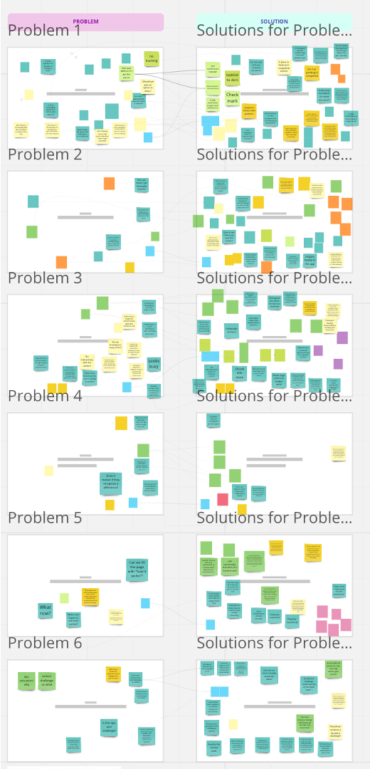
Problem Statements and mIndmapping
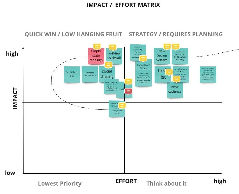
Feature Prioritization Workshop
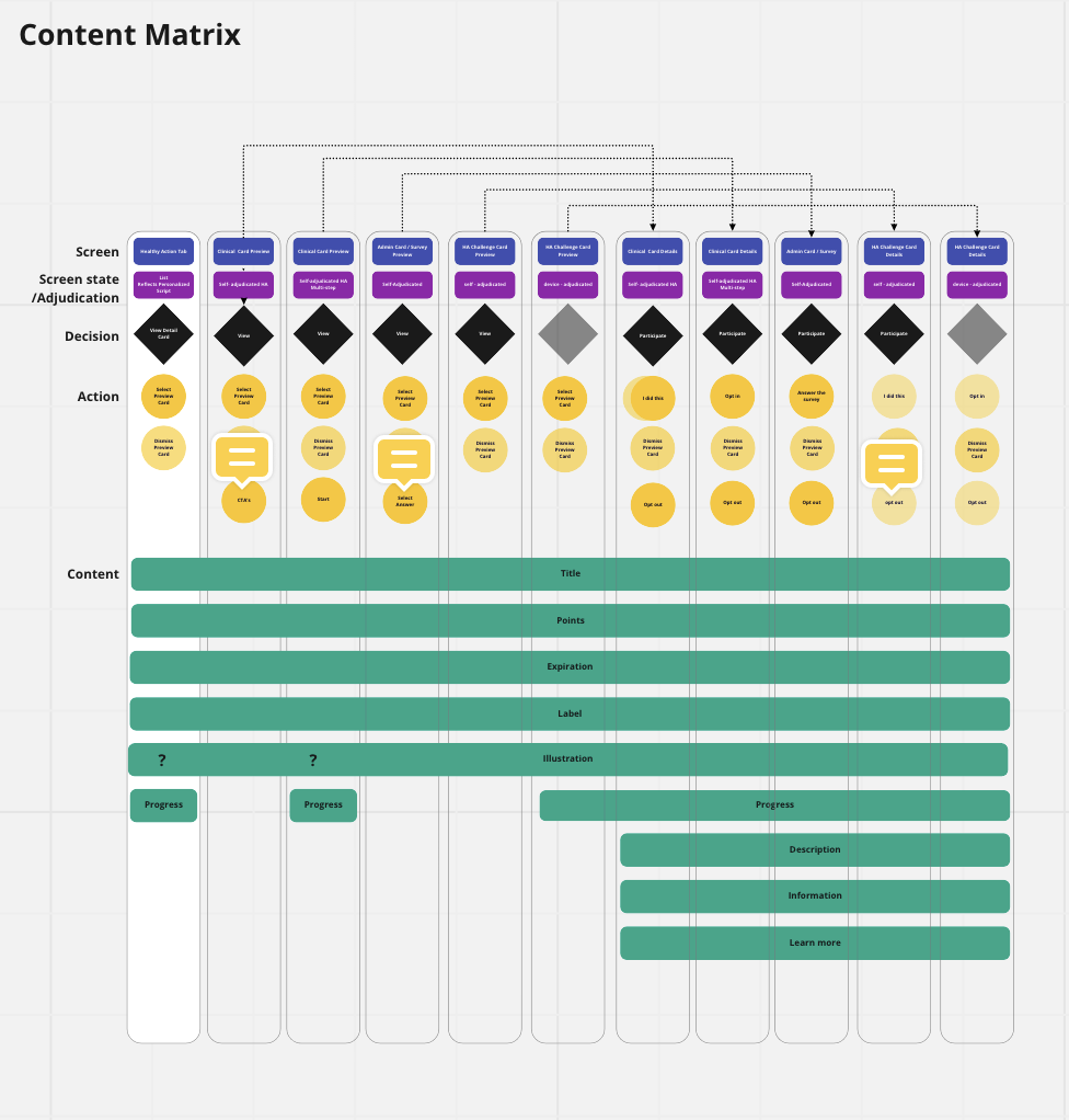
Content matrix deliverable
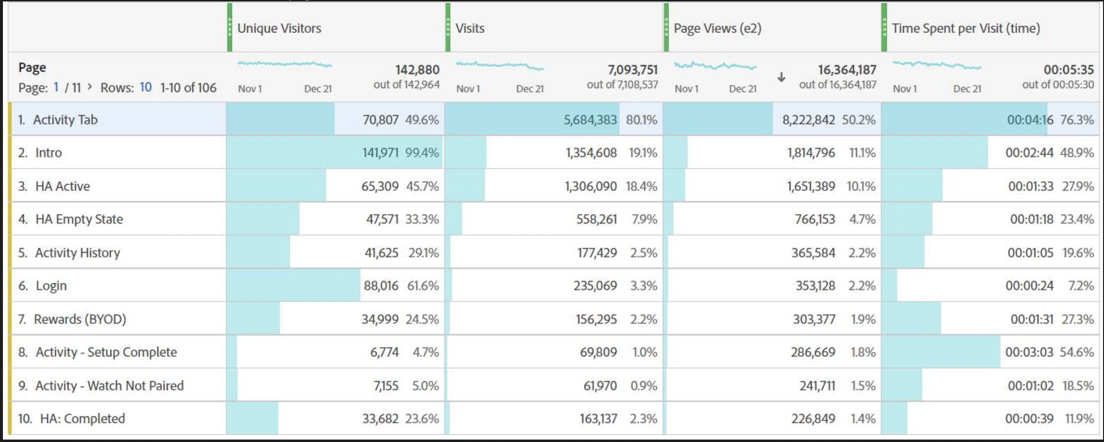
Data Analytics compiled
Use Cases identified
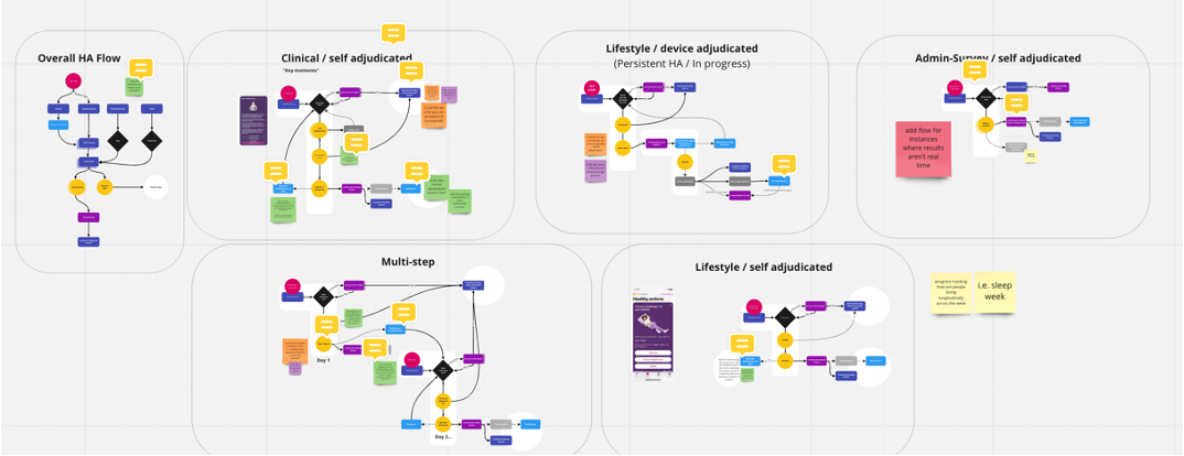
Suggested user flows for various use cases
wireframes
We identified several use cases where there was opportunity to improve the experience and to create more engaging interactions for our users. Major areas of opportunities to explore were in long content, multi-step cards and fitness tracker based actions. We identified the need for users to better understand a connection between certain cards and the surfacing of in progress actions.
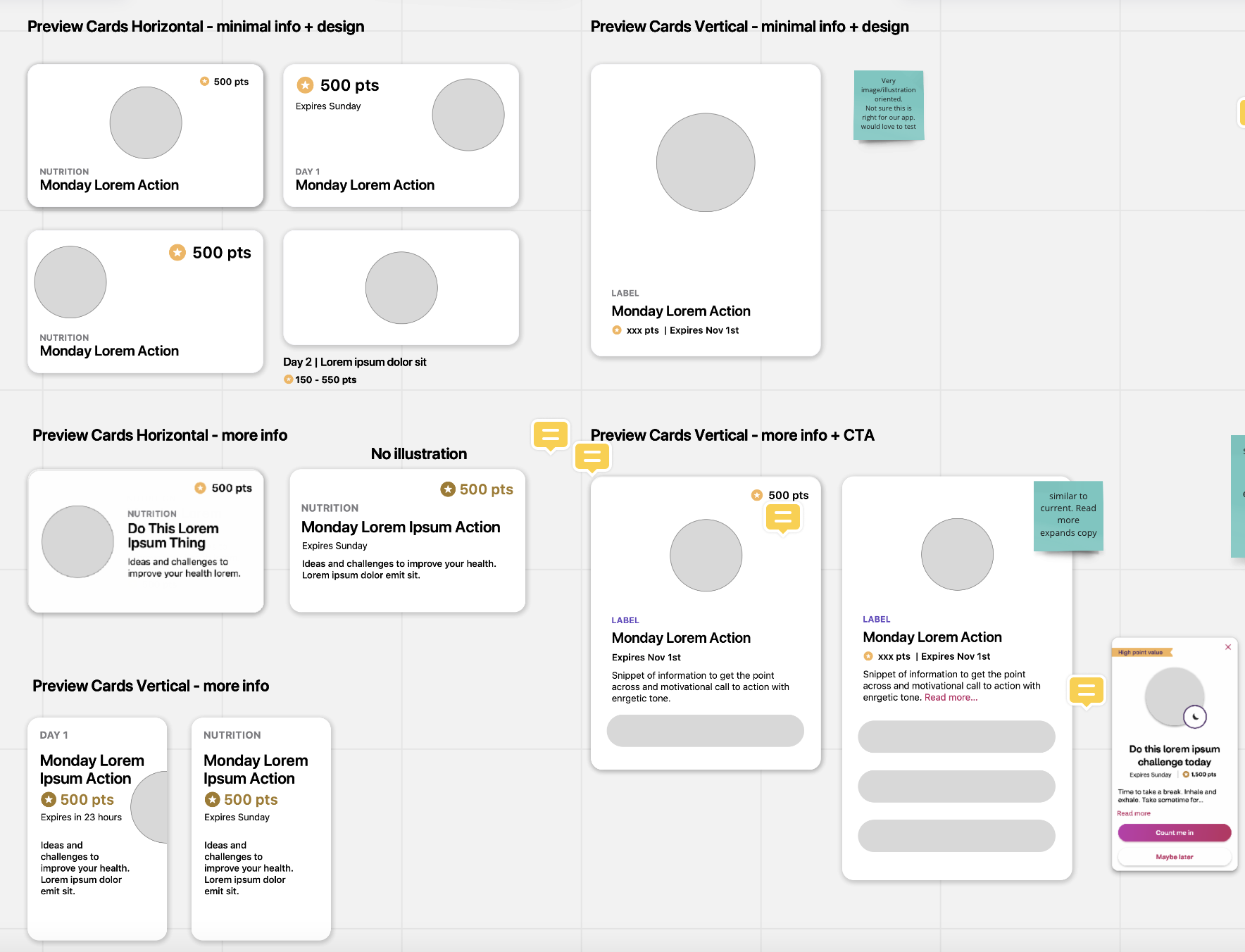
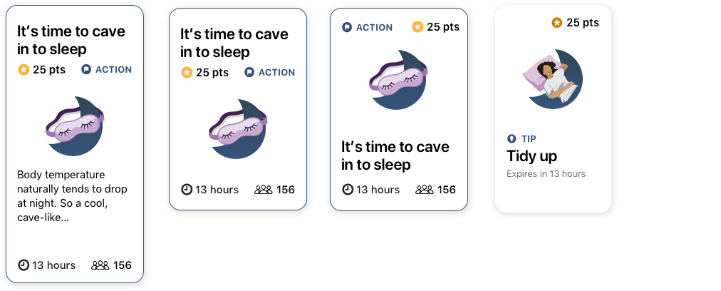
Preview cards / content hierarchy exploration:
Chunking / simplifying
Better information hierarchy
Show what the users find most important first and let them choose what cards to interact with
Tab structure and Navigation systems:
Wallet
Carousel
Connecting tips and challenges
Multi- step cards:
Opportunity to create a sense of traction/accomplishment
Connect daily cards to weekly theme and show progress toward a greater goal
Link similar cards together to see the timeline of that theme
Group related cards in completed section
In progress Challenges:
Lifestyle content served provided a tip and a challenge. The tip being the “why” and the challenge being the “what”.
In our baseline test users saw the connection between the cards but were often confused as to when a card is completed an how they were to earn the points
MULTI-STEP DESIGN EXPLORATION
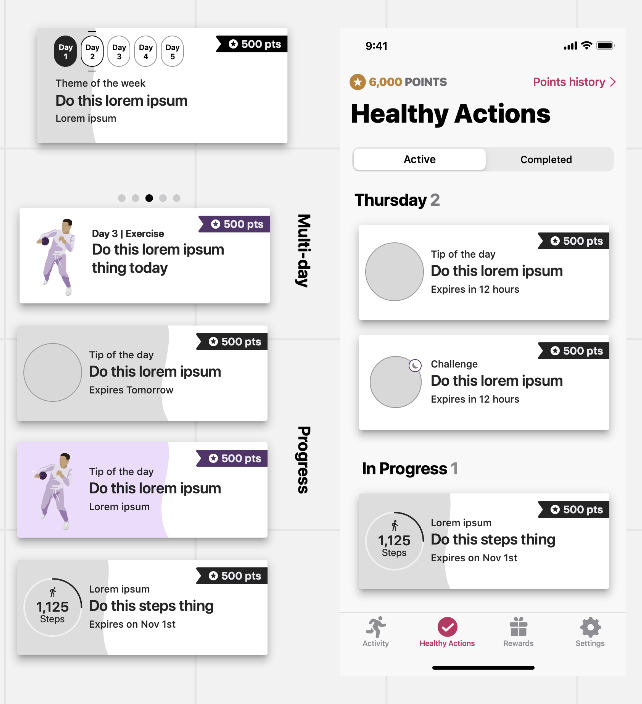
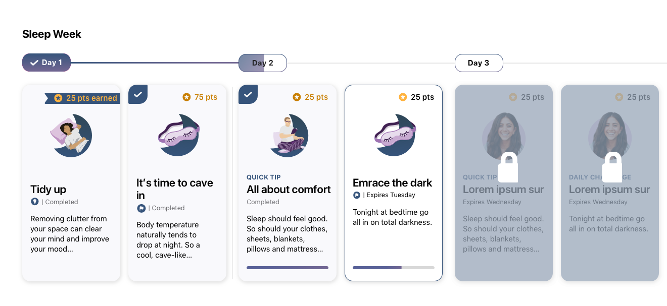
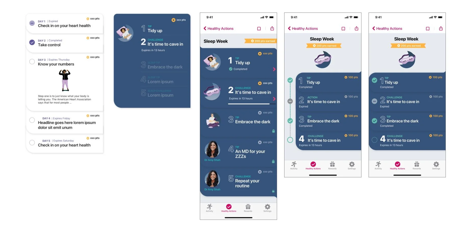
Once we had some wireframes and flows worked out I moved quickly into prototyping some designs so that we can test with users. For the multi-step experience I wanted to explore surfacing up all the content for the week, leveraging unlocking mechanism to keep users interested and aware of the connections between cards as well as differentiating between tips and challenges and status (in progress, completed, expired). Some navigation structures I explored included horizontal carousel and wallet style interactions. Users would be able to tap into each preview card and see the detail view and take action there.
Above: Horizontal scroll creating connection for the theme of the week and displaying card status
Content hierarchy exploration for preview cards
Design Exploration: Multi-step cards, points tracking / wallet style interaction patters + stepped connections
Design Exploration: Preview cards, Progress Tracking, Dark mode
MODERATED USER TESTING
Particpants:
We interviewed 8 participants spanning across age groups, program types and tenure
Test Prototcol:
Part 1: Interview about current Healthy Actions
Part 2: Moderated test of 3 prototypes
Test goals:
Ensure the information shown is useful
Identify participants interpretation and feedback about how card series work
Inform decisions between design variations
Capture future state value-adds for the Healthy Action redesign
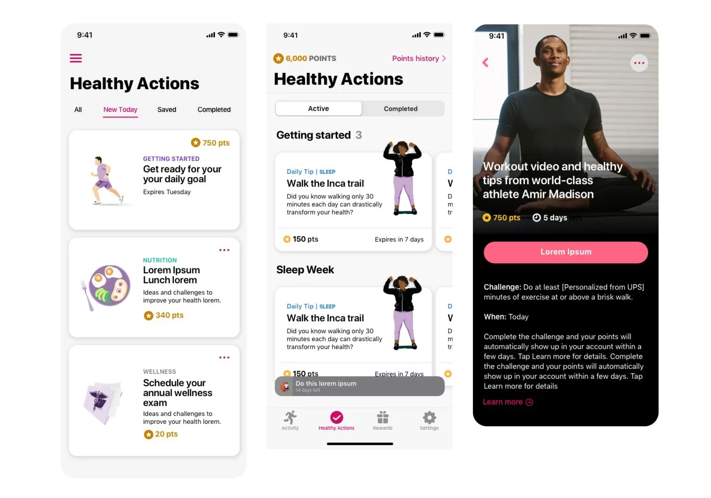
The prototypes shown included a conservative, moderate and ambitious approach. Users were shown the same content in these 3 variations. All 3 versions showed points in a more prominent location and treatment on the card. Conservative approach showed a card that was more similar to the current experience, but the cards were stacked. The moderate approach displayed the preview cards in a vertical scroll with headline dividers, the moderate approach featured the influencer / theme for the week, displayed total points earned vs available and preview cards displayed in horizontal scroll.
3 designs tested:
Prototype 1: Closest to current design
Prototype 2: Long scroll preview cards by categories
Prototype 3: Horizontal scroll based preview cards with progress + points tracking
A new pivot from Product
While we were testing these prototypes new direction was coming from our Product team. There was a decision made to separate activity based challenges from Healthy Actions. This change had a big effect on the proposed solutions.
This simplified the experience, decreased the number of cards available daily, removed the need to differentiate between a tip and a challenge, and would no longer need to show healthy Action cards in progress (because those were activity based and would now live int he Challenges tab). It was determined that having the preview card -> detail card navigation structure wouldn’t be necessary with this change. And since Prototype 1 tested well it was decided that we would choose that direction and create a phased approach for future states.
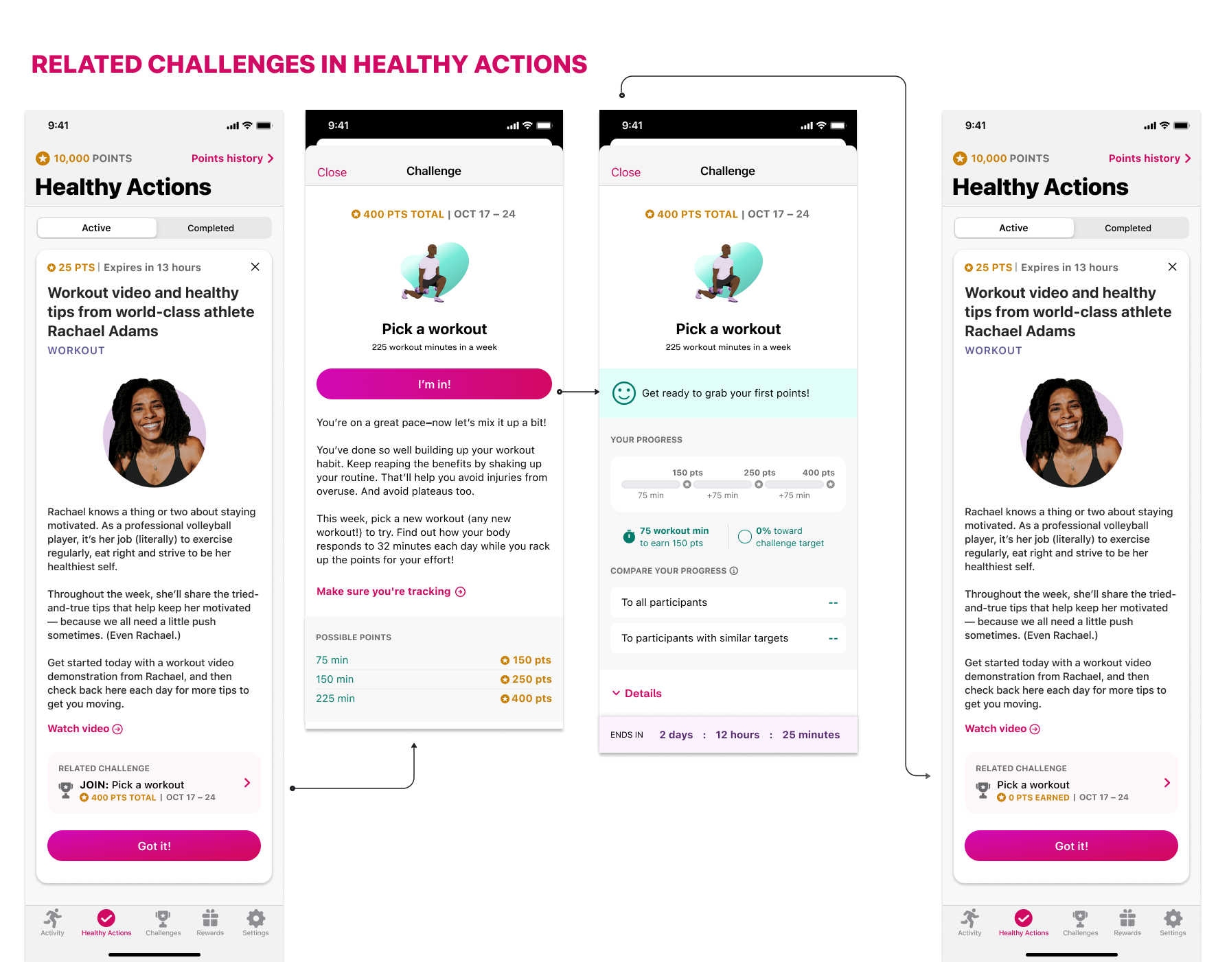
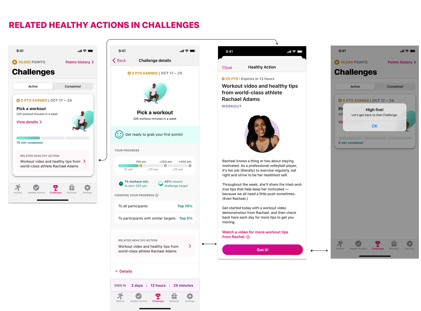
We did however determine that we would still want to make a connection between tips and challenges, but that connection would be reflected via linking 2 sections of the app.

Progressive Insurance: Shower Sessions
Progressive Insurance: Shower Sessions
Progressive Insurance: Shower Sessions Podcast
Problem Statement: In 2018 Progressive Insurance wanted to expand their audience to the young homeowner segment and reposition themselves more like a lifestyle brand. There is a direction from internal partners to try and tap into that audience through their favorite past time - MUSIC!
My role: Workshop Facilitator, Creative pitch team, UX/UI Designer, Interaction Designer, Functional Specs
01 STRATEGY KO
First we partnered with our strategy colleagues at Arnold to come up with the pitch. Some highlites that resonated with our client:
The purpose: To show that movement in long term brand measures can improve in near term ROI on acquisition and retention programs
The hypothesis: If we appeal to their passions we’ll improve our brand impression
The how:
Building an emotional connection with our YHO audience by sharing and contributing to their passion: Music
Prove that what matters to them matters to us - which makes us the brand for people like them
Give people a reason to join and stay with Progressive that is more than just a price.
Create the first insurance brand as a lifestyle brand
Shared insight: Home is the one place in the world where you can be completely and totally yourself. At home you’re free to be 100% you, quirks and all.
02 design thinking
As a former singer-songwriter this was by far one of the most exciting opportunities I had while working at Arnold Worldwide which says a lot because we did a lot of ambitious things at Arnold under the guidance of Sean Will and Icaro Doria.
For this effort I created a war room - where creatives could come in and be immersed in Design Thinking. I ran a workshop for the creatives to brainstorm ideas on how Progressive fits in with this young audience, and how music can naturally be a part of the conversation.
We came up with wild concepts and some very relevant ones. When presented to the client they really liked the idea of a podcast series called Shower Sessions. The initial concept was that we bring emerging artists and film them singing in the shower “ Where we feel most at home”.
04 RESEARCH
First we did competitive research. We found that the idea of singing in the shower as a marketing campaign for products had been used by several brands but never for an insurance company and never quite like our idea. We identified best practices for podcast microsites, music podcasts, and interview podcasts. Armed with this info we went into sketching and wireframing.
03 wireframes
We knew we wanted to build a microsite to house the episodes and we knew this was not going to be a traditional podcast site where visitors are usually kicked to podcast players in order to optimize streaming. Progressive had one goal in mind for the Shower Sessions website: keep users on the website for as long as possible. PGR needed to gather data on non-traditional podcast-listening behavior.
We didnt know who the host and artists were going to be yet, but knew we needed to create a lot of content to keep users engaged so we came up with a couple of directions for the site. For season 1 we wanted to create and launch with 6 episodes about 15 mins each, where each artist has a dedicated page with an interview, a live video performance and some behind the scenes footage. We quickly mocked up a home page and an artist episode page.
04 Early Prototypes
Knowing our clients respond better to designs we created quick prototypes to validate our thinking. The look and feel was very on brand for Progressive and they really resonated with that. We were clear though that this was all FPO as there was no host yet, no set location for a bath/shower and both would really drive the visual direction for the site.
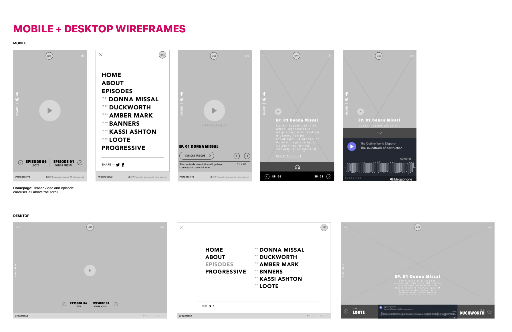
For this prototype, we brought the host and featured artists front and center at the beginning of the experience. When a user lands on the microsite, they have the chance to listen to a one minute teaser to learn more about the podcast while a short highlight video plays at the top. Below the scroll, episodes are listed out in chronological order.
Mobile Home page
04 ST Vincent signs on as the host and Everything changes… for the better
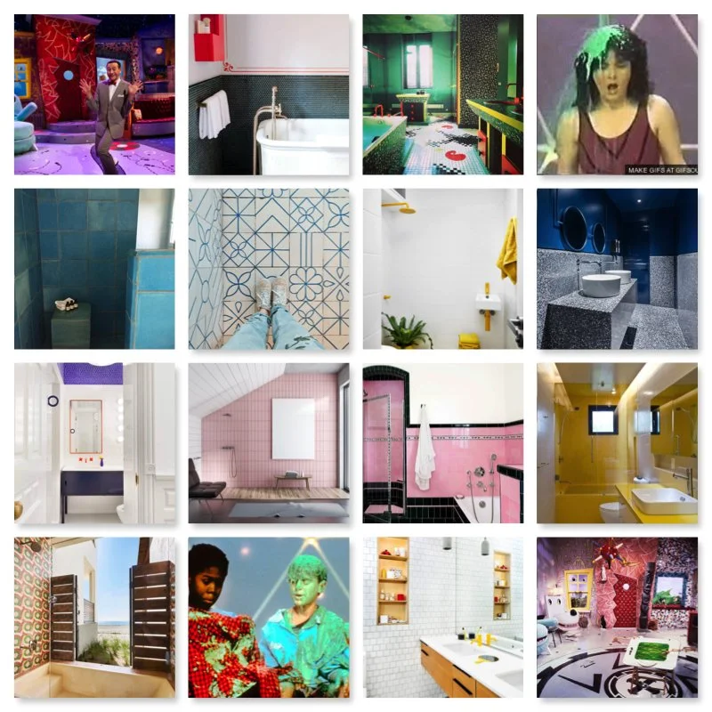
Mood Board provided by St. Vincent
Having been a big fan of St Vincent (and having gone to Berklee College of Music with her) I was elated to see that our partners at UMG also represented her. I suggested early on that St. Vincent should host the show and had even snuck her into the early mockups (see above), but ultimately it was not up to me. I recommended her as the perfect candidate and somehow things aligned and it worked out. And what a revelation it was to us all.
Suddenly the whole project felt refreshing and the commitment and input that St Vincent shared with us pushed us to think a little more outside the box. Luckily the clients were willing to let St Vincent set the tone, choose the artists and we could be a little less “on brand” in terms of look and feel and a little more quirky and daring. St Vincent shared a mood board with us that helped bring this vision to life. We decided to sketch out and wire a new experience based on her brand.
05 Back to the drawing board - sort of
What we wanted to create was an immersive experience - with performances and videos right upon entering the site, in hopes of getting you to spend time watching and listening, and eventually deep-dive into each artist’s episode. This was in line with Progressive’s goal to keep users on the website for as long as possible. Another change we made was removing all the icon links for podcast services to keep in line with Progressive’s goal. These episodes would live on the microsite for the first 6 months of the campaign but eventually would be available on Podcast services.
06 UI Design + Interaction design
For all the time I spent at Arnold this was the first time I was part of the creative team filming on set. Being there really helped inform the UI decisions we would eventually make. The quirky bathroom setting, the edgy vibe the St Vincent brings to everything really set the tone for the look and feel of this site. This was not just a podcast, this was way more than that!


07 WCAG
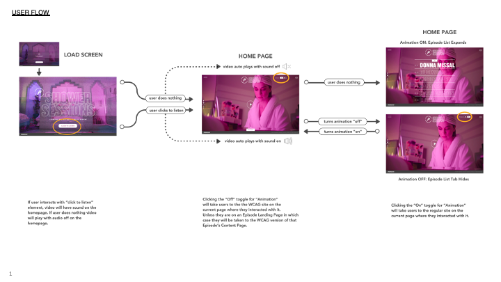
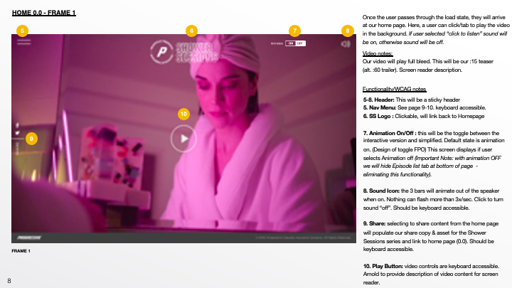
In addition to designing a fully interactive & immersive site, we also had to create a WCAG-friendly experience. Given that this was still owned by Progressive we did have to meet their accessibility guidelines. We didn’t want to compromise the site but we knew we had to be inclusive. We decided to create a parallel experience for those with visual or other impairments. We created separate user flows, guidelines, and functional specs for the WCAG version. We had to eliminate some of the functionality and micro-interactions in order to meet compliance standards. If a user turned the animation toggle off, they would no longer be in the interactive version of the site but the simplified one. In this experience we hid the sticky episode list tab that was at the bottom of the page.
OFFICIAL TRAILER
Costco
Costco
Costco: Wellbeing Portal + Pledge (2021+2022 campaigns)
Problem Statement: Costco wants to relaunch their employee wellness initiative the We’re in This Together pledge. The goal was to improve engagement overall the pledge experience but more importantly to design and launch a brand new wellness portal for all Costco employees. Our team was responsible for the website portal which housed, the pledge experience, testimonials, and content hub. We also ended up launching a successful self-assessment tool.
My Role: UX Strategy, User Flows, Wireframes, Prototypes, Final UI Designs, Illustrations, Styleguide, Functional Specs
Partner in crime: Jayna Moloney
01 Kickoff with Clients
A redesign had been started by a partner agency but they didn’t have a solid team for digital / web design and this is where my team and iI came in to the picture.
The current state of the site
The work in progress redesign we picked up from a partner agency
KPI’s
Boost the number of employees committing to the pledge in January
Grow the number of interactions that users have with campaign content, both in email and on website
Increase the number of users who submit their story
02 Strategy
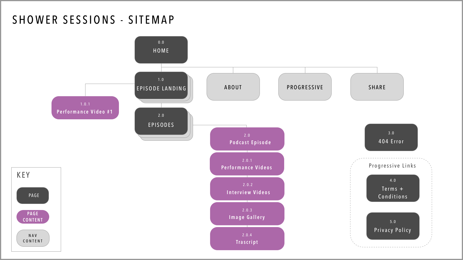
03 Information architecture + Sitemap
We identified 4 main pages that would organize the site’s functionality in an intuitive way and set the employee up to know what to expect and where to go to achieve their objective.
“Homepage” would feature the Pledge as that is our top objective
"Work on my goals" page will house articles and content library and link to relevant localized Costco benefits
"Get Inspired" page will lead with employee stories to inspire others to submit their personal stories by clicking CTA to the form.
"About" page to include language about the campaign, message from the CEO, and helpful information and links.
04 behavior change OPPORTUNITies
Looking at the insights we uncovered with our audience and leveraging Behavior Change techniques we saw an opportunity for our user base to experience more accountability as a way to connect. We proposed and got client buy-in with a quick self assessment quiz for users to be able to get aid in selecting their goals. By answering 6 quick higly visual questions - we could provide them a personalized suggestion,
Additionally we got the client excited about the idea that as user signs the pledge, they do so digitally with the intent of embodying the experience and again, creating more accountability and connection.
Wireframes
Launch - First time journey - Wire flows
Once we sold the client on our UX strategy we immediately began working on the wireframes, flows and visual concepts. The original site and the redesign effort we picked up were not designed to be mobile first and we were adamant to change that. I began wireframing in mobile but simultaneously created the desktop version for our clients to see the whole picture since they were so accustomed to desktop.
In addition to the quiz and pledge experience on the homepage, the site was going to serve as a wellbeing portal where Costco employees could work on their goals. I worked closely with our PM and Content strategist to define the content and cadence for the Work on my Goal section. Once we landed on the type of content we were going to output every month I created template wires that can be reused every time such as articles, recipes, infographics etc.
Since this content library was going to scale and build on itself throught he years, I decided on a card system that would link users to the content once they interacted with it. I also included cards that were not clickable and only served the purpose of providing info, insight, and inspiration.
Mobile Wireframes:
Desktop Wireframes
Homepage + Pledge form
Work on my goals - portal
Look and feel
My design partner Jayna Moloney and I presented 2 style concepts to the clients. The first one being more on brand to Costco, the second one leaning more towards the health and wellness space, more whitespace and calming blob shapes with still a touch of Costco’s brand colors.
We opted to use illustrations of people and only show images of real Costco employees, this felt right to us and the client. In doing so, Costco employees really felt like this is THEIRS.
Style 1
Style 2
Clients resonated more with Style 1 - keeping the Costco brand but liked the illustration style form Style 2
Final designs
2021 Self-assessment quiz




2021 website launch
2022 campaign
The client was very pleased withour 2021 launch and was excited to continue this format. For the 2022 campaign we launched the site with new content, archived content from 2021, a new type of assessment quiz (well-being journey type), and a new content search feature.
“Your well-being journey style” quiz relaunch 2022




Know Your Water
Know Your Water
My Role: UX/UI Design, Wireframing, Prototyping, Client Presentations, Interaction Design
Design Partner: Sophie London
Our Goal: Create the most comprehensive, accessible collection of water treatment data available to consumers
KPI’s :
Increase customer satisfaction
Provide quick and accurate data
demonstrate a personalized experience that increases credibility by disclosing sources of infiormation
Create a scalable framework
emphasize modularity
create connected, flexible tiers of information
Continue to drive engagement
Improve CTR to PUR.com
Decrease Bounce Rate by allowing users to engage with data in personalized experience.
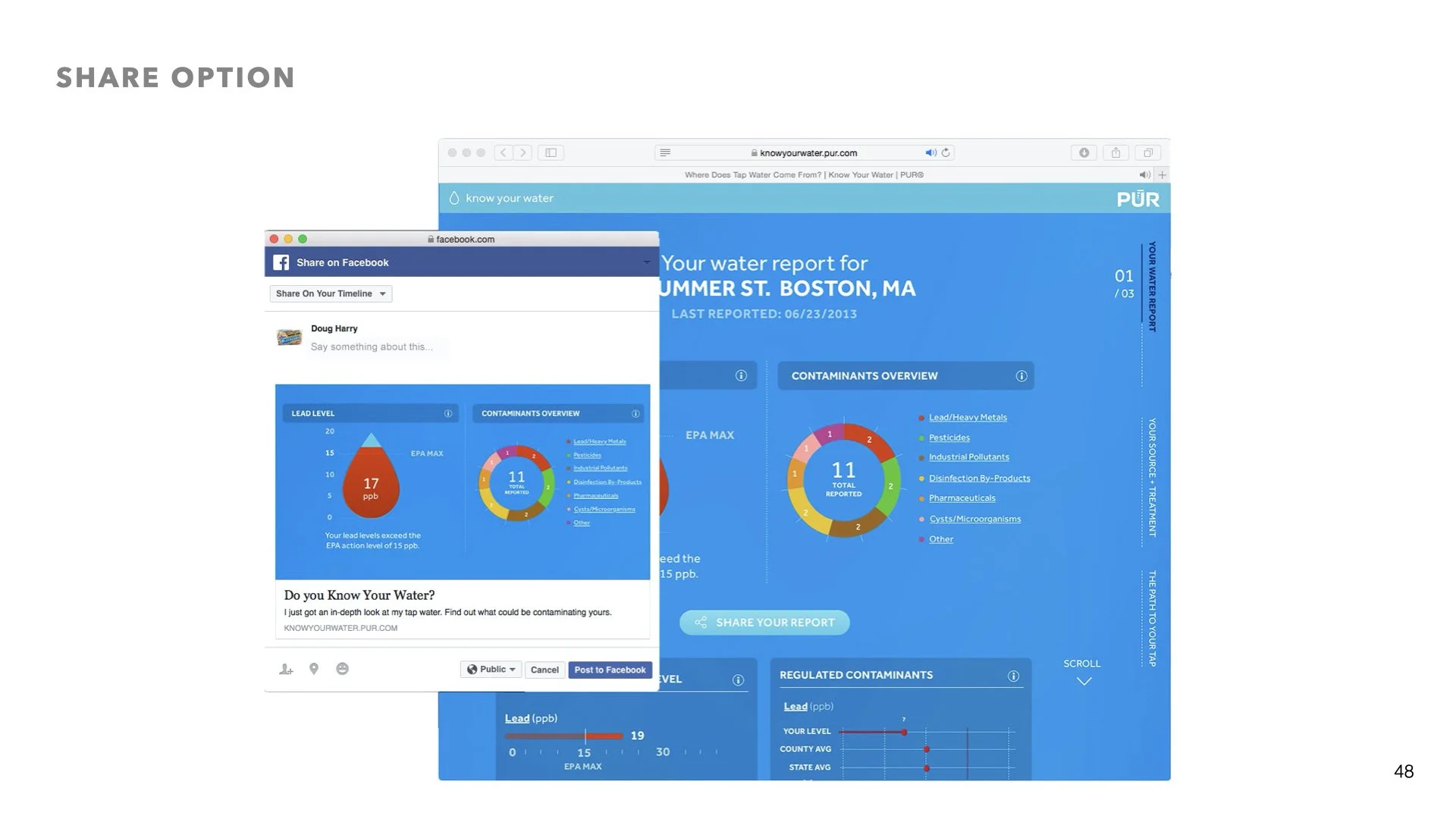
Give users the access to share their experience with more prominent social media options
01 Research + Usability feedback
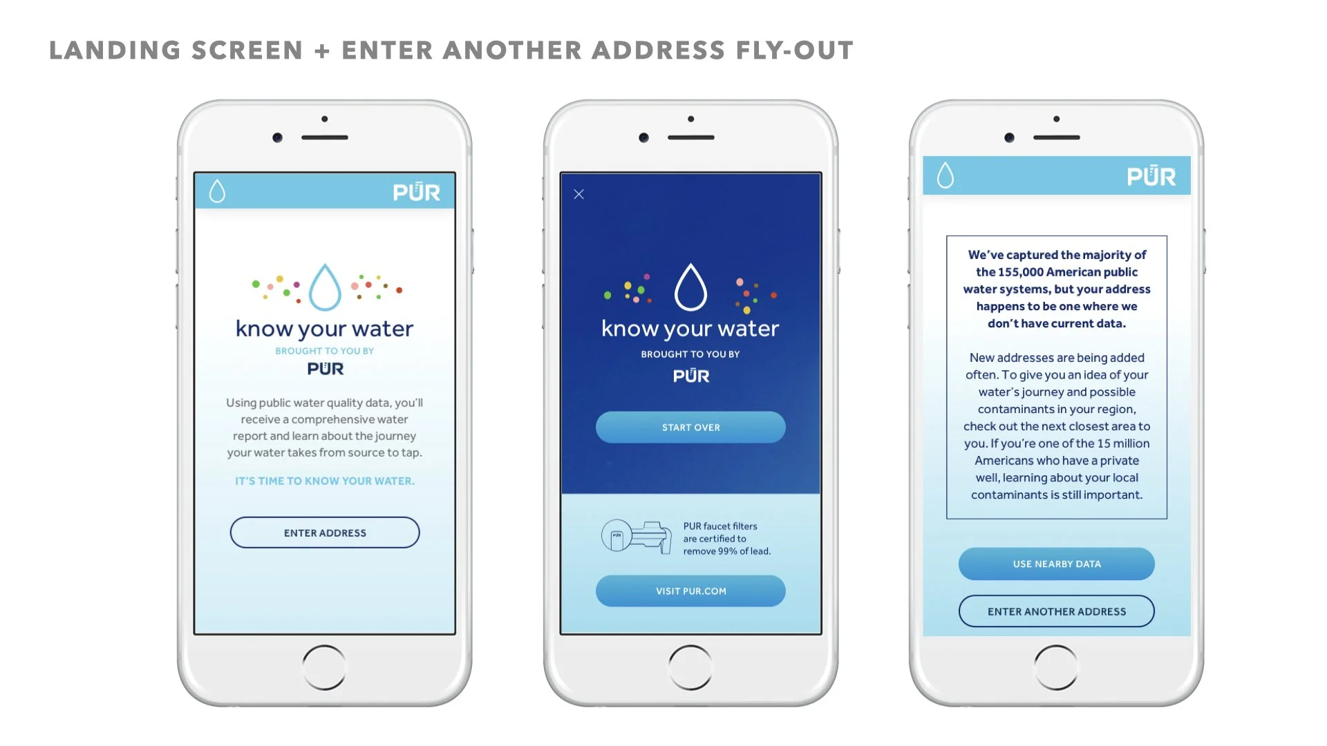
The first Know Your Water experience was using WebGL animation - user testing feedback convinced the client that a redesign was in order if they were to improve engagement and CTR.
User feedback:
“Am I slow reader? Im not sure I’m understanding how this is important to me”
“This is a lot of information to read all at once”
“Detailed information doesn’t feel relevant”
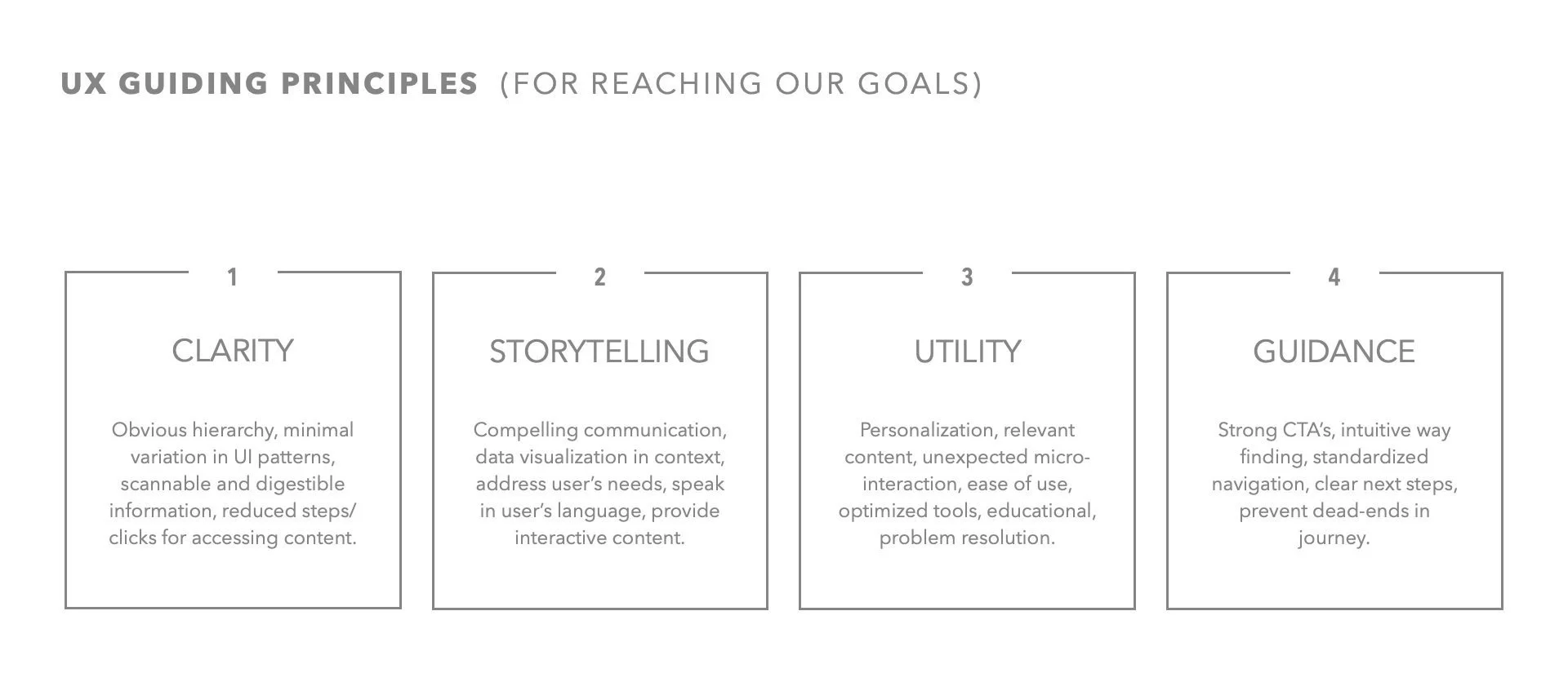
02 UX guidelines + strategy
03 Data team collaboration
Working closely with our data team at Smart Current we identified and validated the types of data we could crawl and surface and improvements to make:
Weekly automated crawling of updates form EPA.gov loaded into database, staging area
Gather more historical contaminants and treatments (currently limited to 3 years)
Gather violations and enforcements (currently excluded)
Automate data validation
Add external city/state/zip data validation for query expansion
Improve data accuracy
Include additional sources (i.e Schools, private wells, treatments etc.)
04 User flows + Navigation
We identified 3 focus areas, PERSONALIZATION, UTILITY, MODULARITY.
04 wireframes
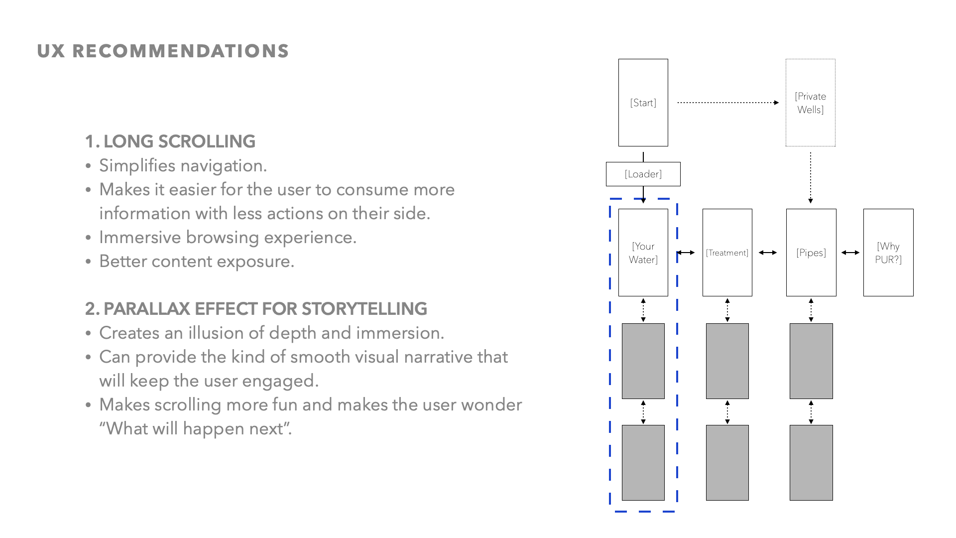
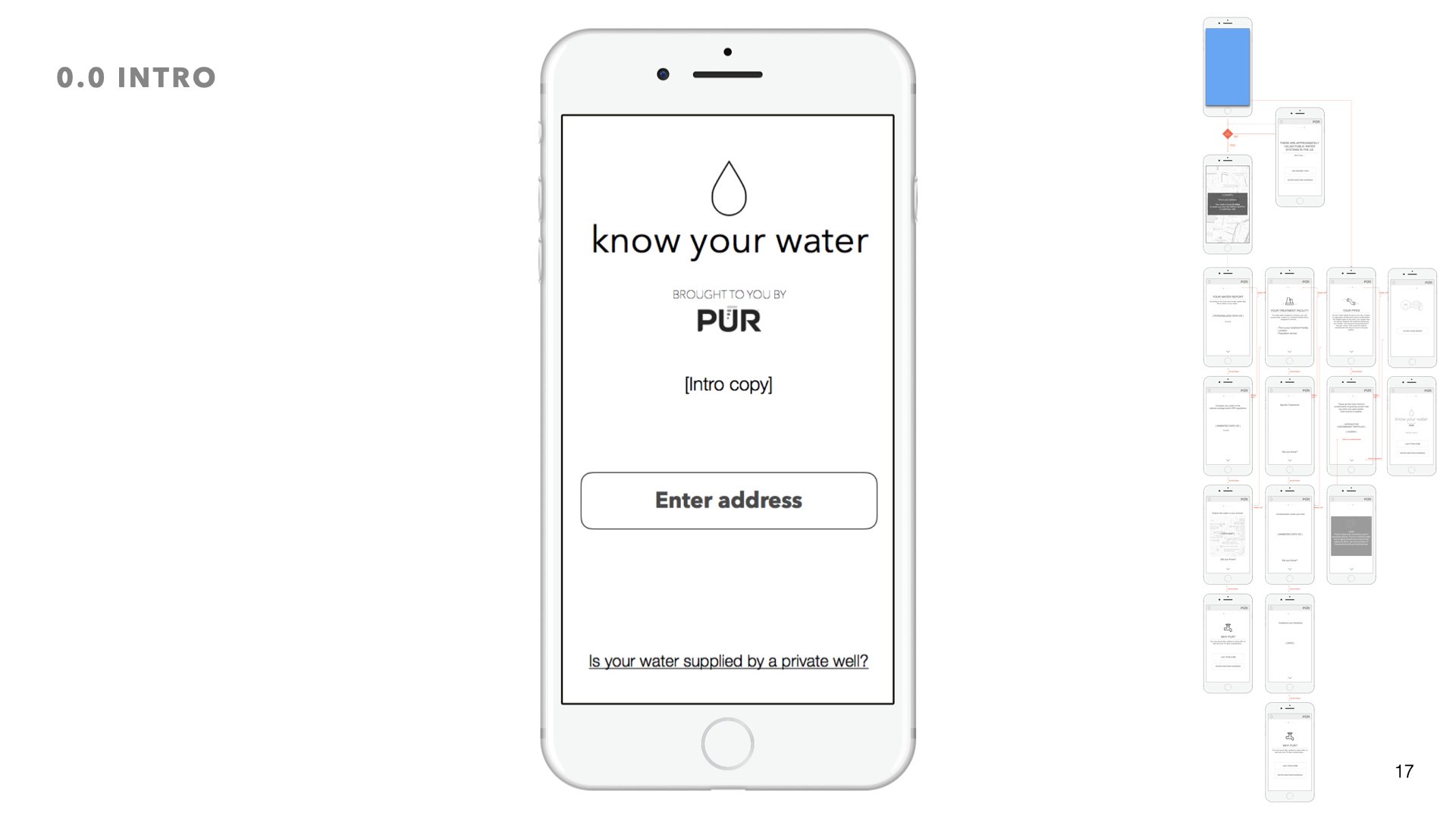
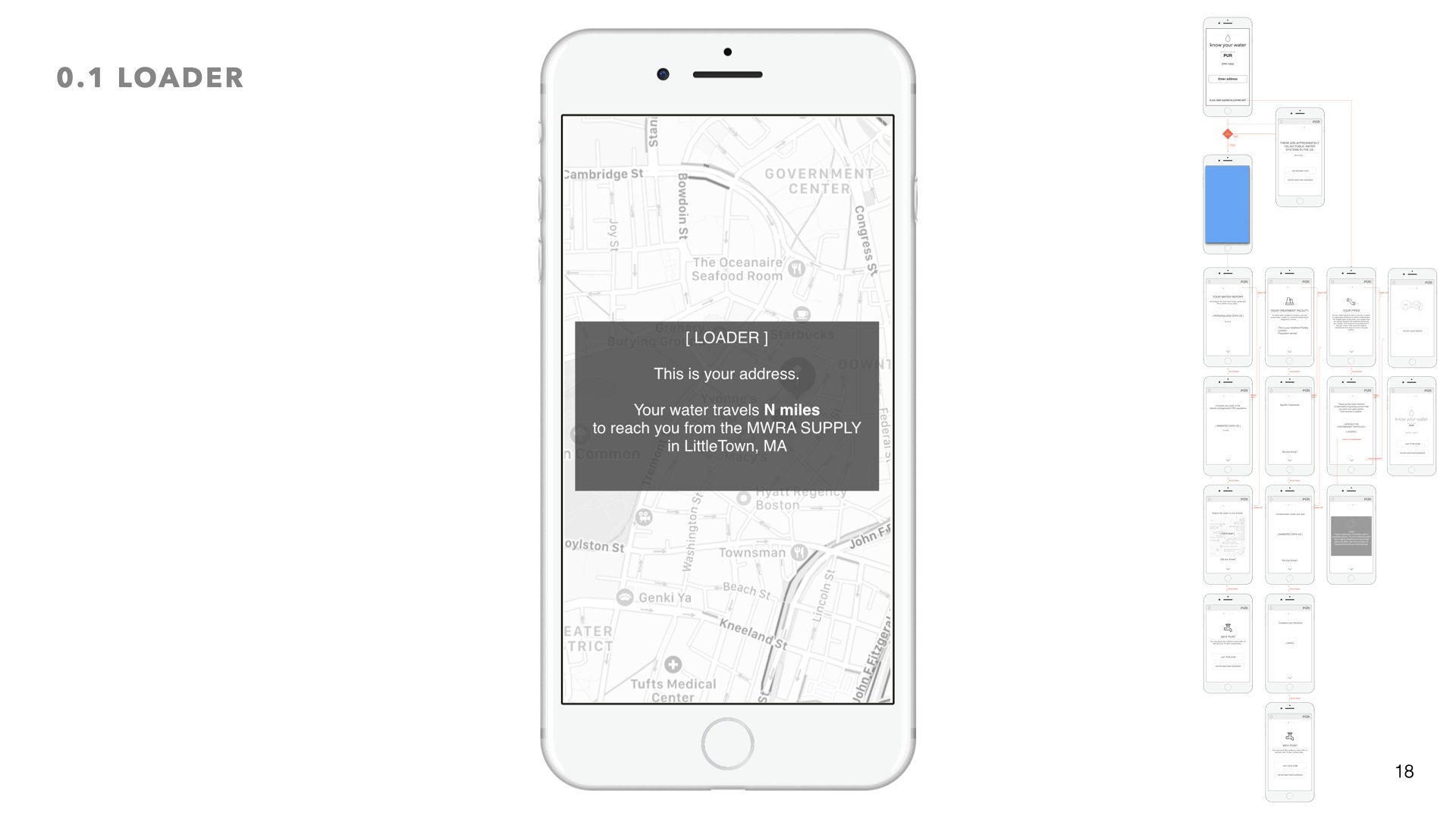
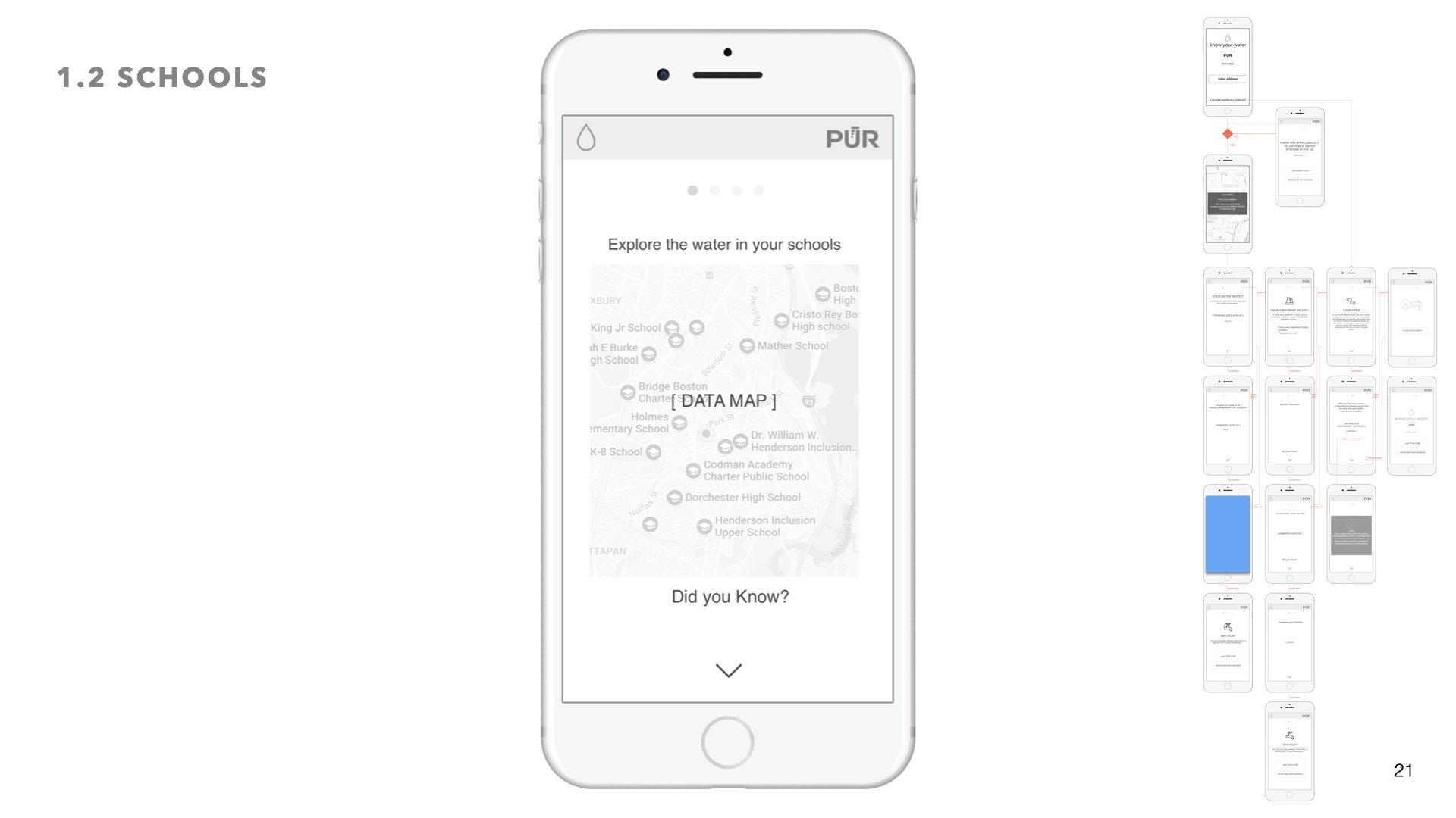
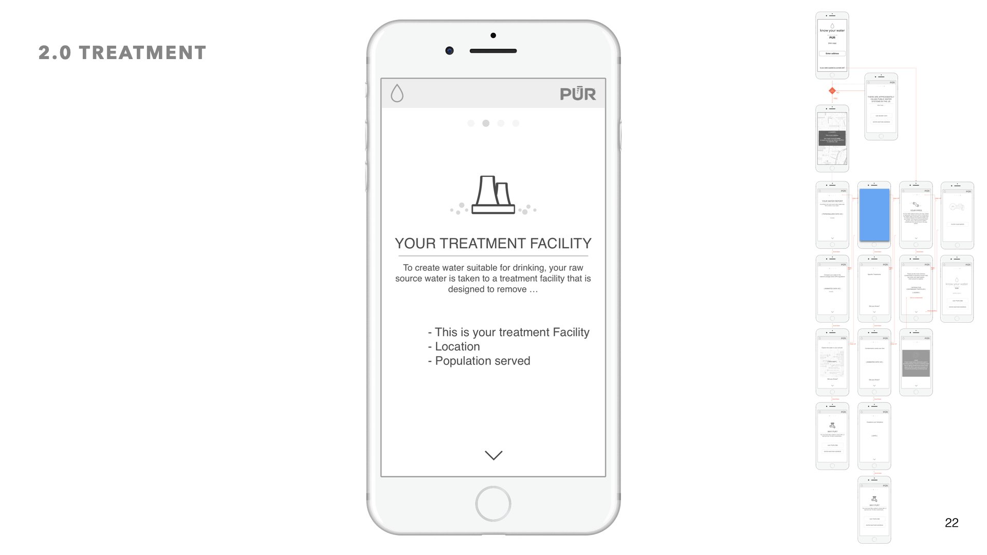
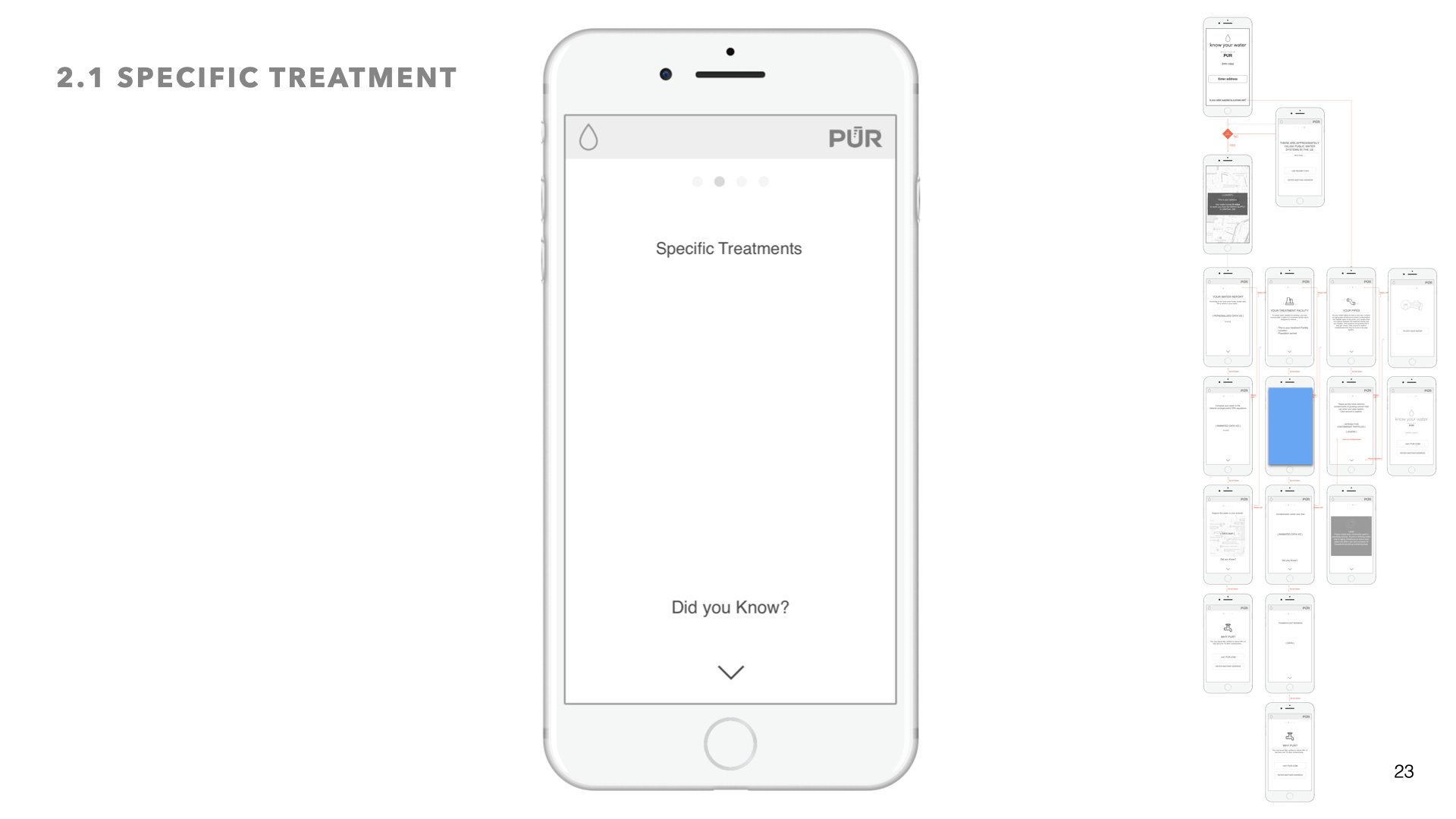
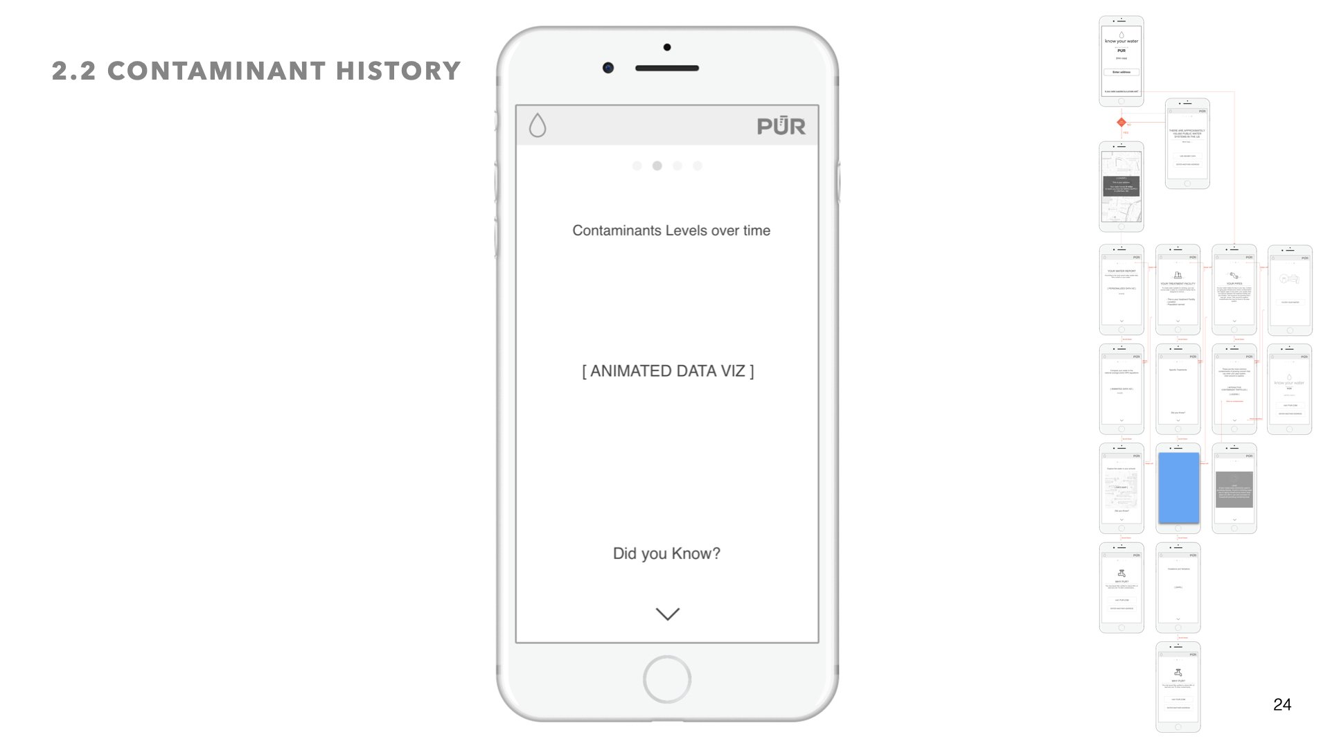
We wanted to tell a story. The story of your water. So we broke the experience down into chapters, just like a story.
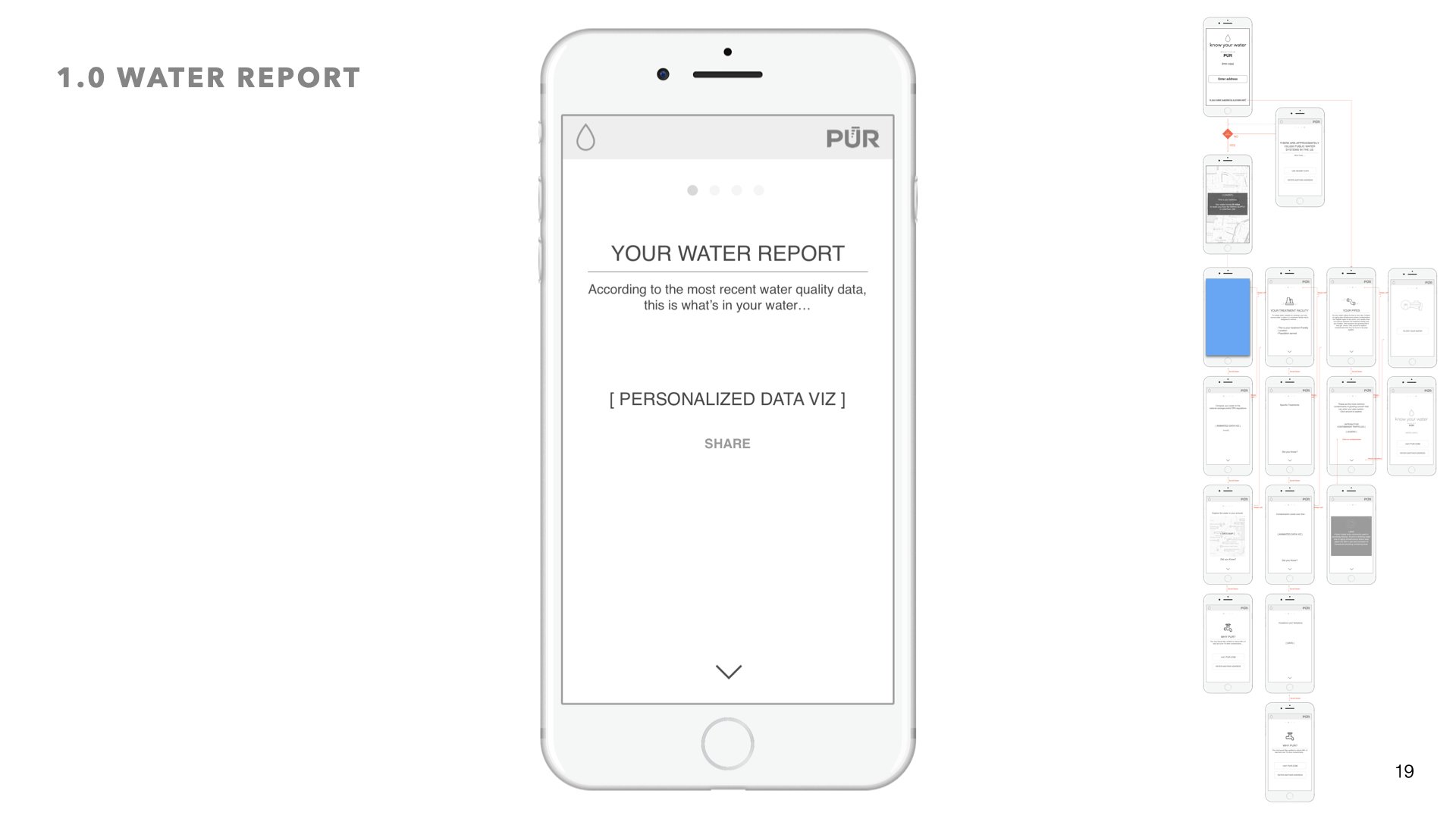
Chapter 1: Your Water Report
We wanted to start with whats most important to the user. According to the most recent water quality data, this is what’s in your water. leveraging data viz layouts, users can get a report that is shareable.
Chapter 2: Your Treatment Facility
In this section users can learn more about what treatment facility their water goes through, and what that treatment facility is designed to remove.
Chapter 3: Your Pipes
After water leaves the treatment facility it enters anaging pipe infrastructure before it makes its way into your pipes. Here we wanted to let the user explore on their own the contaminants that may be found in the pipe system


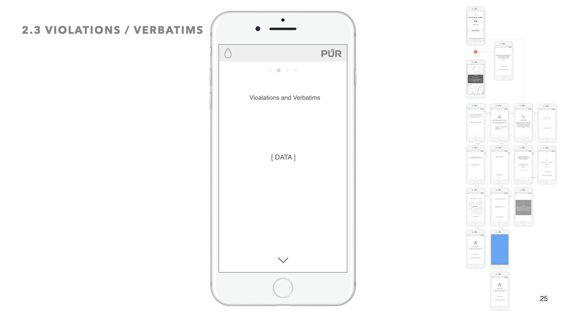
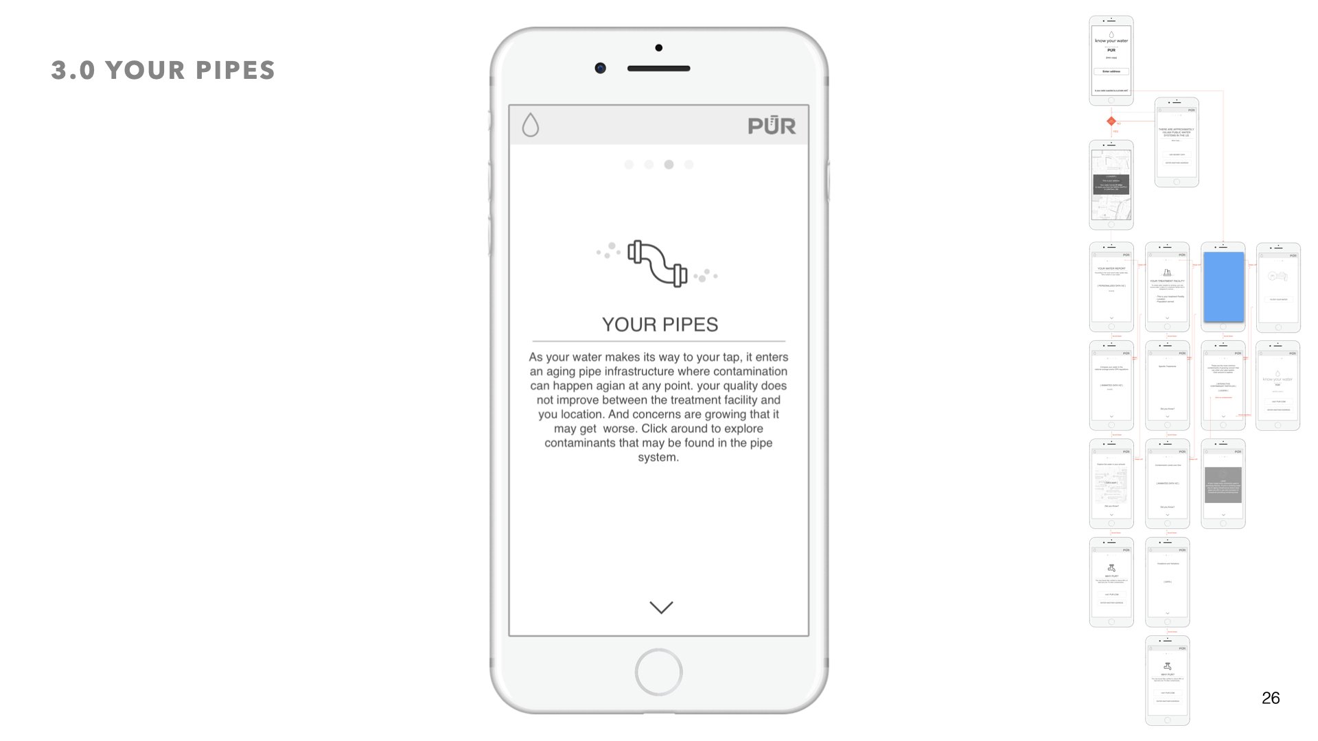
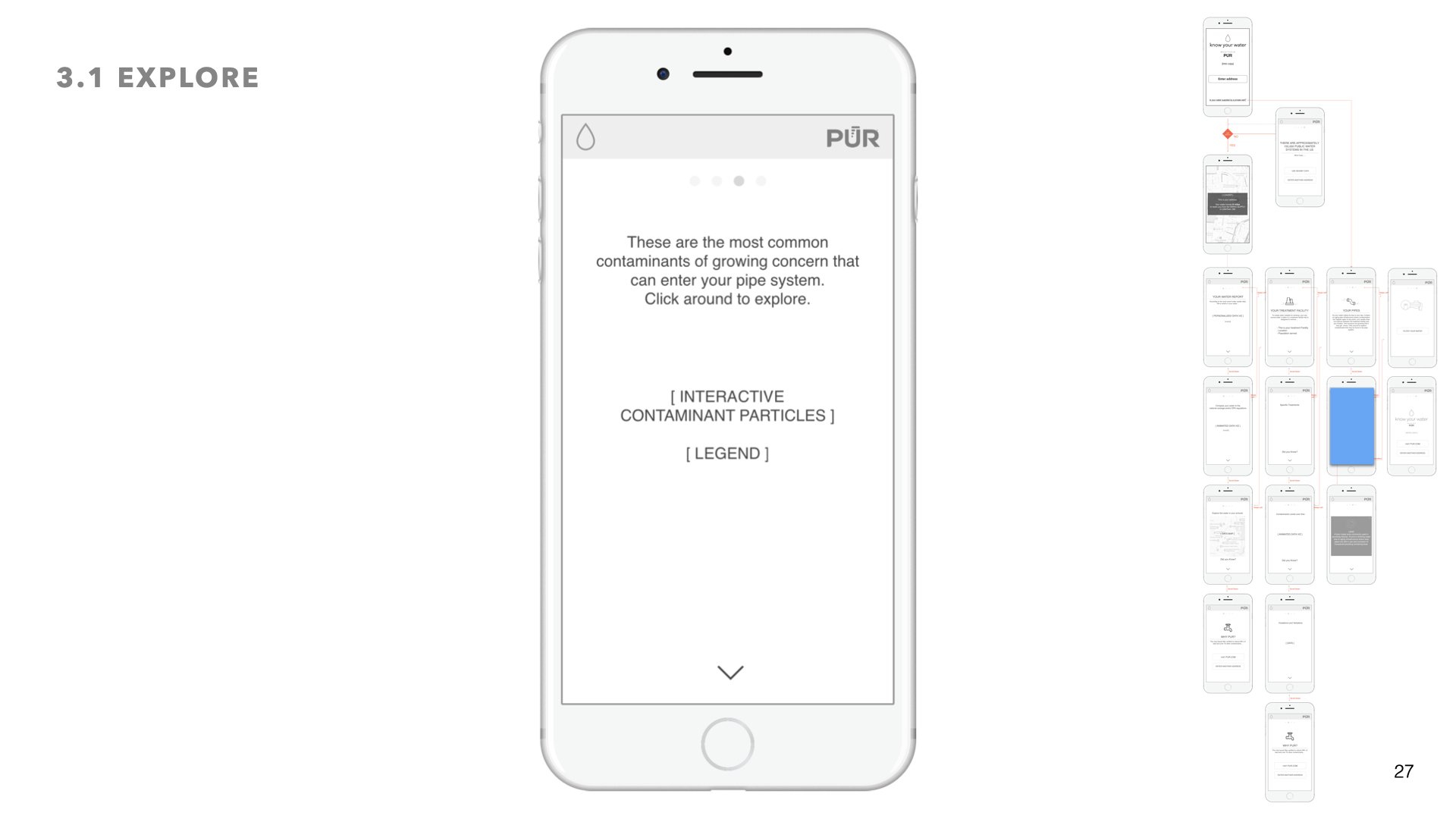
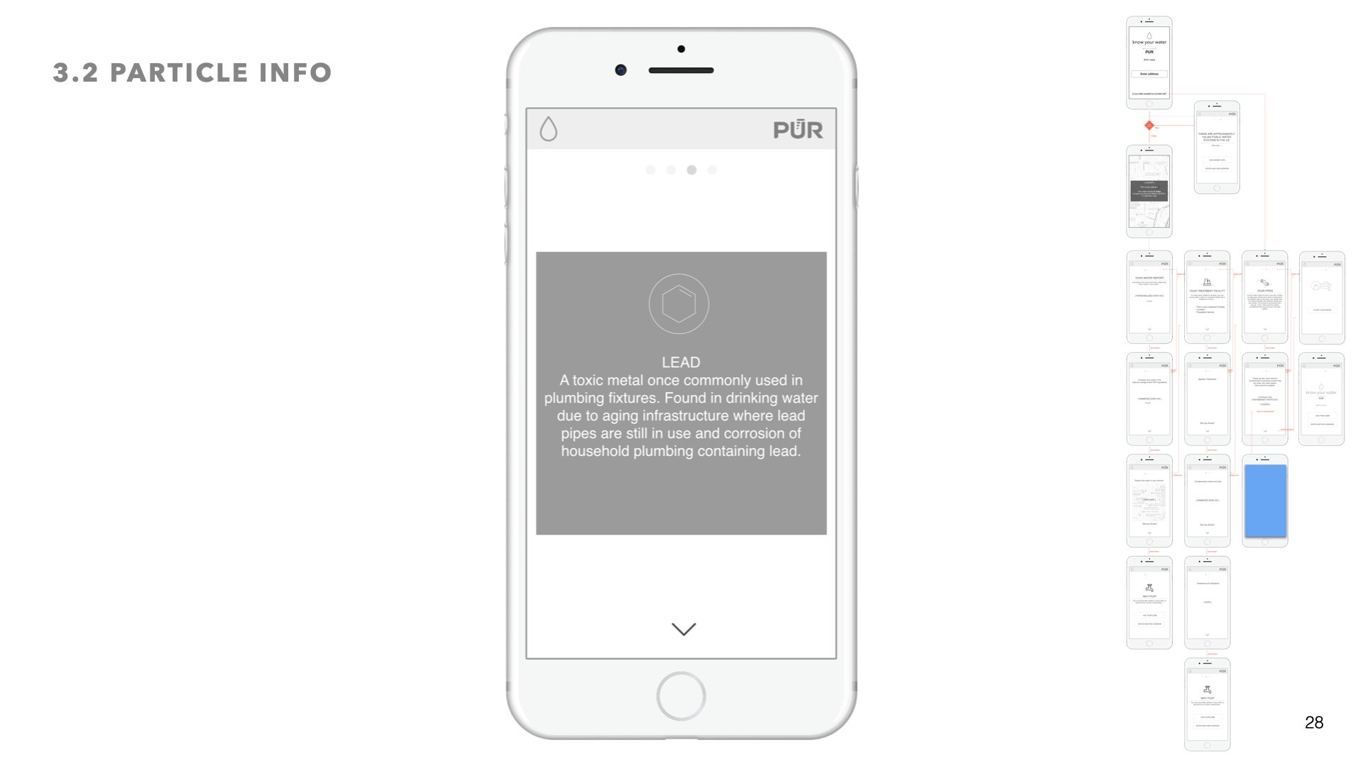
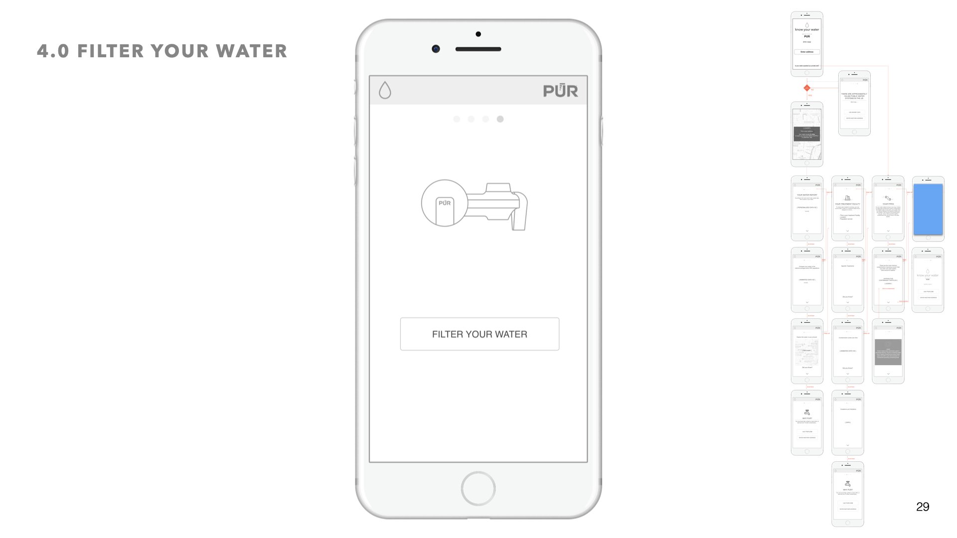
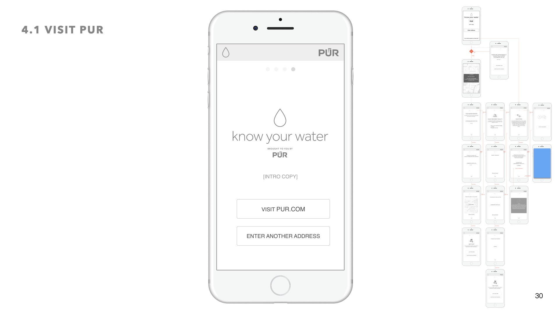
final ui design
Desktop layouts
Design System
05 prototypes + Interaction design
I knew I wanted to create an interactive and immersive experience, one where the user feels more in control and can access the information that is most relevant to them. For that reason I created a modular system with info tray slideouts, persistent guidance and navigation controls, and opportunities for exploration.
The desktop version leveraged a right side progress bar - so that users always know where they are in the story of their water’s journey. Additionally whenever a user wanted more info on certain data, the sliding info tray would glide in from the left and the modular data viz system would behave responsively by stacking on top of each other.
SimSpace
SimSpace
SimSpace - CyberRange Portal Web App
01 KIckoff
CyberRange Portal is a platform for cybersecurity training testing and assessments. Users can log on to a network of virtual machines and train against Red Team operators and automatic attack scripts.
I was tasked with creating a suite of tools which included a web app for multi-user collaboration that collected data and made correlations between attackers and defenders. The suite also includes an Admin app and a dashboard to serve organization leads who need a way to manage and monitor total usage by Events, Networks, and Users.
02 Contextual Research
One of the first things I was lucky enough to experience was a live simulated cyber attack event at an army base in Georgia. This was just a deep dive into the real time experience, in a high intensity setting that was technical and fast paced. I interviewed several of the soldiers that participated in the event and put together findings for leadership.
Working closely with Stakeholders, Front-End and Back-End developers to understand needs and requirements. Shown on the left is a dashboard view and an alert system for users to set monthly quotas and to monitor their organization's monthly usage.
METHODS USED:
Stakeholder interviews, user research, sketching and wireframing, prototyping, interaction design, UX writing, user onboarding, usability testing.
TOOLS USED:
Paper and pen, Whiteboard, Sketch, InVision
PROBLEM STATEMENT:
We have great technology, but too many use cases and client needs. How do we make one flexible interface for all and still provide a great user experience?
PLATFORM OVERVIEW:
PROCESSS
Below is some of the process that followed an extensive Discovery phase which included stakeholder interviews, contextual inquiries, competitive analysis, and user interviews.
The following images are blurred to protect the work and data. If you would like to see more of this please reach out to me personally.
With lots of brainstorming and card sorting we created a whole new IA. One of the main challenges was use of the label of an Event because there are a multitude of Event Types. (The image above only covers some of the apps but not the entire suite.)
Most of the user flows were done during whiteboard sessions. Above are some examples for permission models and registration flows.
Once the IA and Task flows were fleshed out I started out sketching on paper.
The above sketch is one of the initial ideas on how to display attack injects for the red team and the white team.
The above sketch shows what the blue team and the white team want to see during an event. It was critical for all to be able to create and filter data quickly and easily as well as connect between items. Grouping items together allows the white team to understand the cyber defender's workflow and thought processes.
Final Scaffolding Designs:
Shown above is the final Sidenav design and scaffolding for each Web-app in the suite of tools. By clicking the app menu, a tray would slide out allowing users to quickly switch between apps. Each App would have it's own primary color helping users recognize their current page. The sidenav was the best solution for this case because it draws the user's attention and creates a natural flow for the user.
By clicking the context menu users can change their context (in this case a network) in much the same way that they switch between apps. Each app has it's corresponding context and in this way we were able to create a symmetrical interaction throughout the entire suite of tools.
Dashboard page includes an overview of all the apps available to the user.
Using Joyride we created a walkthrough for first time users and beginners to demonstrate interaction patterns within the suite of tools.
SimSpace - Website Redesign
(Currently In Progress)
Process:
Website Audit
identifying Customer segments
1. Financial Institutions
2. Technology
3. Government
4. Health Care
5. Retail
6. Academia
Personas
identifying Customer Needs
Our customer needs to be able to:
• Read the site’s purpose from the entry point.
• Recognize whether he or she is the target audience.
• Understand what services are being offered.
• Understand why these services are needed.
• Quickly identify what differentiates us from our competitors
Strategy: Website Segmentation
Proposed Website segmentation as the overall Design strategy for the website's layout and navigation.
Main Reasons why:
• In essence, website segmentation delivers unique, targeted content that speaks to specific customer or industry segments’ needs and pain points, and does so in the clearest, most concise, and most interesting manner.
• Speaks persuasively to each audience
• Maximizes the user experience of each audience
• Includes compelling calls-to-action perfectly suited to each audience
Allowing users to self-identify their audience type and to navigate to a highly customized “microsite” built specially around the needs of that audience. This is the type of site that could really elevate a brand, drive leads, and deliver ROI on multiple fronts.
Iterative Design
Initial Mockup
The LIFT Model provides a conversion optimization framework showing the Six Conversion Factors that allow US to evaluate landing pages from the perspective of the page visitor. The goal is to provide simple value proposition that speak clearly to the needs of that segment.
Your value proposition is a cost vs. benefits equation that shows our prospect’s motivation.
If our perceived benefits outweigh the perceived costs, our prospects will be motivated to act.
Second Mockup - focusing on Website Segmentation and a new company slogan that followed a branding workshop I led at a company offsite:
"CyberSecurity Quantified"
.... an example of how we adopted some of our original ideas and messaging "Take Back Your Network. Protect Your Data" for collateral material
Aimovig
Aimovig
Amgen: Aimovig Site Redesign
New Page
New Page
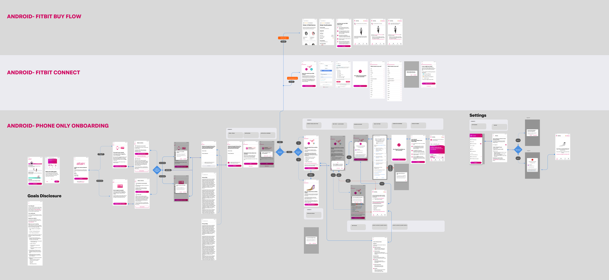
Attain App Onboarding and Device Integration
Attain app users check eligibility and enroll in the Attain program through the onboarding flow. It is essential for the user to have a simple and frictionless first interaction with the app. For the Attain App increasing the user options for device integration decreased barriers for entry into the program in order to grow the users base.
Working closely with Architecture and Product I led the effort in the introduction of accelerometer tracking.
