Costco: Wellbeing Portal + Pledge (2021+2022 campaigns)
Problem Statement: Costco wants to relaunch their employee wellness initiative the We’re in This Together pledge. The goal was to improve engagement overall the pledge experience but more importantly to design and launch a brand new wellness portal for all Costco employees. Our team was responsible for the website portal which housed, the pledge experience, testimonials, and content hub. We also ended up launching a successful self-assessment tool.
My Role: UX Strategy, User Flows, Wireframes, Prototypes, Final UI Designs, Illustrations, Styleguide, Functional Specs
Partner in crime: Jayna Moloney
01 Kickoff with Clients
A redesign had been started by a partner agency but they didn’t have a solid team for digital / web design and this is where my team and iI came in to the picture.
The current state of the site
The work in progress redesign we picked up from a partner agency
KPI’s
Boost the number of employees committing to the pledge in January
Grow the number of interactions that users have with campaign content, both in email and on website
Increase the number of users who submit their story
02 Strategy
03 Information architecture + Sitemap
We identified 4 main pages that would organize the site’s functionality in an intuitive way and set the employee up to know what to expect and where to go to achieve their objective.
“Homepage” would feature the Pledge as that is our top objective
"Work on my goals" page will house articles and content library and link to relevant localized Costco benefits
"Get Inspired" page will lead with employee stories to inspire others to submit their personal stories by clicking CTA to the form.
"About" page to include language about the campaign, message from the CEO, and helpful information and links.
04 behavior change OPPORTUNITies
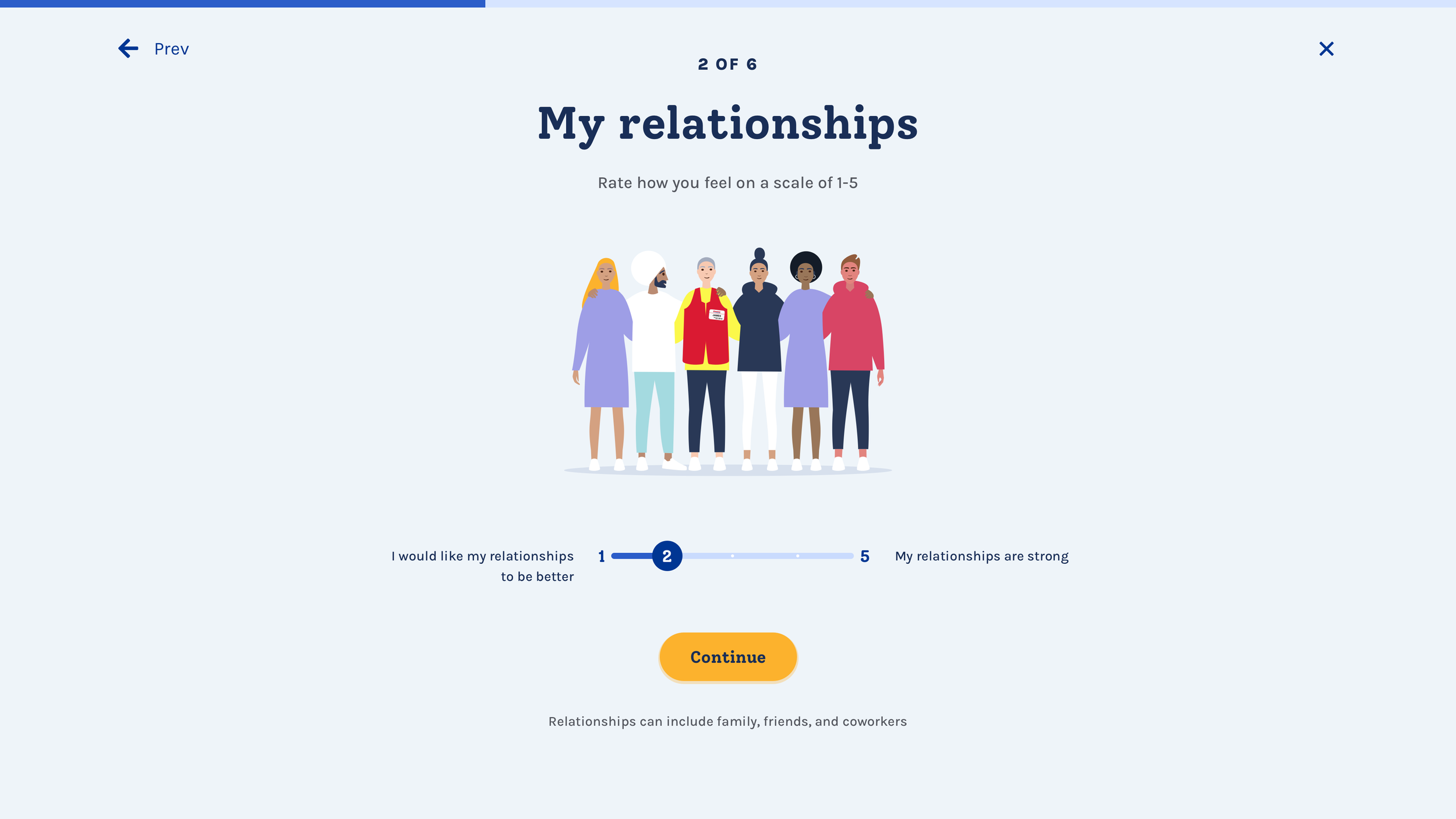
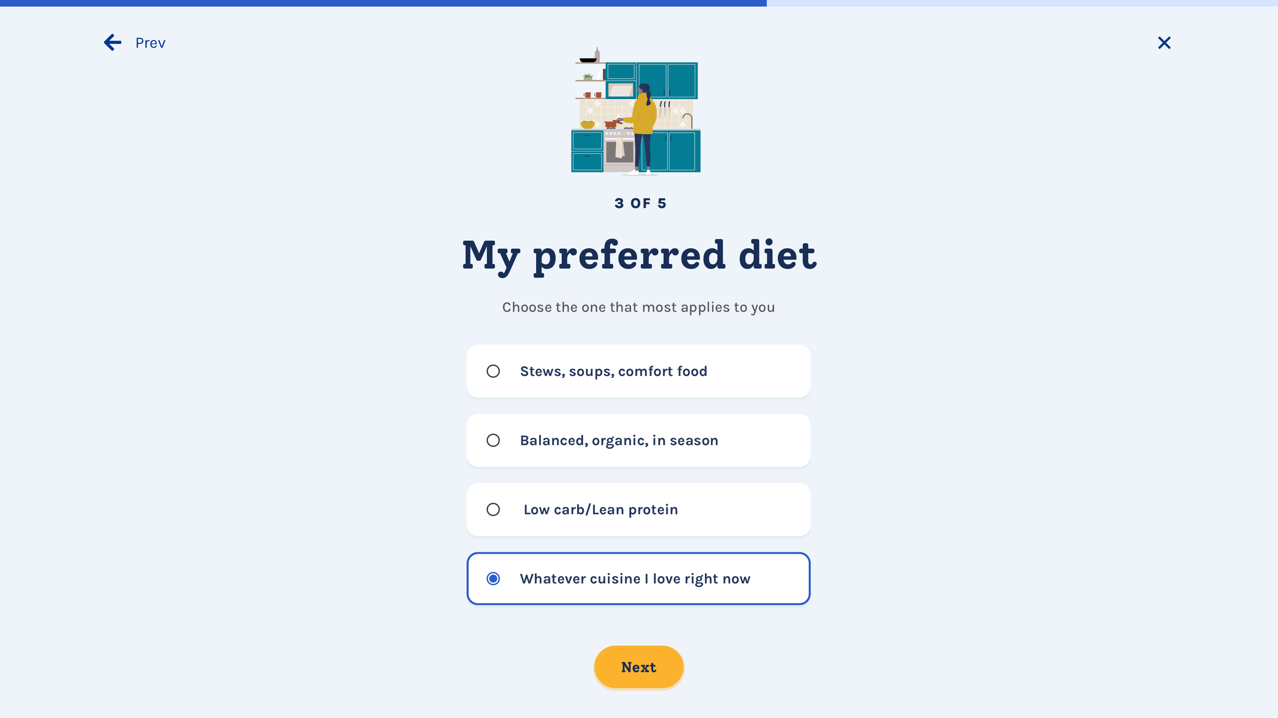
Looking at the insights we uncovered with our audience and leveraging Behavior Change techniques we saw an opportunity for our user base to experience more accountability as a way to connect. We proposed and got client buy-in with a quick self assessment quiz for users to be able to get aid in selecting their goals. By answering 6 quick higly visual questions - we could provide them a personalized suggestion,
Additionally we got the client excited about the idea that as user signs the pledge, they do so digitally with the intent of embodying the experience and again, creating more accountability and connection.
Wireframes
Launch - First time journey - Wire flows
Once we sold the client on our UX strategy we immediately began working on the wireframes, flows and visual concepts. The original site and the redesign effort we picked up were not designed to be mobile first and we were adamant to change that. I began wireframing in mobile but simultaneously created the desktop version for our clients to see the whole picture since they were so accustomed to desktop.
In addition to the quiz and pledge experience on the homepage, the site was going to serve as a wellbeing portal where Costco employees could work on their goals. I worked closely with our PM and Content strategist to define the content and cadence for the Work on my Goal section. Once we landed on the type of content we were going to output every month I created template wires that can be reused every time such as articles, recipes, infographics etc.
Since this content library was going to scale and build on itself throught he years, I decided on a card system that would link users to the content once they interacted with it. I also included cards that were not clickable and only served the purpose of providing info, insight, and inspiration.
Mobile Wireframes:
Desktop Wireframes
Homepage + Pledge form
Work on my goals - portal
Look and feel
My design partner Jayna Moloney and I presented 2 style concepts to the clients. The first one being more on brand to Costco, the second one leaning more towards the health and wellness space, more whitespace and calming blob shapes with still a touch of Costco’s brand colors.
We opted to use illustrations of people and only show images of real Costco employees, this felt right to us and the client. In doing so, Costco employees really felt like this is THEIRS.
Style 1
Style 2
Clients resonated more with Style 1 - keeping the Costco brand but liked the illustration style form Style 2
Final designs
2021 Self-assessment quiz


2021 website launch
2022 campaign
The client was very pleased withour 2021 launch and was excited to continue this format. For the 2022 campaign we launched the site with new content, archived content from 2021, a new type of assessment quiz (well-being journey type), and a new content search feature.
“Your well-being journey style” quiz relaunch 2022


