My Role: UX/UI Design, Wireframing, Prototyping, Client Presentations, Interaction Design
Design Partner: Sophie London
Our Goal: Create the most comprehensive, accessible collection of water treatment data available to consumers
KPI’s :
Increase customer satisfaction
Provide quick and accurate data
demonstrate a personalized experience that increases credibility by disclosing sources of infiormation
Create a scalable framework
emphasize modularity
create connected, flexible tiers of information
Continue to drive engagement
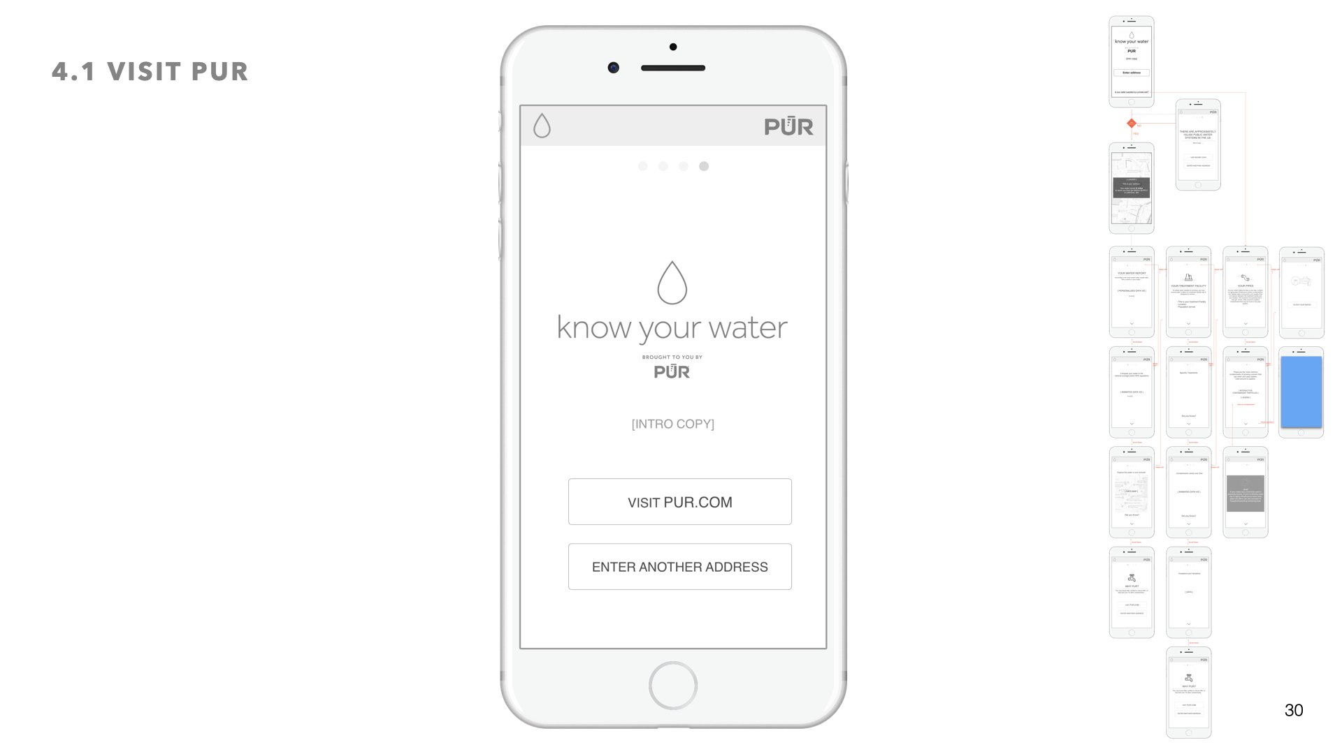
Improve CTR to PUR.com
Decrease Bounce Rate by allowing users to engage with data in personalized experience.
Give users the access to share their experience with more prominent social media options
01 Research + Usability feedback
The first Know Your Water experience was using WebGL animation - user testing feedback convinced the client that a redesign was in order if they were to improve engagement and CTR.
User feedback:
“Am I slow reader? Im not sure I’m understanding how this is important to me”
“This is a lot of information to read all at once”
“Detailed information doesn’t feel relevant”
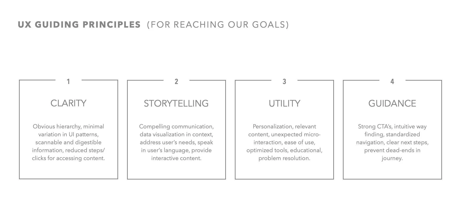
02 UX guidelines + strategy
03 Data team collaboration
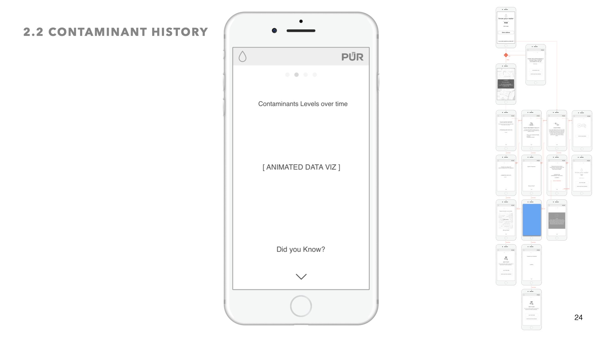
Working closely with our data team at Smart Current we identified and validated the types of data we could crawl and surface and improvements to make:
Weekly automated crawling of updates form EPA.gov loaded into database, staging area
Gather more historical contaminants and treatments (currently limited to 3 years)
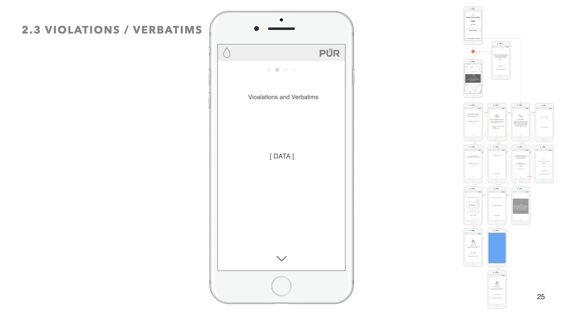
Gather violations and enforcements (currently excluded)
Automate data validation
Add external city/state/zip data validation for query expansion
Improve data accuracy
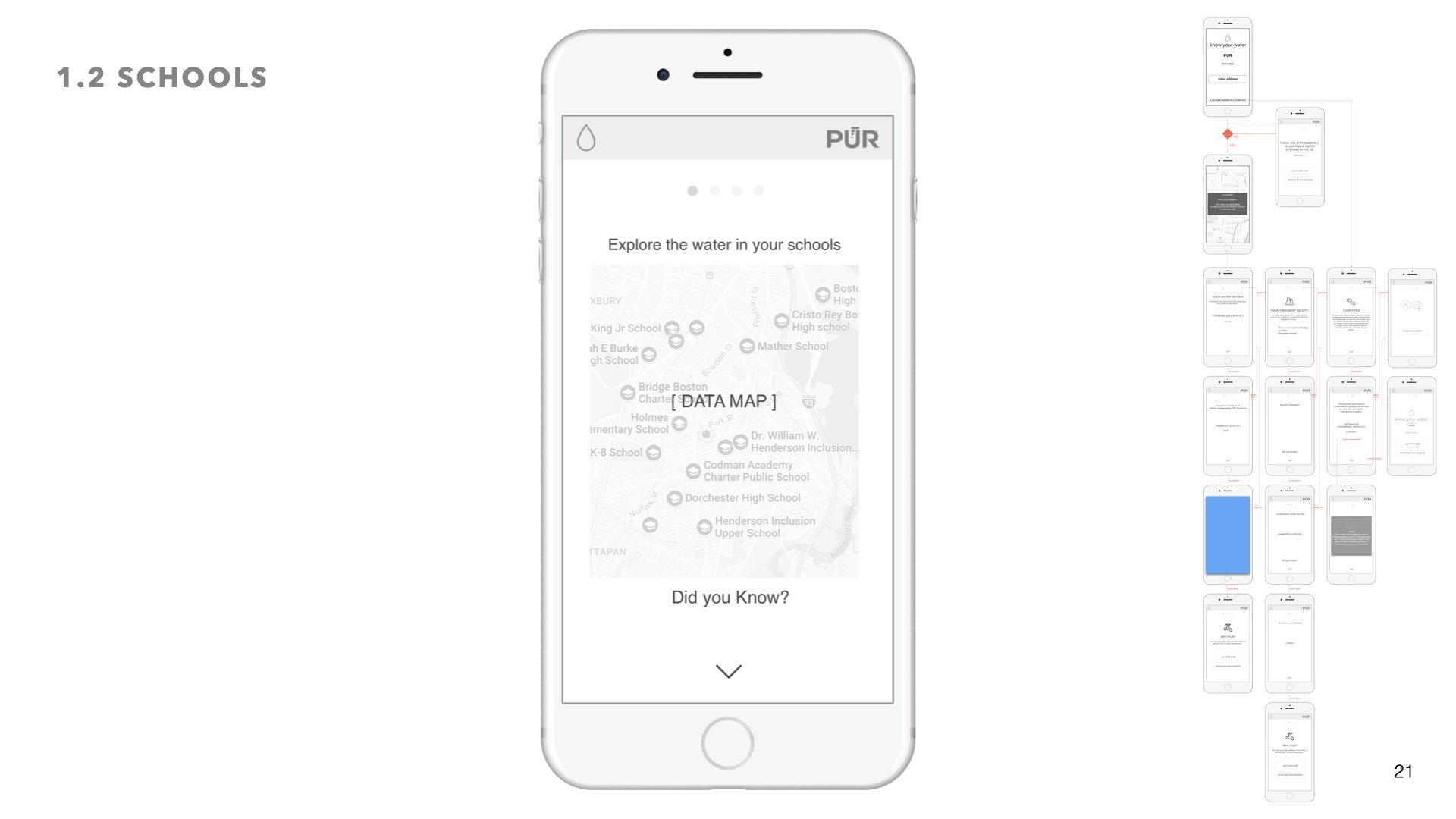
Include additional sources (i.e Schools, private wells, treatments etc.)
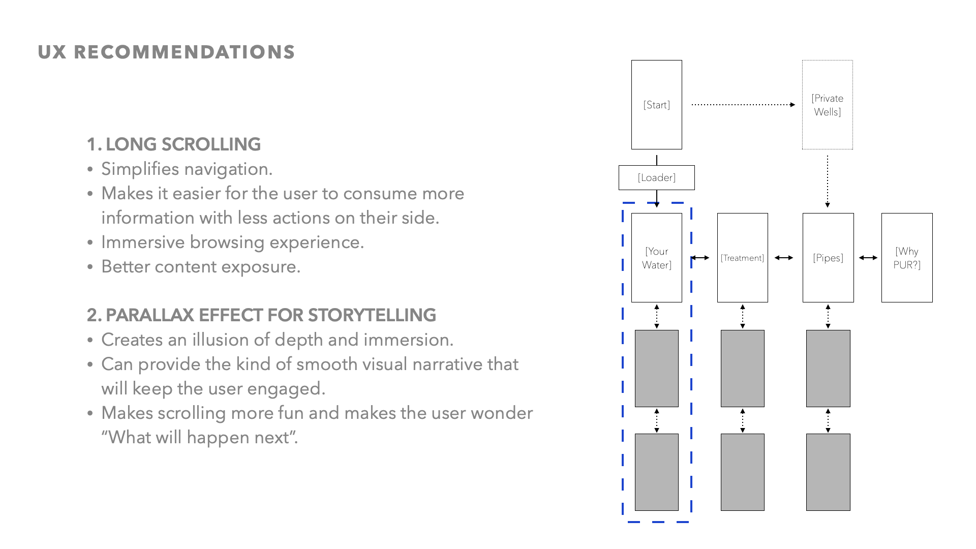
04 User flows + Navigation
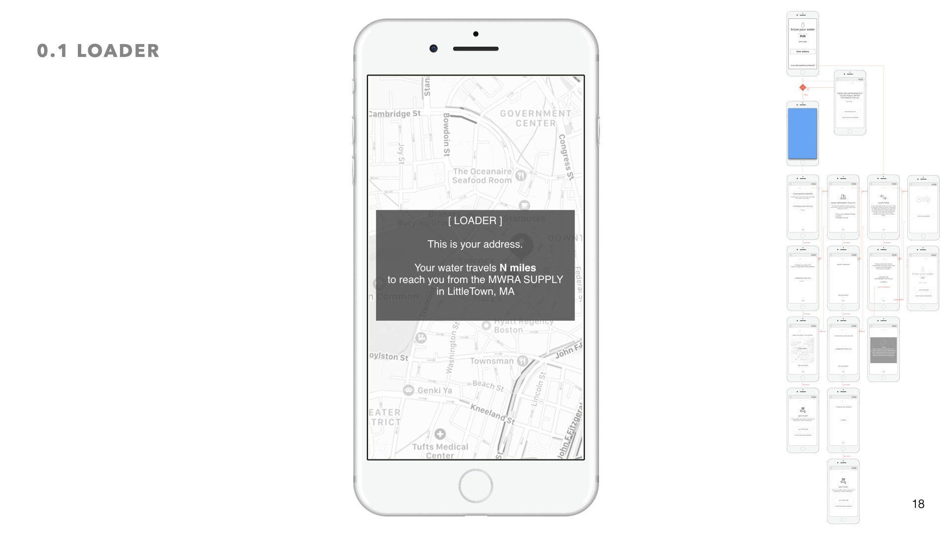
We identified 3 focus areas, PERSONALIZATION, UTILITY, MODULARITY.
04 wireframes
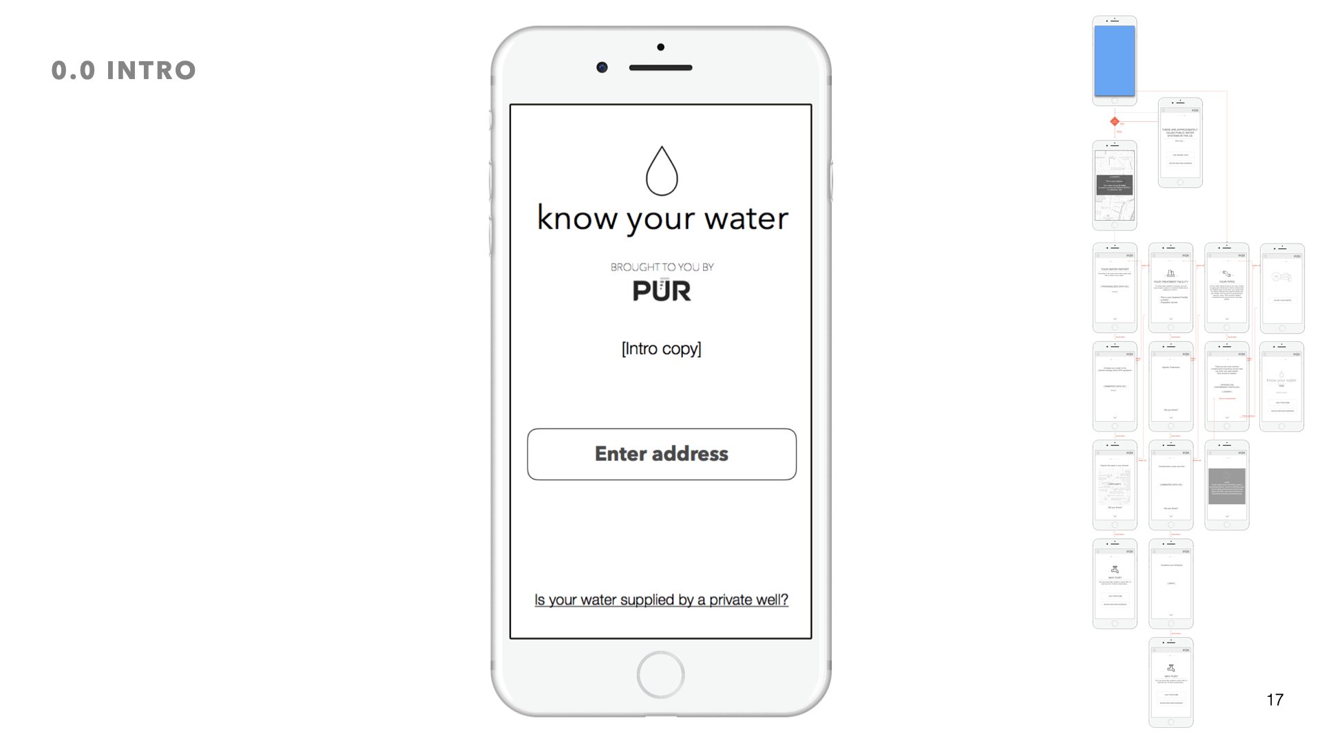
We wanted to tell a story. The story of your water. So we broke the experience down into chapters, just like a story.
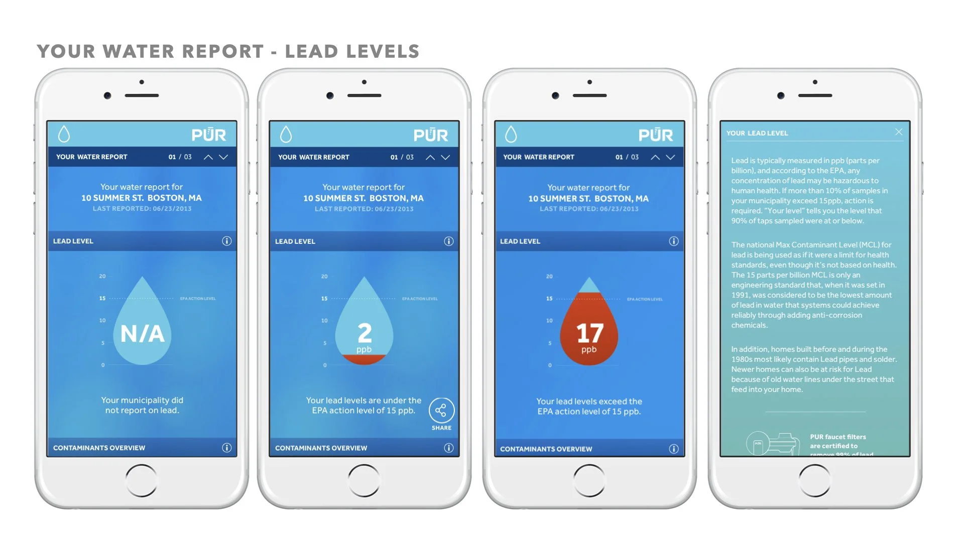
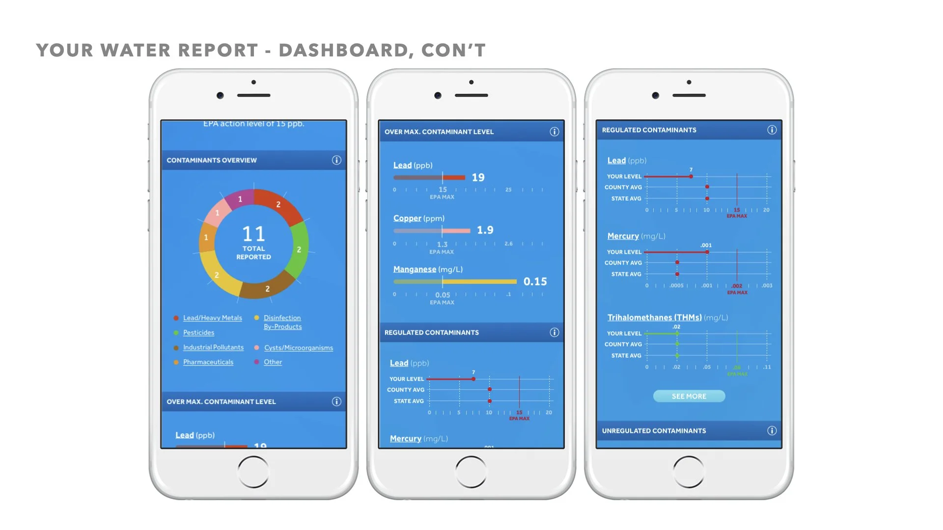
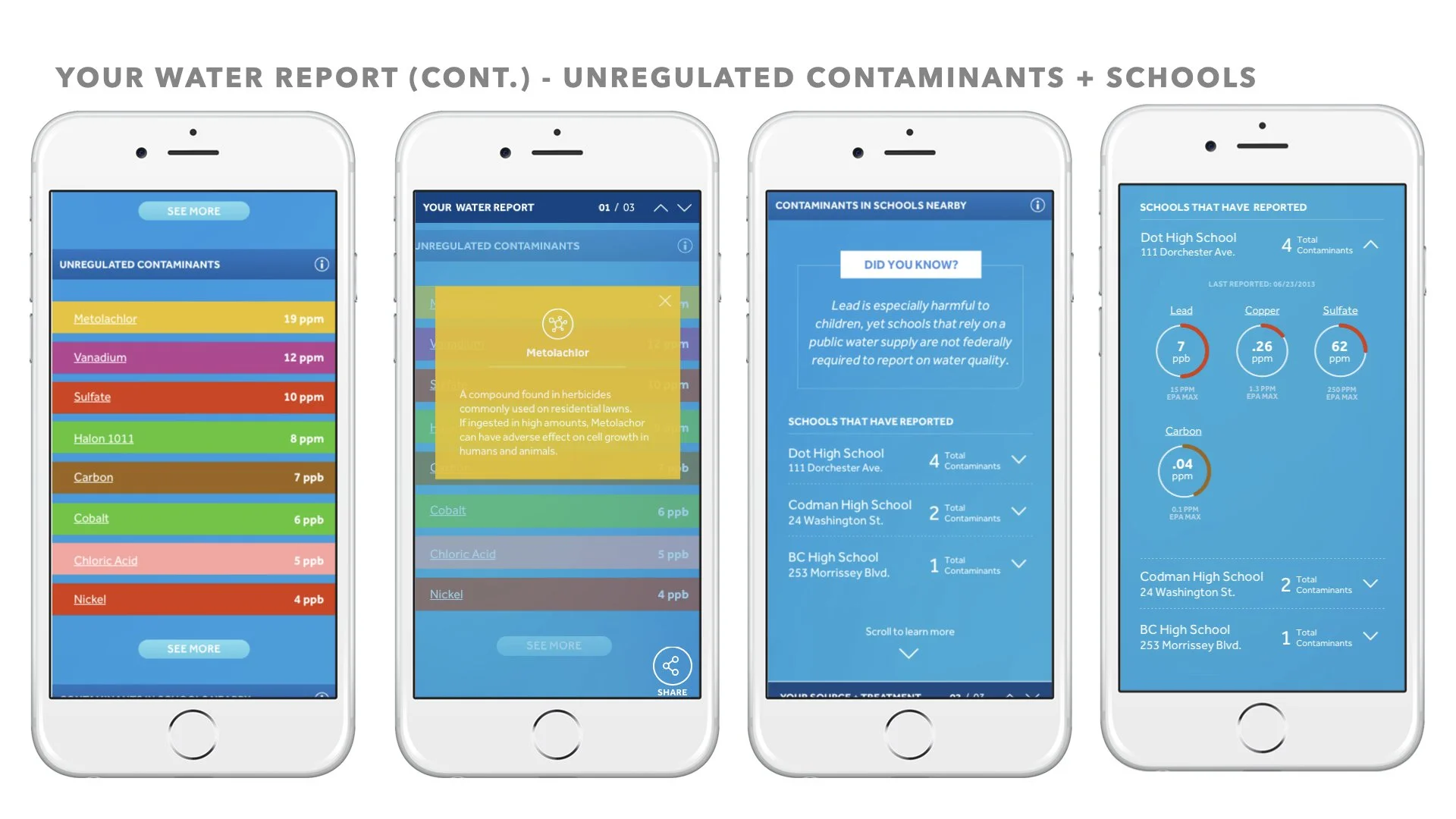
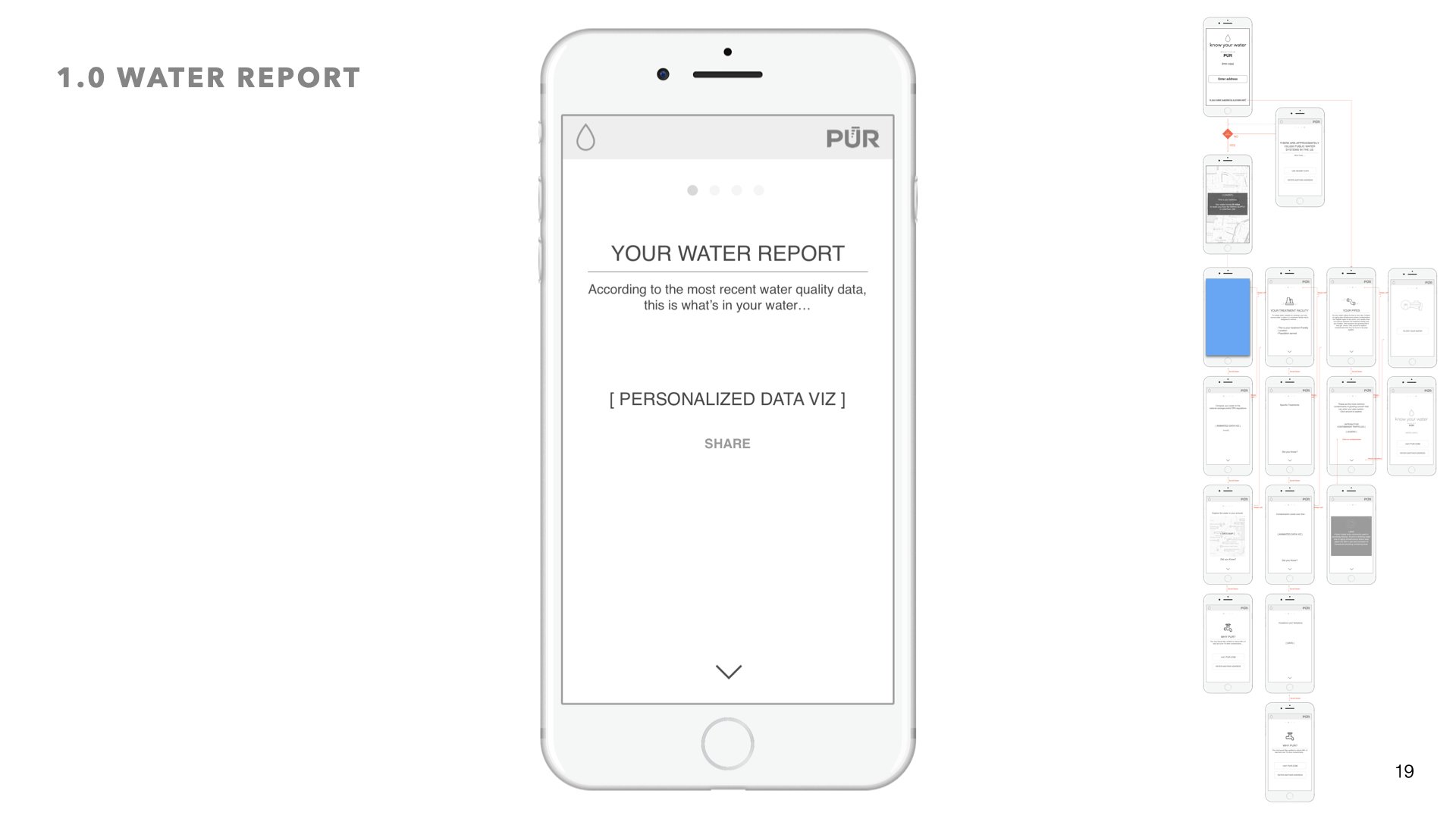
Chapter 1: Your Water Report
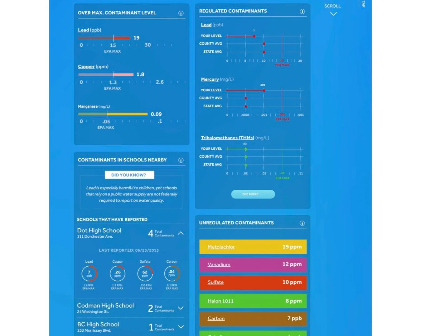
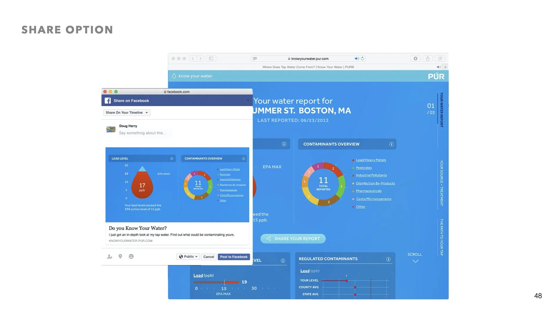
We wanted to start with whats most important to the user. According to the most recent water quality data, this is what’s in your water. leveraging data viz layouts, users can get a report that is shareable.
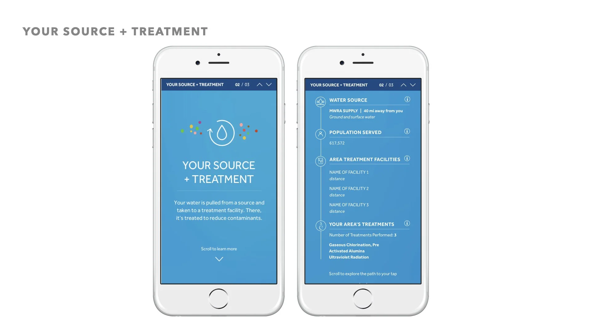
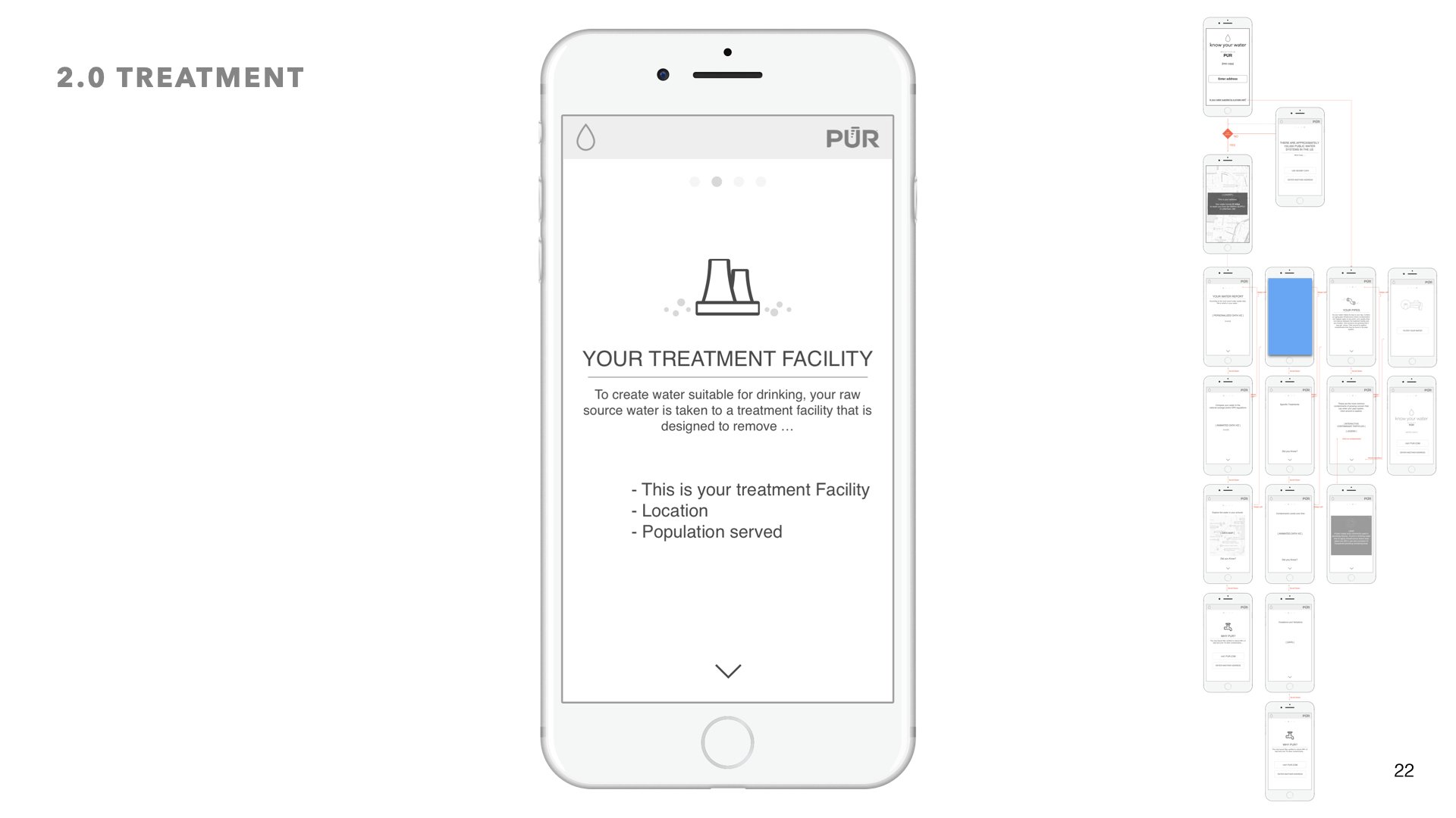
Chapter 2: Your Treatment Facility
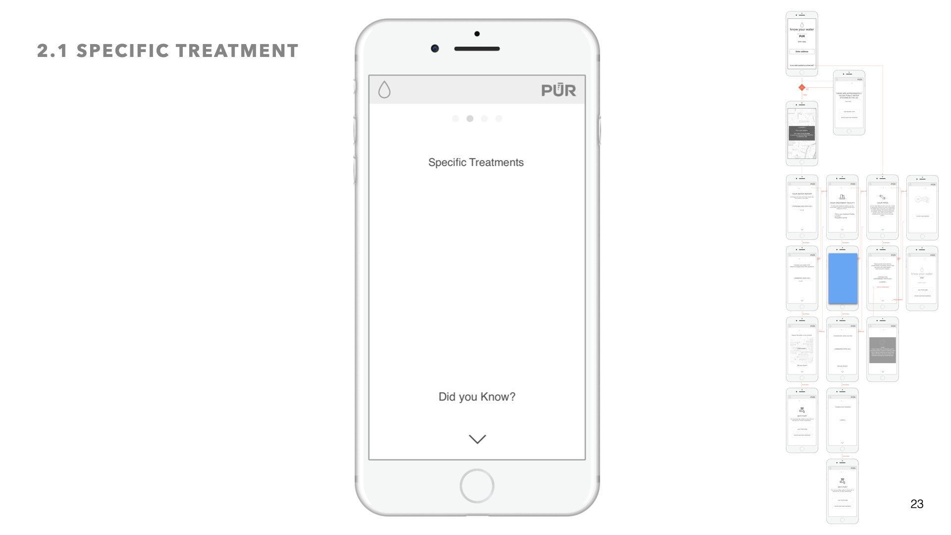
In this section users can learn more about what treatment facility their water goes through, and what that treatment facility is designed to remove.
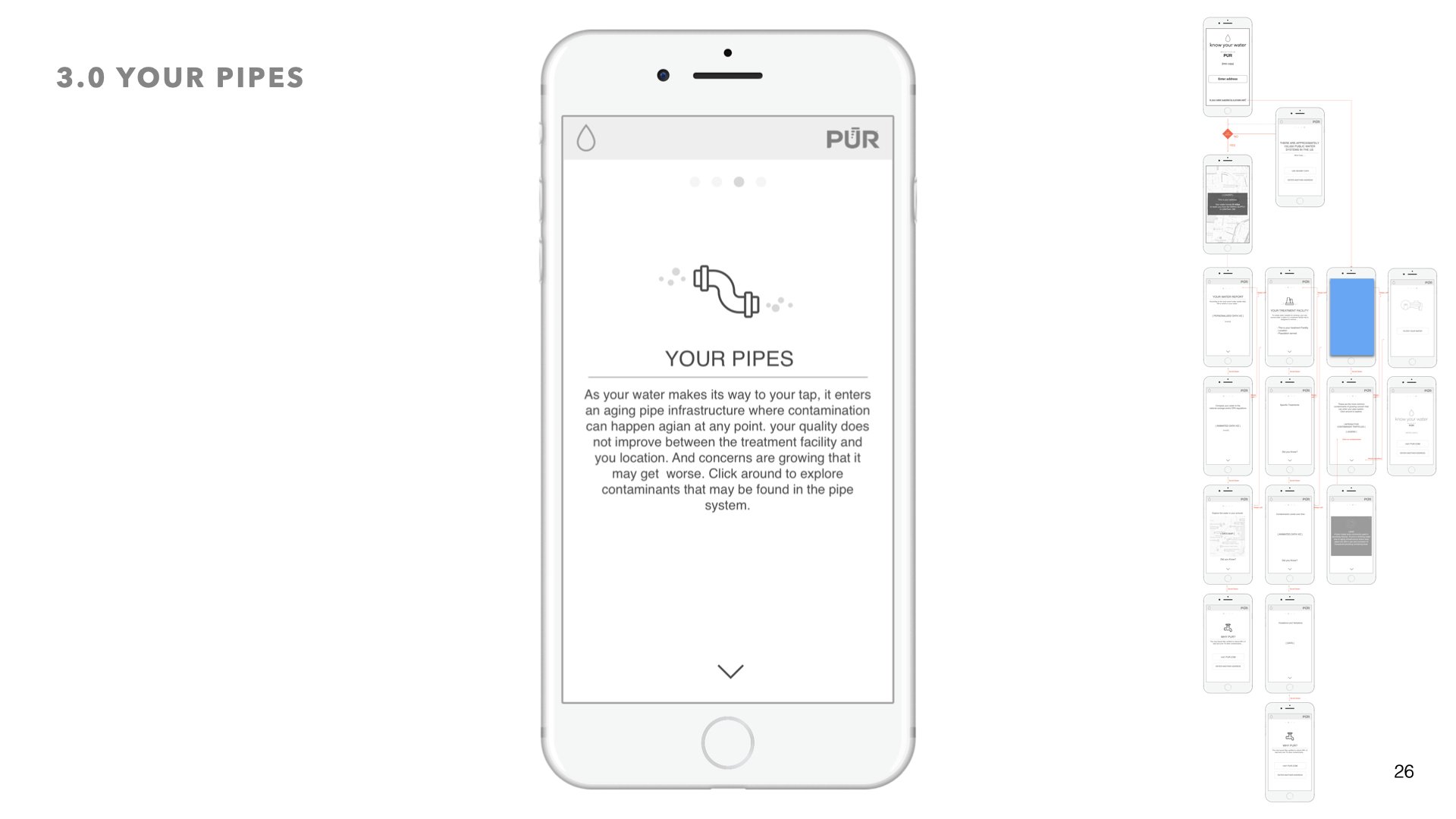
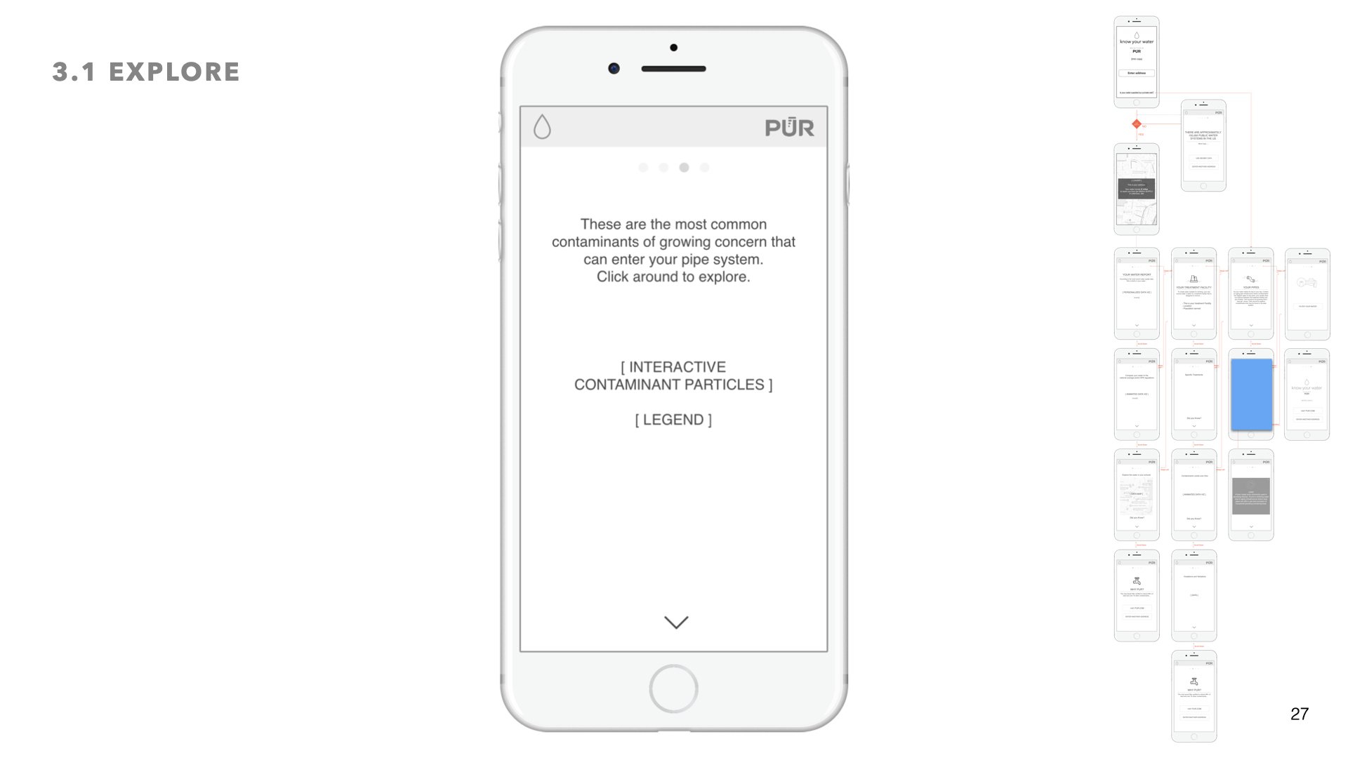
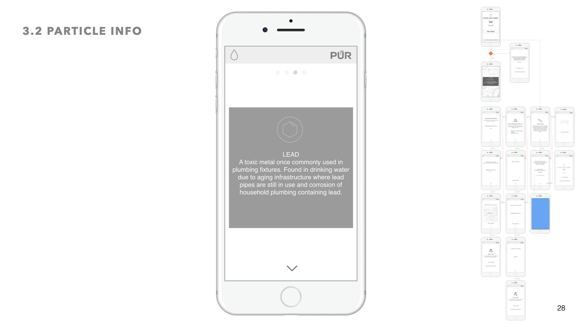
Chapter 3: Your Pipes
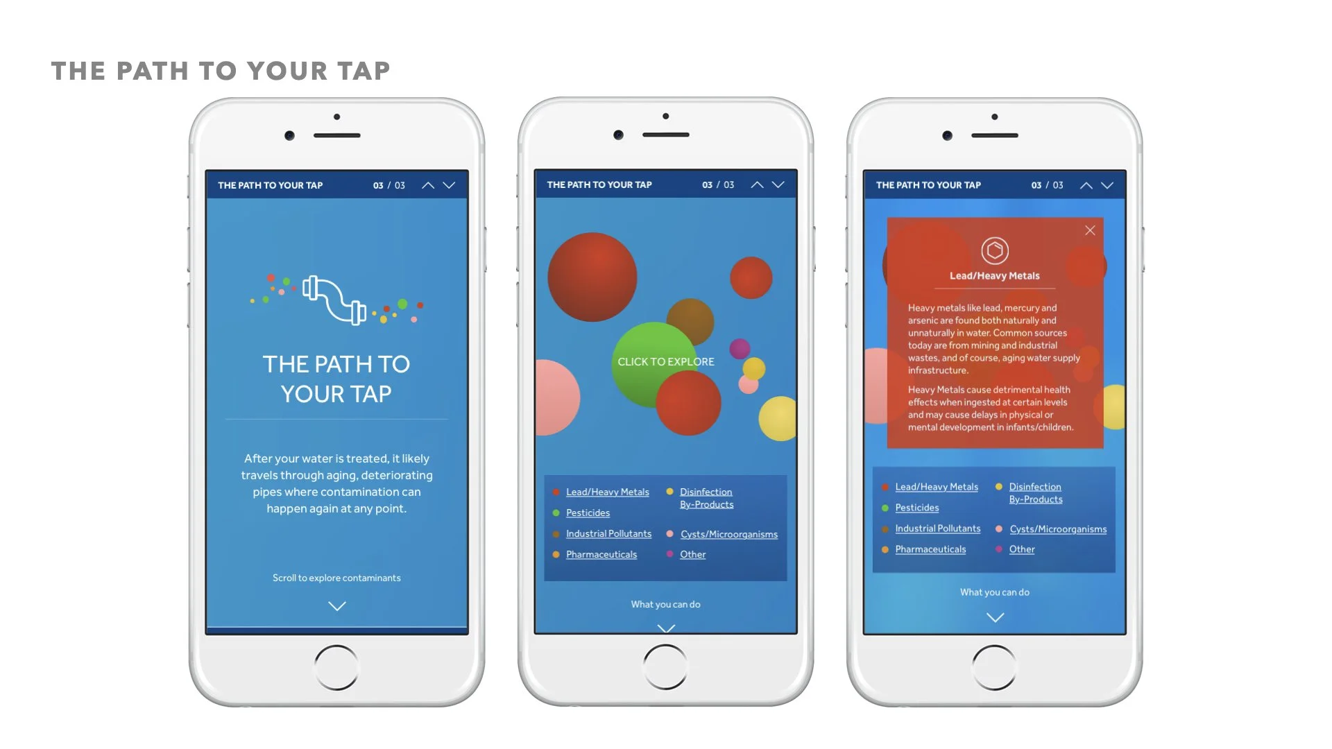
After water leaves the treatment facility it enters anaging pipe infrastructure before it makes its way into your pipes. Here we wanted to let the user explore on their own the contaminants that may be found in the pipe system


final ui design
Desktop layouts
Design System
05 prototypes + Interaction design
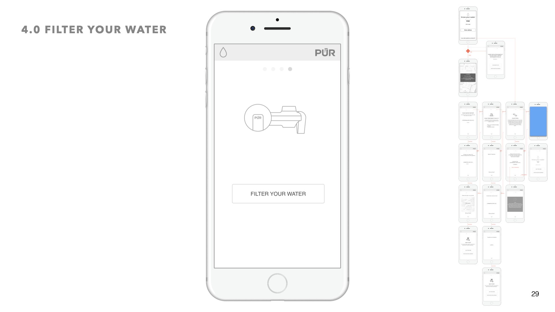
I knew I wanted to create an interactive and immersive experience, one where the user feels more in control and can access the information that is most relevant to them. For that reason I created a modular system with info tray slideouts, persistent guidance and navigation controls, and opportunities for exploration.
The desktop version leveraged a right side progress bar - so that users always know where they are in the story of their water’s journey. Additionally whenever a user wanted more info on certain data, the sliding info tray would glide in from the left and the modular data viz system would behave responsively by stacking on top of each other.
