SimSpace - CyberRange Portal Web App
01 KIckoff
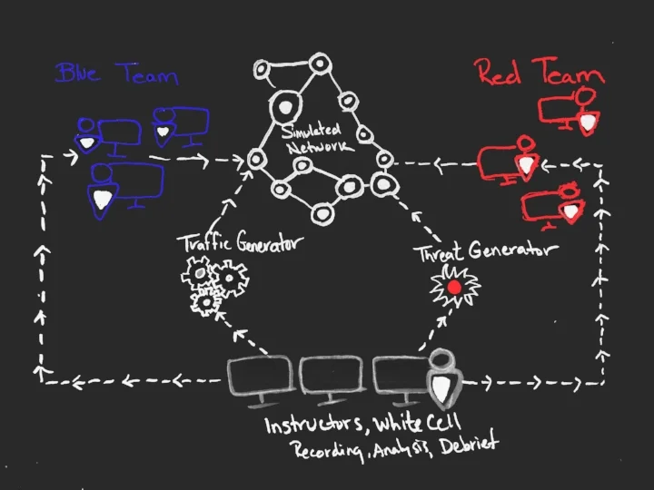
CyberRange Portal is a platform for cybersecurity training testing and assessments. Users can log on to a network of virtual machines and train against Red Team operators and automatic attack scripts.
I was tasked with creating a suite of tools which included a web app for multi-user collaboration that collected data and made correlations between attackers and defenders. The suite also includes an Admin app and a dashboard to serve organization leads who need a way to manage and monitor total usage by Events, Networks, and Users.
02 Contextual Research
One of the first things I was lucky enough to experience was a live simulated cyber attack event at an army base in Georgia. This was just a deep dive into the real time experience, in a high intensity setting that was technical and fast paced. I interviewed several of the soldiers that participated in the event and put together findings for leadership.
Working closely with Stakeholders, Front-End and Back-End developers to understand needs and requirements. Shown on the left is a dashboard view and an alert system for users to set monthly quotas and to monitor their organization's monthly usage.
METHODS USED:
Stakeholder interviews, user research, sketching and wireframing, prototyping, interaction design, UX writing, user onboarding, usability testing.
TOOLS USED:
Paper and pen, Whiteboard, Sketch, InVision
PROBLEM STATEMENT:
We have great technology, but too many use cases and client needs. How do we make one flexible interface for all and still provide a great user experience?
PLATFORM OVERVIEW:
PROCESSS
Below is some of the process that followed an extensive Discovery phase which included stakeholder interviews, contextual inquiries, competitive analysis, and user interviews.
The following images are blurred to protect the work and data. If you would like to see more of this please reach out to me personally.
With lots of brainstorming and card sorting we created a whole new IA. One of the main challenges was use of the label of an Event because there are a multitude of Event Types. (The image above only covers some of the apps but not the entire suite.)
Most of the user flows were done during whiteboard sessions. Above are some examples for permission models and registration flows.
Once the IA and Task flows were fleshed out I started out sketching on paper.
The above sketch is one of the initial ideas on how to display attack injects for the red team and the white team.
The above sketch shows what the blue team and the white team want to see during an event. It was critical for all to be able to create and filter data quickly and easily as well as connect between items. Grouping items together allows the white team to understand the cyber defender's workflow and thought processes.
Final Scaffolding Designs:
Shown above is the final Sidenav design and scaffolding for each Web-app in the suite of tools. By clicking the app menu, a tray would slide out allowing users to quickly switch between apps. Each App would have it's own primary color helping users recognize their current page. The sidenav was the best solution for this case because it draws the user's attention and creates a natural flow for the user.
By clicking the context menu users can change their context (in this case a network) in much the same way that they switch between apps. Each app has it's corresponding context and in this way we were able to create a symmetrical interaction throughout the entire suite of tools.
Dashboard page includes an overview of all the apps available to the user.
Using Joyride we created a walkthrough for first time users and beginners to demonstrate interaction patterns within the suite of tools.
SimSpace - Website Redesign
(Currently In Progress)
Process:
Website Audit
identifying Customer segments
1. Financial Institutions
2. Technology
3. Government
4. Health Care
5. Retail
6. Academia
Personas
identifying Customer Needs
Our customer needs to be able to:
• Read the site’s purpose from the entry point.
• Recognize whether he or she is the target audience.
• Understand what services are being offered.
• Understand why these services are needed.
• Quickly identify what differentiates us from our competitors
Strategy: Website Segmentation
Proposed Website segmentation as the overall Design strategy for the website's layout and navigation.
Main Reasons why:
• In essence, website segmentation delivers unique, targeted content that speaks to specific customer or industry segments’ needs and pain points, and does so in the clearest, most concise, and most interesting manner.
• Speaks persuasively to each audience
• Maximizes the user experience of each audience
• Includes compelling calls-to-action perfectly suited to each audience
Allowing users to self-identify their audience type and to navigate to a highly customized “microsite” built specially around the needs of that audience. This is the type of site that could really elevate a brand, drive leads, and deliver ROI on multiple fronts.
Iterative Design
Initial Mockup
The LIFT Model provides a conversion optimization framework showing the Six Conversion Factors that allow US to evaluate landing pages from the perspective of the page visitor. The goal is to provide simple value proposition that speak clearly to the needs of that segment.
Your value proposition is a cost vs. benefits equation that shows our prospect’s motivation.
If our perceived benefits outweigh the perceived costs, our prospects will be motivated to act.
Second Mockup - focusing on Website Segmentation and a new company slogan that followed a branding workshop I led at a company offsite:
"CyberSecurity Quantified"
.... an example of how we adopted some of our original ideas and messaging "Take Back Your Network. Protect Your Data" for collateral material


