Attain App : Healthy Actions Card Redesign
The Attain app is a sensor-based health, activity & rewards experience delivered via native mobile apps. Attain combines user health history with wearable data to offer personalized goals, achievable actions and rewards with the goal of driving behavior change to improve user health.
In the Attain App, Healthy Actions are easy to digest tips and actions deployed via content cards daily. Healthy Actions are an opportunity for users to develop daily engagement with in improving healthy habits around topics of sleep, nutrition, mindfulness and activity. There is also an opportunity for more personalized clinical content deployed based on user's medical history.
The Problem Statement: The goal of optimizing the design of the Healthy Action Cards was to increase engagement rates with the cards (current rates) through improved readability and hierarchy of card content. I also explored creating a more holistic experience, one that would inform the user of their progress, help them determine which content was of importance to them, and provide a more overall personalized experience.
My Role: Lead product designer, User Research + Discovery, Workshops, Wireframing, User Flows, User Testing, UI Design, Interaction Design
Baseline Test
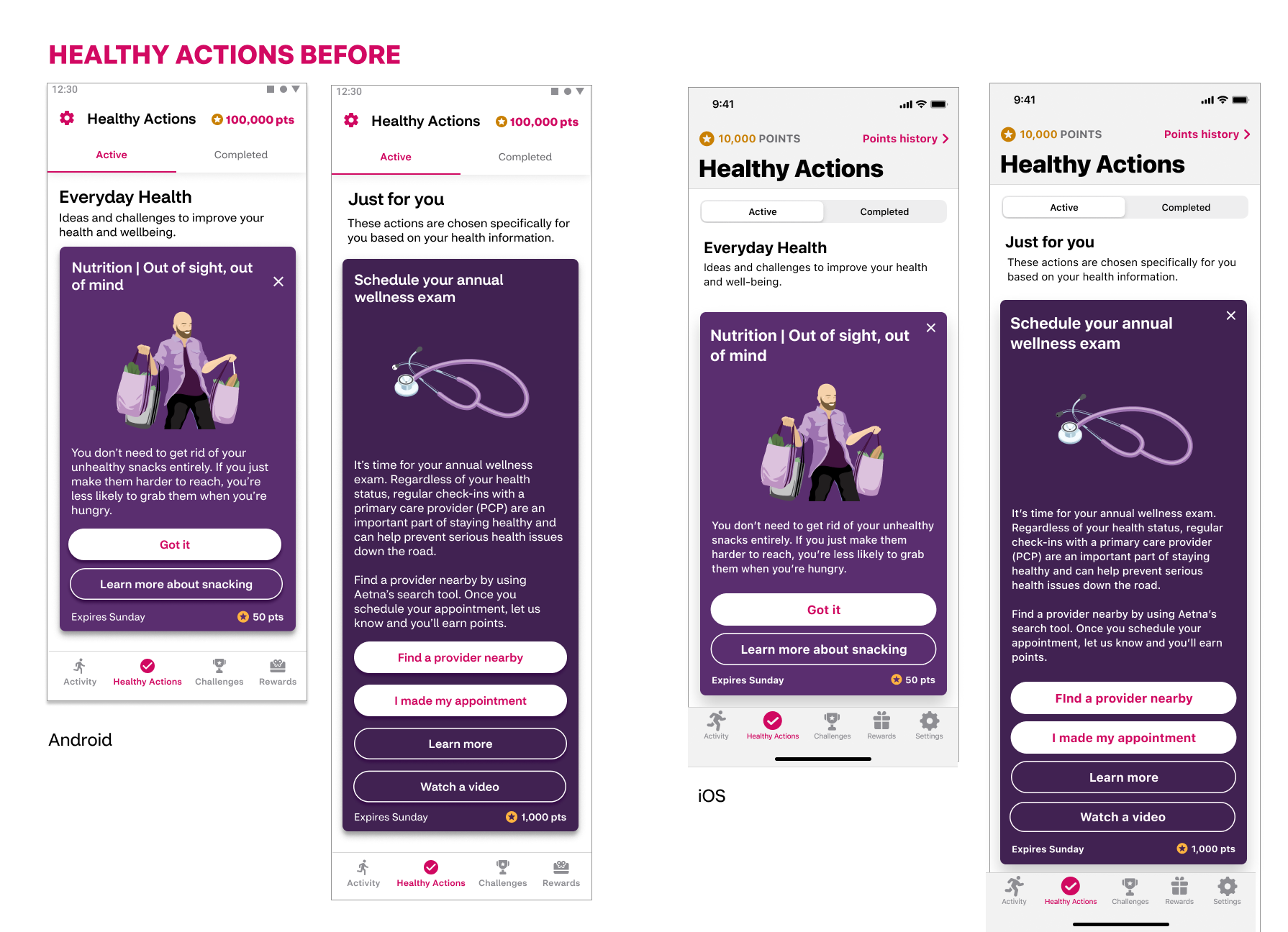
The purpose of this test was to gain feedback from both Attain members and non-Attain members on the current lifestyle and clinical Healthy Action card experience in order to have something to compare to later when we are testing the proposed solution.
6 participants total: 3 Attain members, 3 non-Attain members
Each participant saw both the clinical and lifestyle cards, 3 participants saw lifestyle first and 3 clinical cards first.
Results:
Participants did not notice the difference in cards bw lifestyle and clinical even though they were different shades of purple and had a different headline
Participants understood the relationship between cards in multistep experience
CTA language was either not understood or felt irrelevant. Users were confused by the number of CTAs.
We conducted usability baseline testing, design exploration and workshopping to identify the first phase of improvements planned to launch, collect real time user feedback learnings, then continue to adapt and improve.
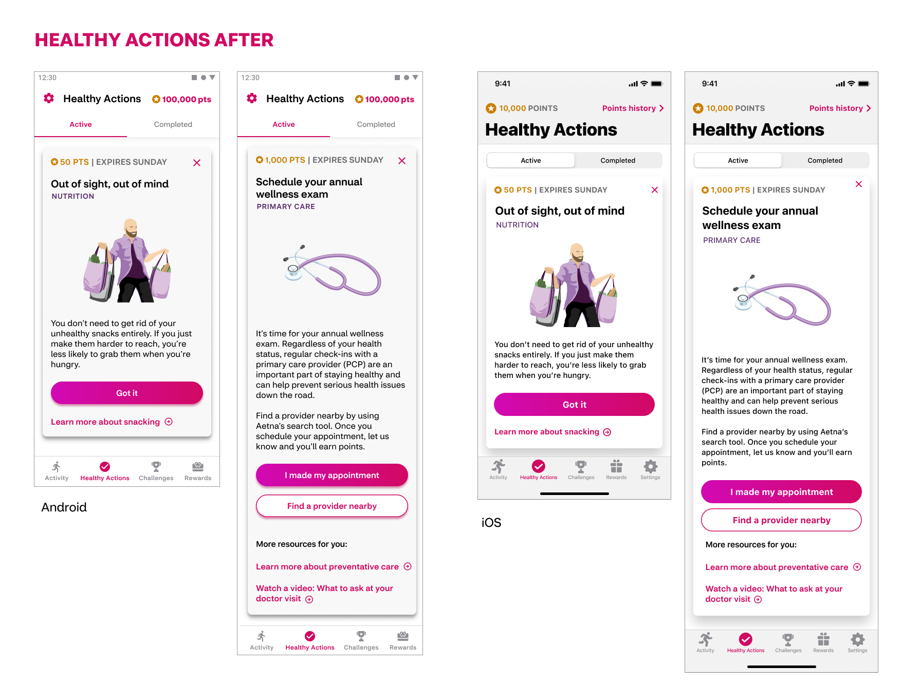
Design improvements include:
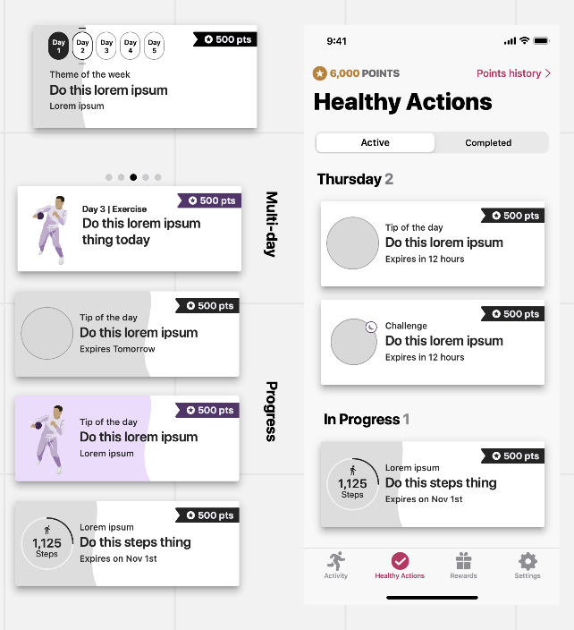
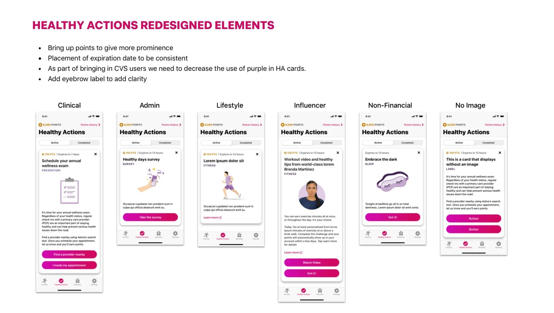
Improved CTA hierarchy: Updated call to action hierarchy to include clearly denoted primary and secondary buttons for adjudicated actions as well as links for related resources.
Update in the color of the cards for improved readability: White background with black text is easier for most users than white text on violet color, especially for longer clinical cards.
Retain branding personality: Retained brand colors and personality with the use of violet toned illustrations
Added theme visibility: With the addition of a label that denotes the theme of the Healthy Action cards, users will have more awareness of content themes that span over a week of time of clinical cards that span over several weeks.
Increased visibility of points and date: Based on user feedback of importance, moved the points value and expiration date from the bottom to top of the card.
Removed ineffective copy: From user feedback, we learned there was a lack of attention paid to and clarity to the headlines that delineated the "everyday health" and "just for you" sections of Healthy Actions. This cleans up the space so users can focus on the information of higher importance rather than what had become white noise.
Competitive + Desktop Research:
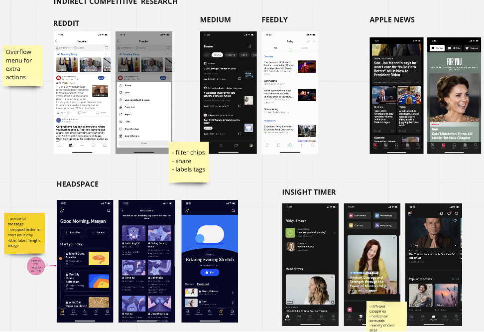
One of my favorite things about working on Attain is the amount of time and respect given to proper research. Having a UX researcher embedded on the team was helpful though not enough. Due to capacity issues I took over the research for this redesign effort. I completed competitive research, design discovery, and Card UI Best practices audit and report. As well as user testing proposed solutions in the later stages.
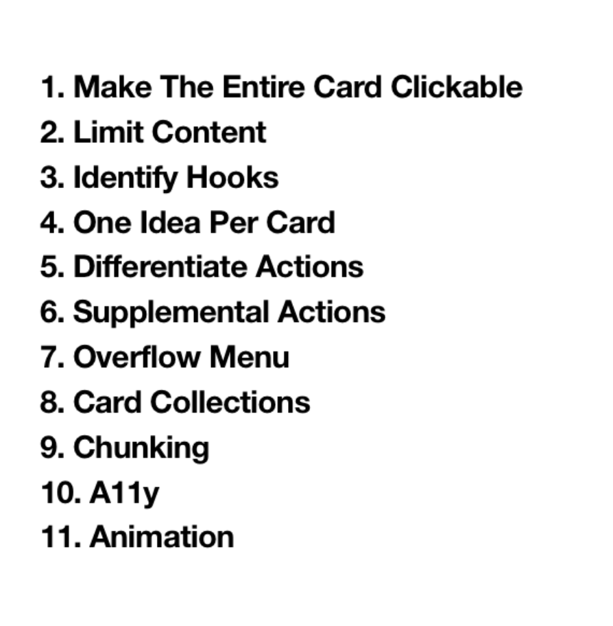
Establishing Card UI Guidelines
Some competitive research collected on Miro
Cross-functional Workshops
In order to get the most out of our early sprints of informational gathering, I organized and ran several cross-functional workshops with Product, Architecture, Data Science and Design teams. The outcomes of these workshops were very helpful in organizing the information that was independently stored in everyone’s heads. Working with highly experienced team members across the teams I learned that many folks had many strong opinions and different ideas on what Healthy Actions could or should be in the future state. Having everybody on equal plane workshopping in design thinking really set the stage for synthesizing concepts. These workshops along with the research conducted helped me create the narrative, user flows and other deliverables to inform and back up our approaches to be eventually tested.
A snapshot of one of many Design thinking Workshops: Crazy 8’s
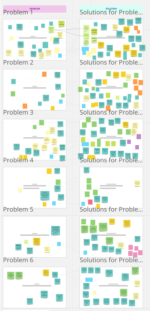
Problem Statements and mIndmapping
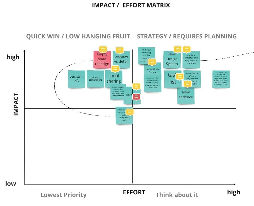
Feature Prioritization Workshop
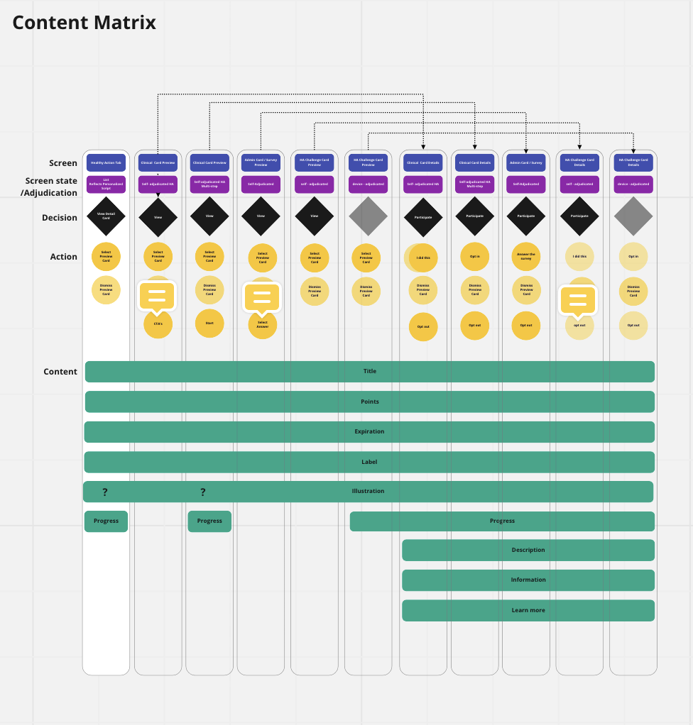
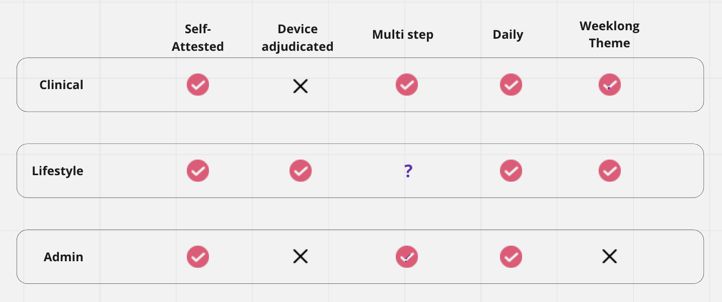
Content matrix deliverable
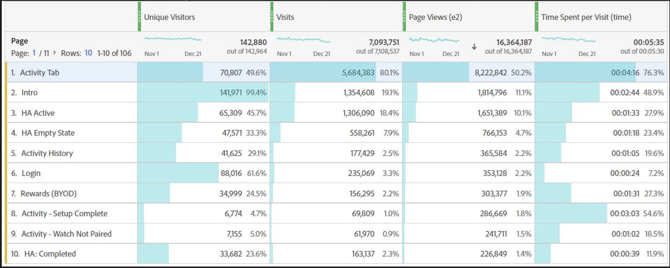
Data Analytics compiled
Use Cases identified
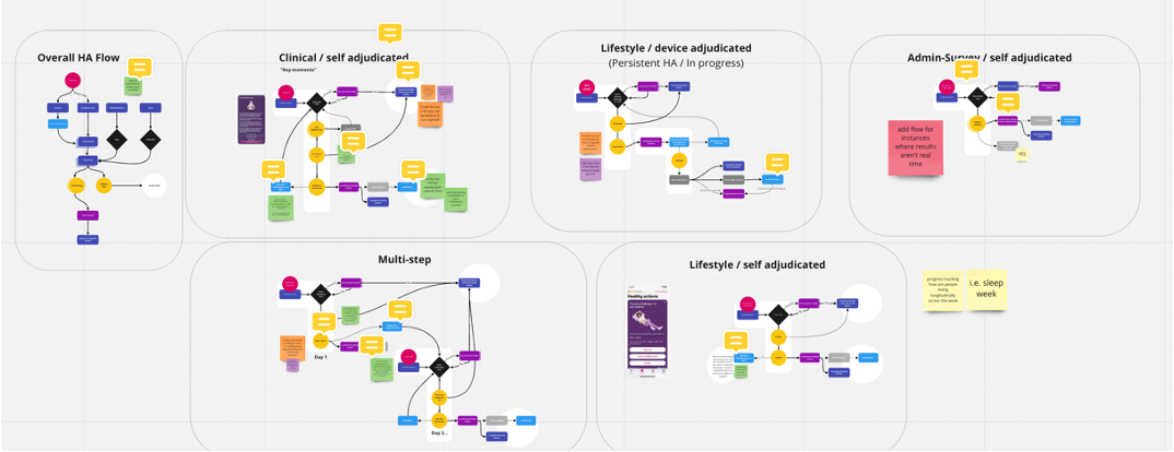
Suggested user flows for various use cases
wireframes
We identified several use cases where there was opportunity to improve the experience and to create more engaging interactions for our users. Major areas of opportunities to explore were in long content, multi-step cards and fitness tracker based actions. We identified the need for users to better understand a connection between certain cards and the surfacing of in progress actions.
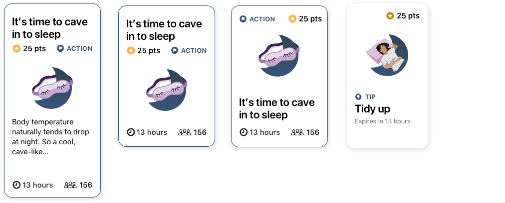
Preview cards / content hierarchy exploration:
Chunking / simplifying
Better information hierarchy
Show what the users find most important first and let them choose what cards to interact with
Tab structure and Navigation systems:
Wallet
Carousel
Connecting tips and challenges
Multi- step cards:
Opportunity to create a sense of traction/accomplishment
Connect daily cards to weekly theme and show progress toward a greater goal
Link similar cards together to see the timeline of that theme
Group related cards in completed section
In progress Challenges:
Lifestyle content served provided a tip and a challenge. The tip being the “why” and the challenge being the “what”.
In our baseline test users saw the connection between the cards but were often confused as to when a card is completed an how they were to earn the points
MULTI-STEP DESIGN EXPLORATION
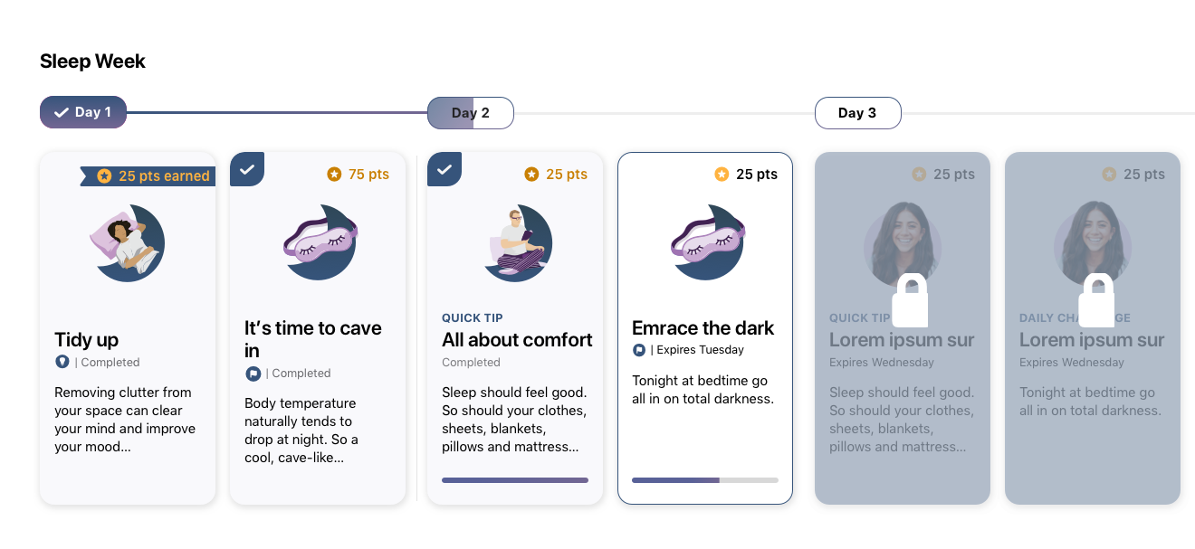
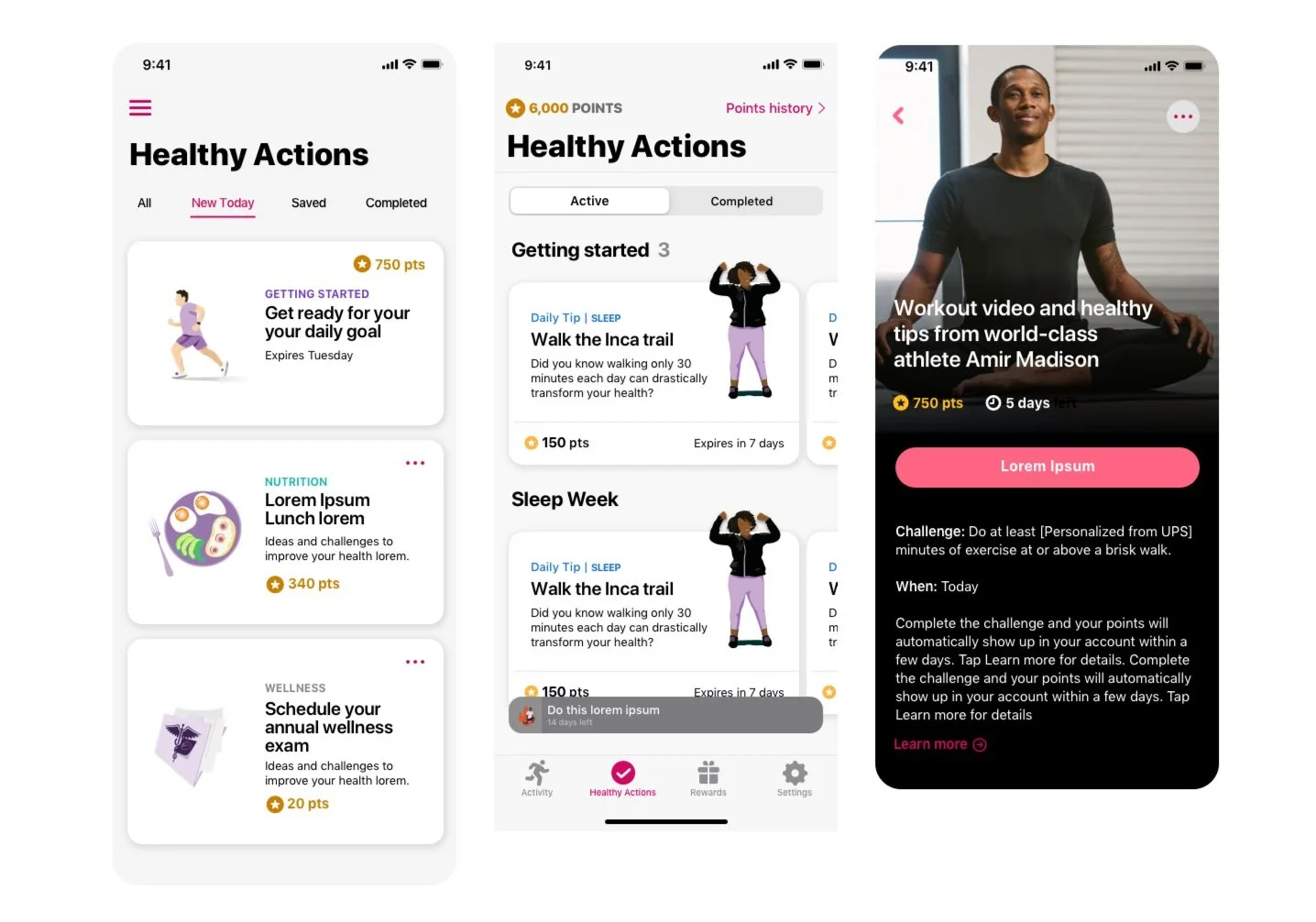
Once we had some wireframes and flows worked out I moved quickly into prototyping some designs so that we can test with users. For the multi-step experience I wanted to explore surfacing up all the content for the week, leveraging unlocking mechanism to keep users interested and aware of the connections between cards as well as differentiating between tips and challenges and status (in progress, completed, expired). Some navigation structures I explored included horizontal carousel and wallet style interactions. Users would be able to tap into each preview card and see the detail view and take action there.
Above: Horizontal scroll creating connection for the theme of the week and displaying card status
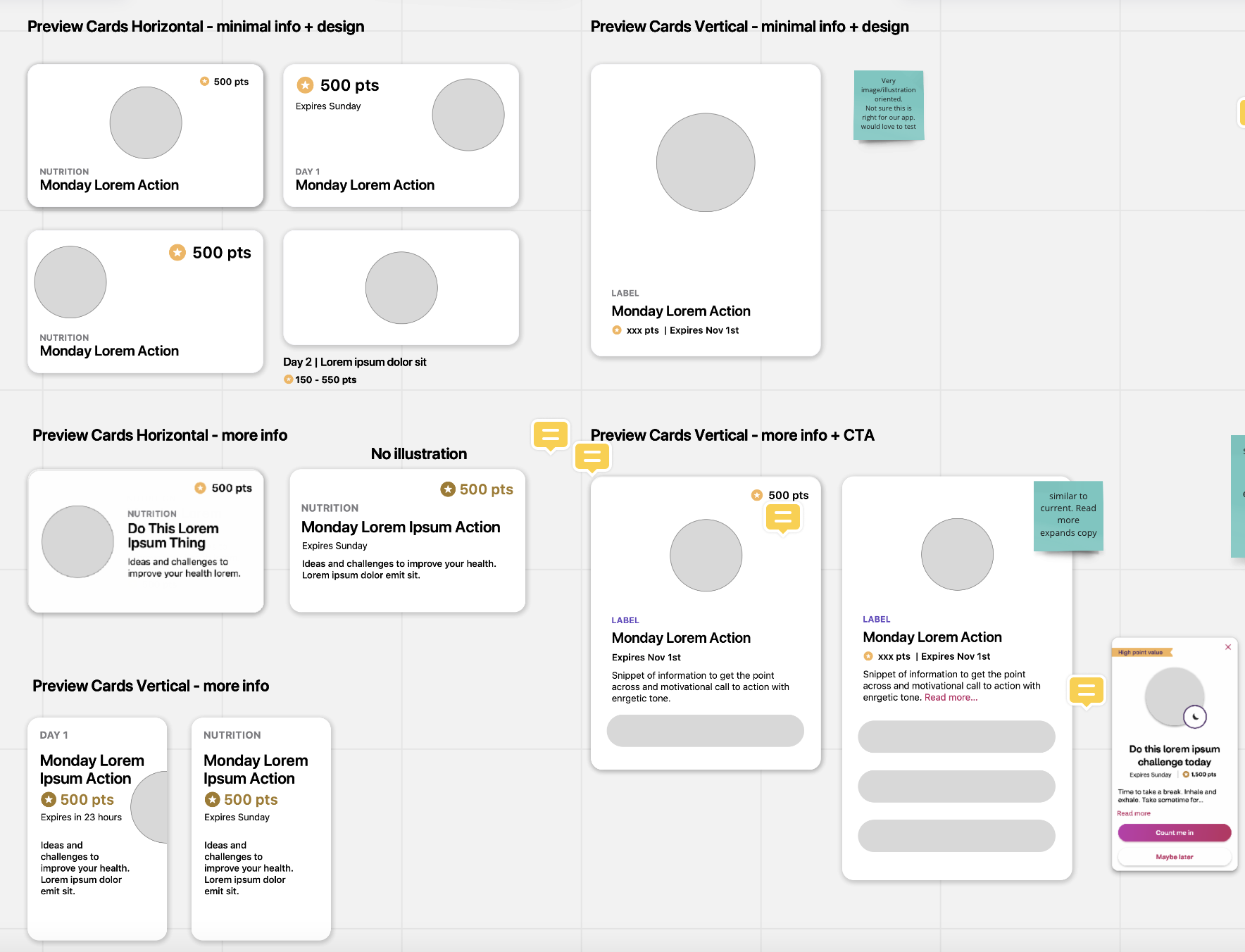
Content hierarchy exploration for preview cards
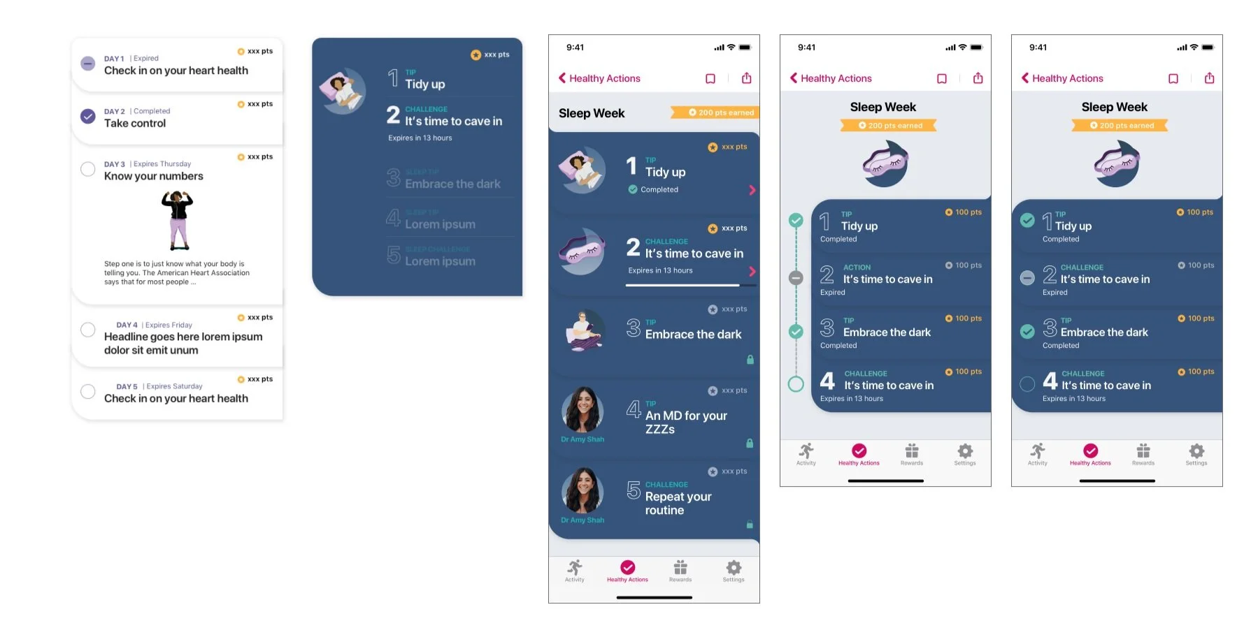
Design Exploration: Multi-step cards, points tracking / wallet style interaction patters + stepped connections
Design Exploration: Preview cards, Progress Tracking, Dark mode
MODERATED USER TESTING
Particpants:
We interviewed 8 participants spanning across age groups, program types and tenure
Test Prototcol:
Part 1: Interview about current Healthy Actions
Part 2: Moderated test of 3 prototypes
Test goals:
Ensure the information shown is useful
Identify participants interpretation and feedback about how card series work
Inform decisions between design variations
Capture future state value-adds for the Healthy Action redesign
The prototypes shown included a conservative, moderate and ambitious approach. Users were shown the same content in these 3 variations. All 3 versions showed points in a more prominent location and treatment on the card. Conservative approach showed a card that was more similar to the current experience, but the cards were stacked. The moderate approach displayed the preview cards in a vertical scroll with headline dividers, the moderate approach featured the influencer / theme for the week, displayed total points earned vs available and preview cards displayed in horizontal scroll.
3 designs tested:
Prototype 1: Closest to current design
Prototype 2: Long scroll preview cards by categories
Prototype 3: Horizontal scroll based preview cards with progress + points tracking
A new pivot from Product
While we were testing these prototypes new direction was coming from our Product team. There was a decision made to separate activity based challenges from Healthy Actions. This change had a big effect on the proposed solutions.
This simplified the experience, decreased the number of cards available daily, removed the need to differentiate between a tip and a challenge, and would no longer need to show healthy Action cards in progress (because those were activity based and would now live int he Challenges tab). It was determined that having the preview card -> detail card navigation structure wouldn’t be necessary with this change. And since Prototype 1 tested well it was decided that we would choose that direction and create a phased approach for future states.
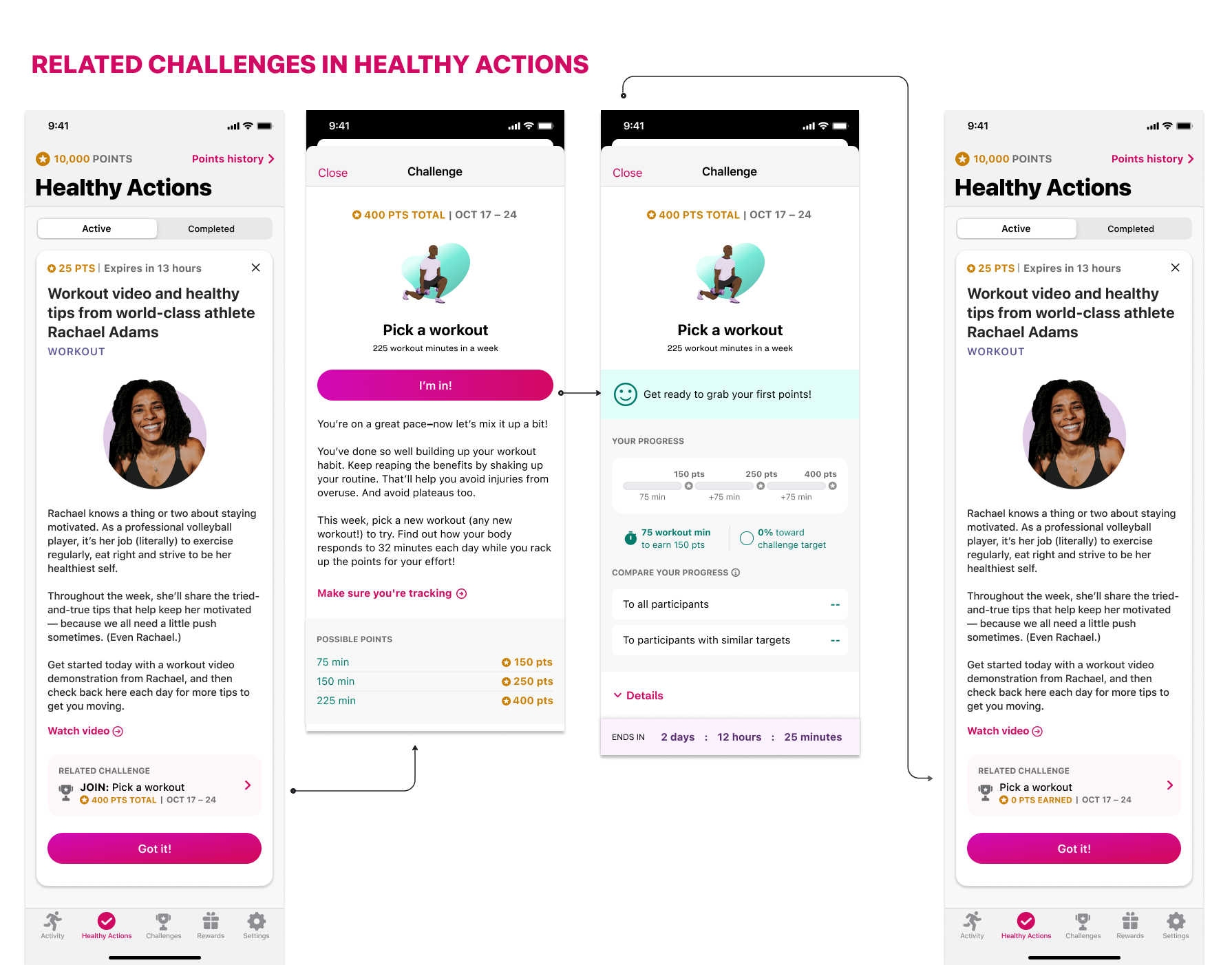
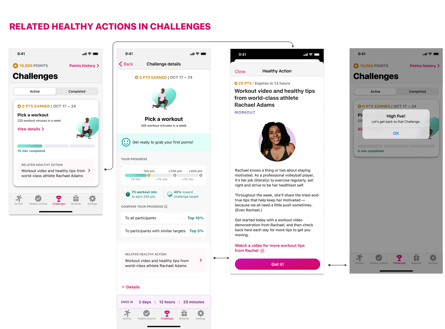
We did however determine that we would still want to make a connection between tips and challenges, but that connection would be reflected via linking 2 sections of the app.
